


Bartini
a martini bar
A playful identity and mobile-friendly website for Portland’s martini hotspot, known for oversized glasses, bold hues, and endless happy-hour drinks.
The design and custom iconography echo the bar’s signature tabletops and its dazzling lineup of martinis.
2017
Rebranding
#colormetini
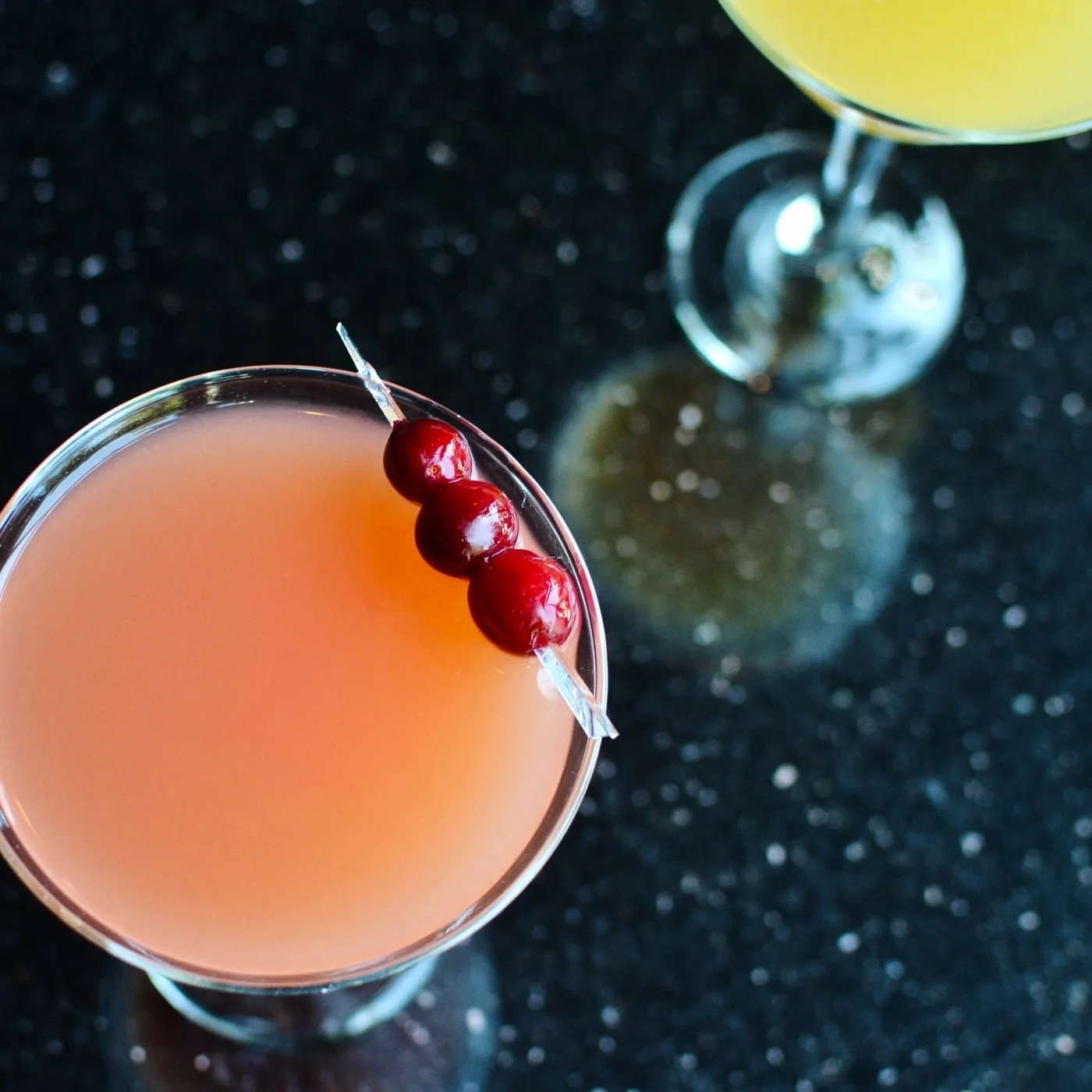
Renowned for its oversized, candy-colored cocktails, the bar was as much about spectacle as it was about sipping.
The line alludes to both the signature saturated drinks and younger times, perfectly capturing the youthful, carefree vibe and nights that blurred outside the lines.
Brand Story
Creative Direction, Copywriting
Background
Bartini first opened its doors in late 2003 in Portland’s Northwest District, just off the bustling NW 21st Avenue.
Bartini wasn’t about the classic dry martini in a coupe — it was about giant goblets in neon hues and rainbow mixes of flavors.
Known for its endless happy hour, it quickly became a go-to for students, young professionals, and bar-hoppers in the neighborhood.
tagline
menus

Bartini’s dated menus needed more than just an update — they needed to match the energy of the bar itself.
Guests weren’t there for fine dining; they were hopping between spots, snapping photos, and enjoying Bartini’s candy-colored cocktails.

Before
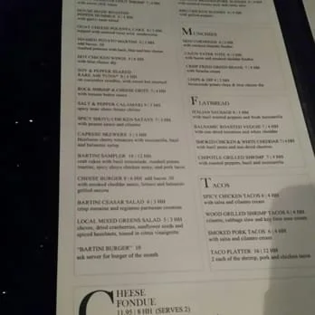
Images from Yelp
menus
Bartini’s menus needed more than just an update — they needed to match the energy of the bar itself.
Guests weren’t there for fine dining; they were hopping between spots, snapping photos, and enjoying Bartini’s oversized, candy-colored drinks.
Before
Images from Yelp
menus
The old “keyhole oak tree” mark felt too literal — and increasingly out of step with the company’s pivot toward government security. Its chunky typography carried weight, but not the precision the brand now needed.
The redesign introduced a lighter, crisper cut of Graphik and shifted the focus back to the name itself. By carving a small square “bit” from the “O” and echoing it as a final block at the end of the wordmark, the logo now tied directly into the brand story — data secured, bit by bit.
Creative Direction, Design
Before
Keyhole oak logo
After
Precision and clarity, bit by bit
menus
Bartini’s menus needed more than just an update — they needed to match the energy of the bar itself. Guests weren’t there for a fine-dining experience; they were hopping between spots, snapping photos, and enjoying Bartini’s oversized, candy-colored martinis.
Creative Direction, Design
Before
Precision and clarity, bit by bit
#colormetini
Known for its oversized, candy-colored cocktails, the bar was as much about spectacle as it was about sipping.
The line nodded to both the signature saturated hues and younger times, perfectly capturing the youthful, carefree vibe and nights that blurred outside the lines that made Bartini a neighborhood favorite.
Brand Story
Creative Direction, Copywriting
Background
Bartini first opened its doors in late 2003 in Portland’s Northwest District, just off the bustling NW 21st Avenue.
Known for its oversized, candy-colored cocktails and endless happy hour, it quickly became a go-to for students, young professionals, and bar-hoppers in the neighborhood.
tagline
menus
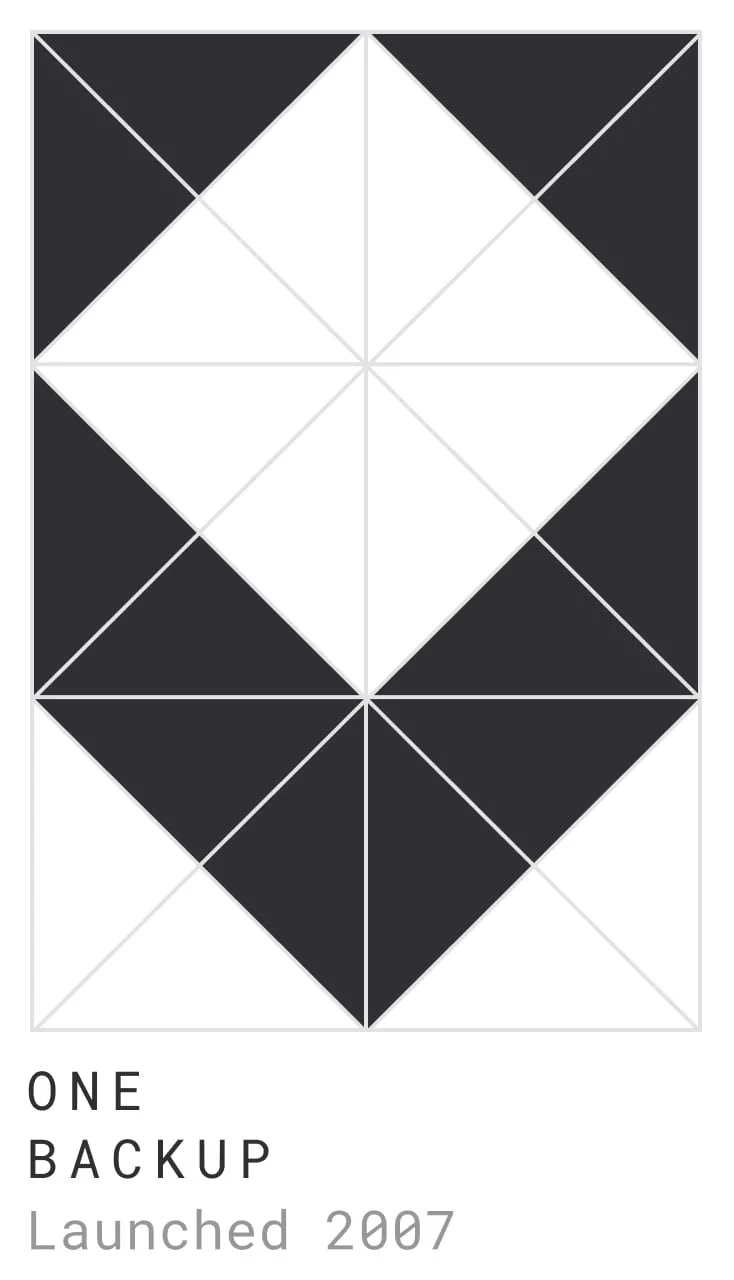
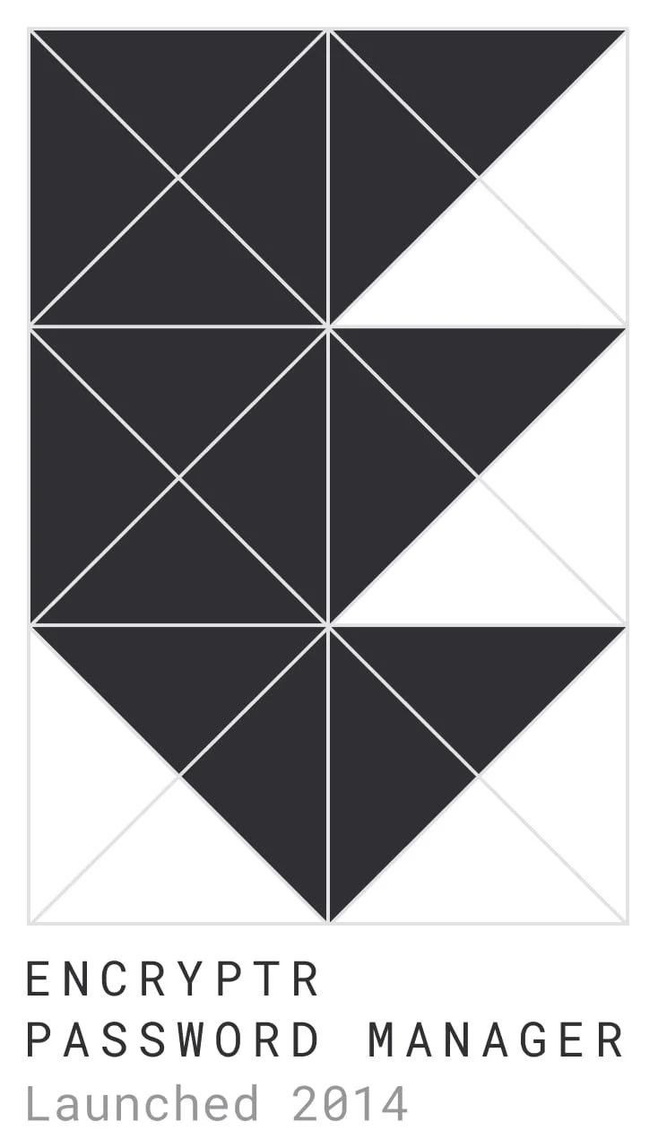
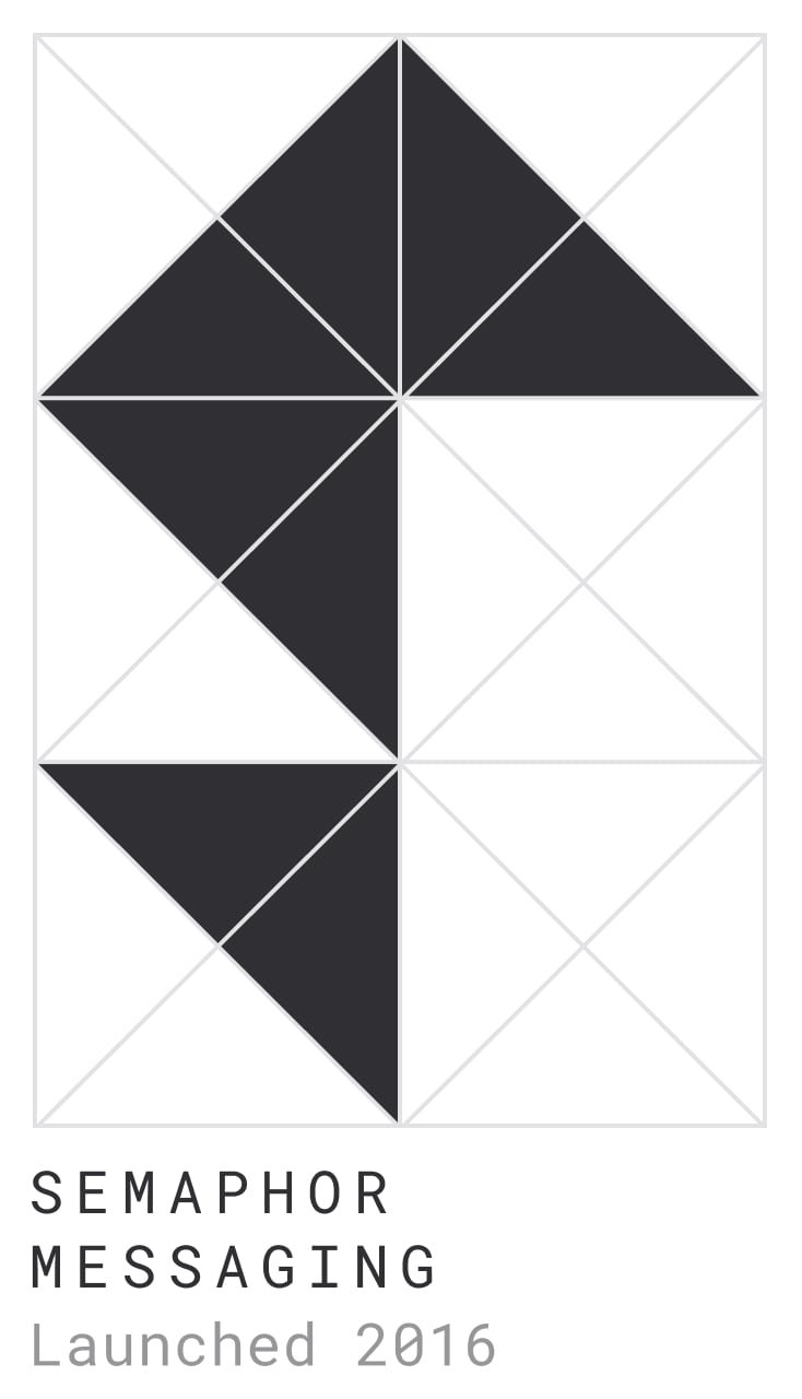
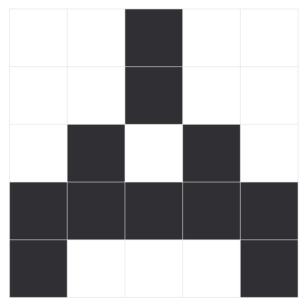
Although the SpiderOak brand had struggled to find solid footing over the years, the original three product logos, at least, had never changed.
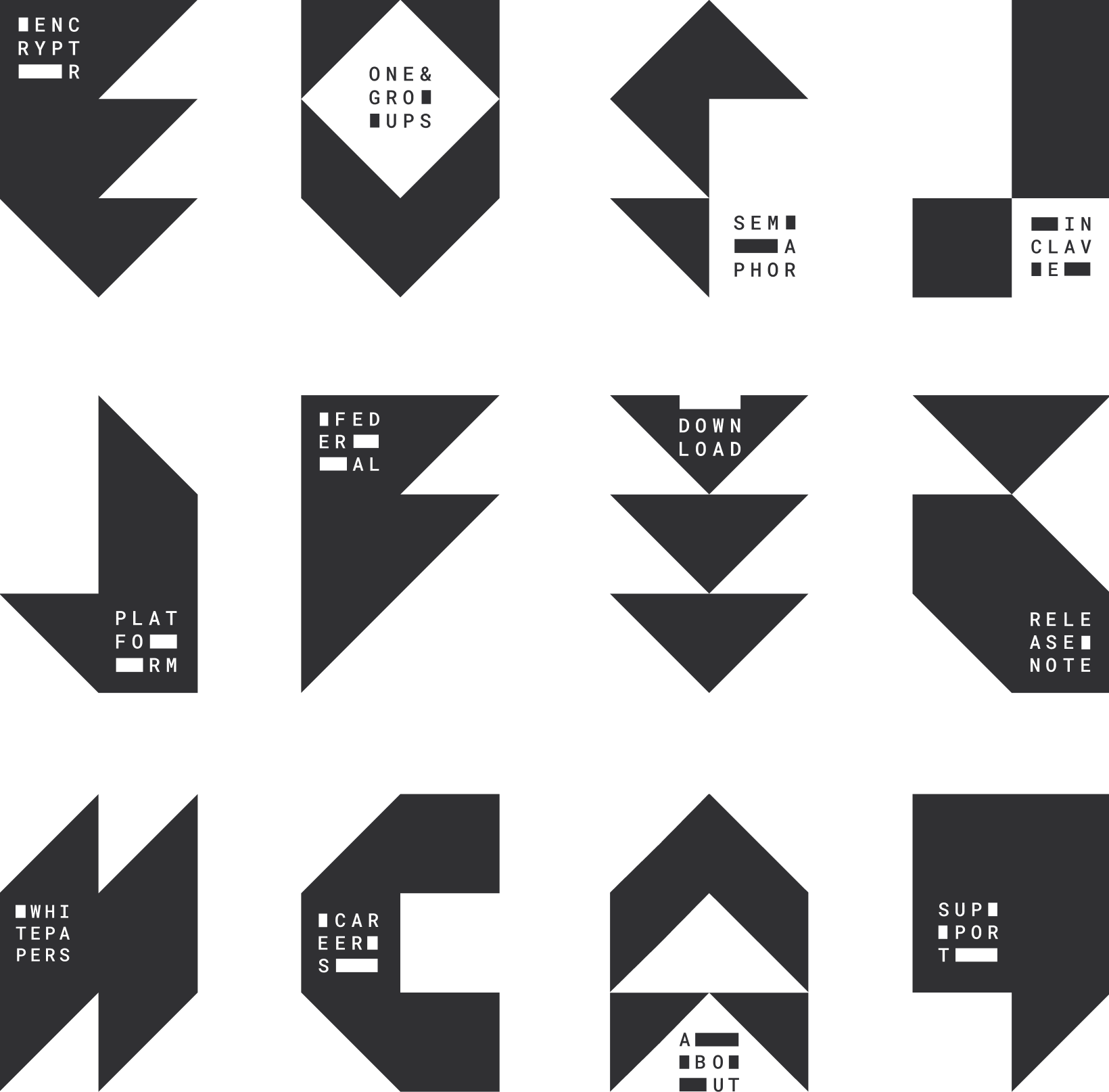
Wanting to maintain some continuity between these mainstays and the newest branding concept, the logo system naturally expanded using the same geometric grid of precise triangles and squares.
Using this same grid, numerous other aspects of the brand could be built out with a unique identifying mark while still fitting cohesively within the larger brand system.
Creative Direction, Design
icons
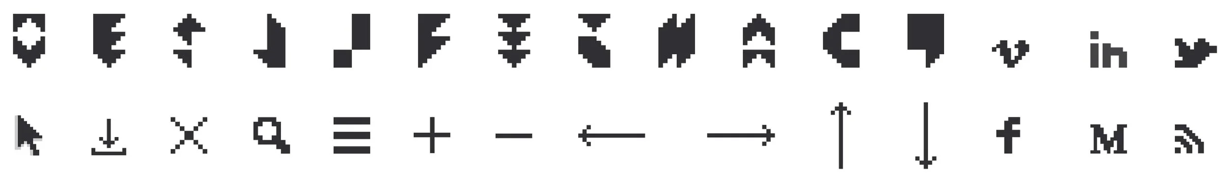
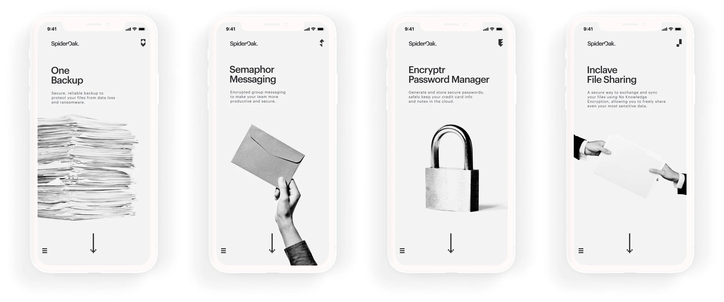
The 8-bit icons, often coupled with Roboto Mono, are used throughout the brand concept to indicate points of user interaction.
Such “clickable” elements appear throughout the website to signal interactive points for users.
Creative Direction, Design
In print, they serve as intentional accents, highlighting the company website or emphasizing a pull quote.
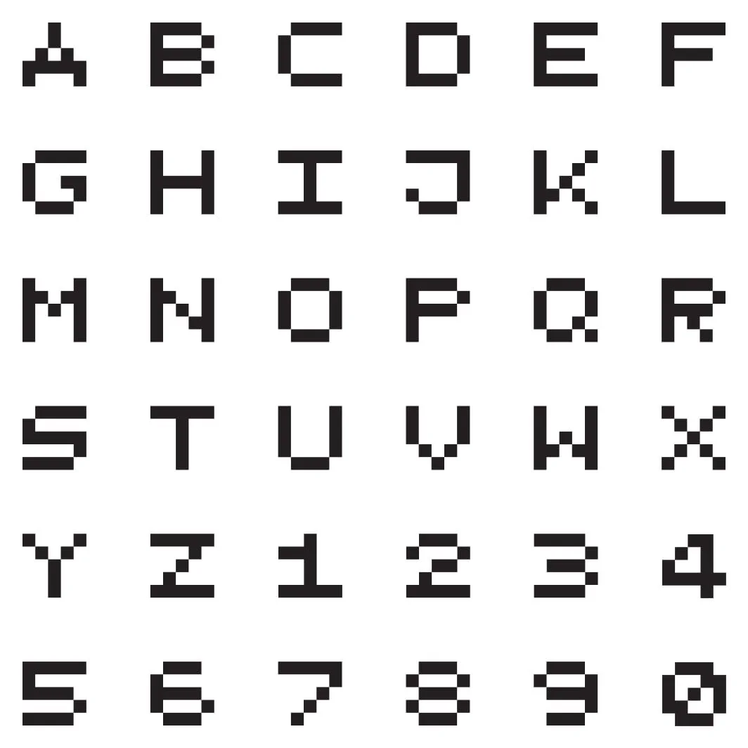
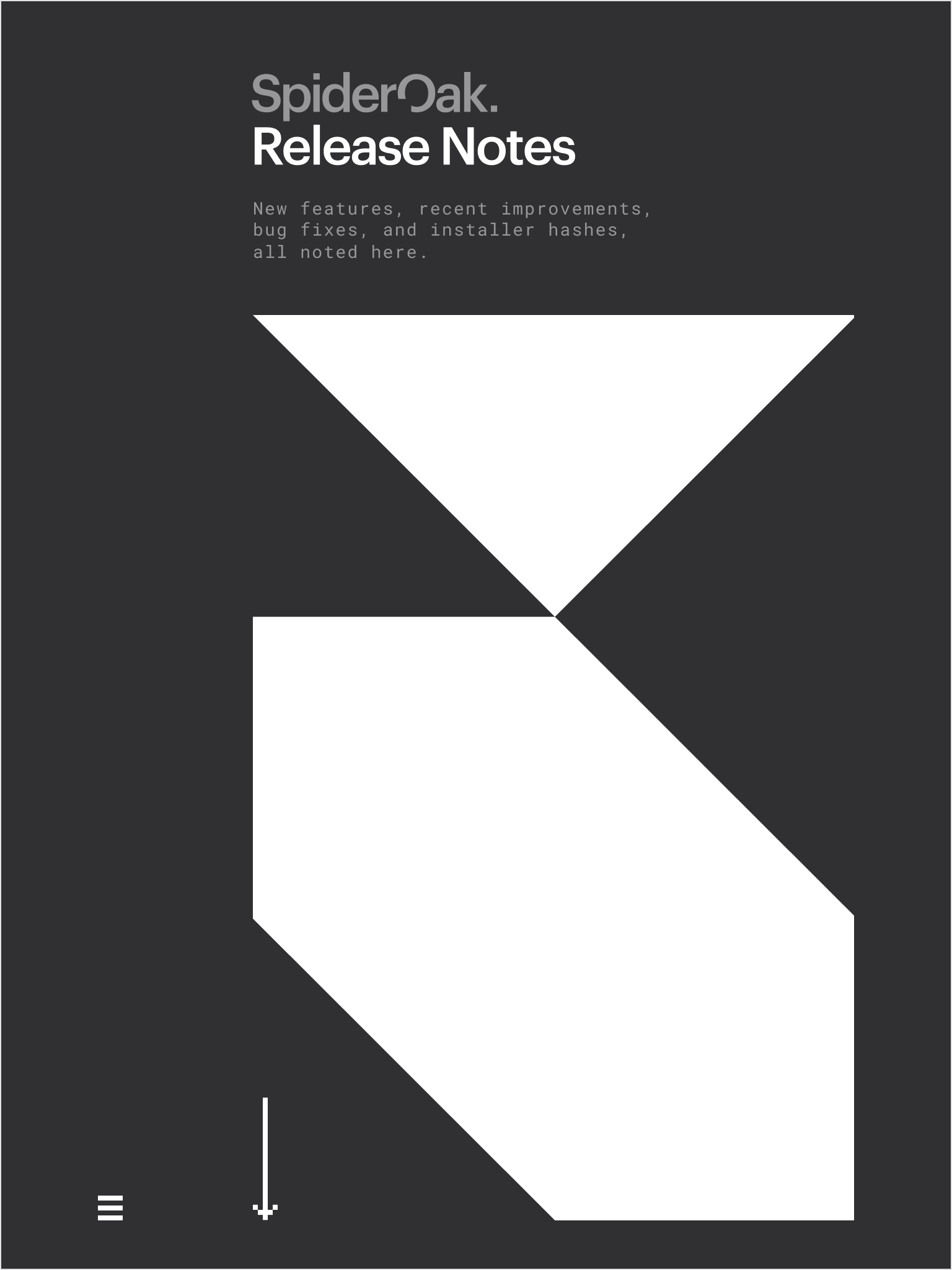
Alphabet
In need of a strong accessory headline font, a pixel-based character set seemed the logical choice.
The strong square shapes complement the logo system in a way that Roboto Mono, even bold, could not, as illustrated in the Release Notes.
Creative Direction, Design
Products
Taking cues from Swiss Design, black and white photography served as effective at-a-glance communication for objectivity and clarity.
Creative Direction, Design
Downloads
With software updates constantly underway, SpiderOak needed a way to keep Release Notes and downloadable versions current.
The website concept anticipated a workflow using the Hugo static site generator and collaborative development between Marketing and DevOps to enable continuous updates.
Creative Direction, Design
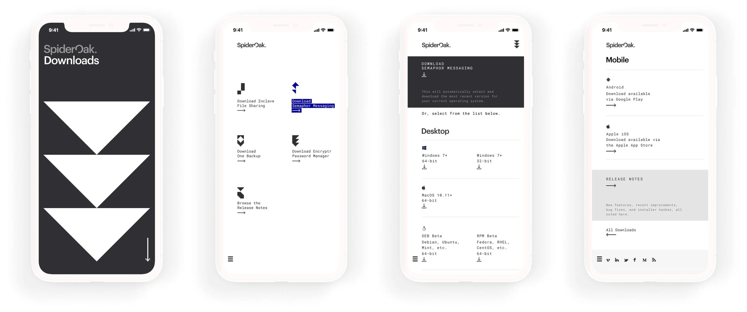
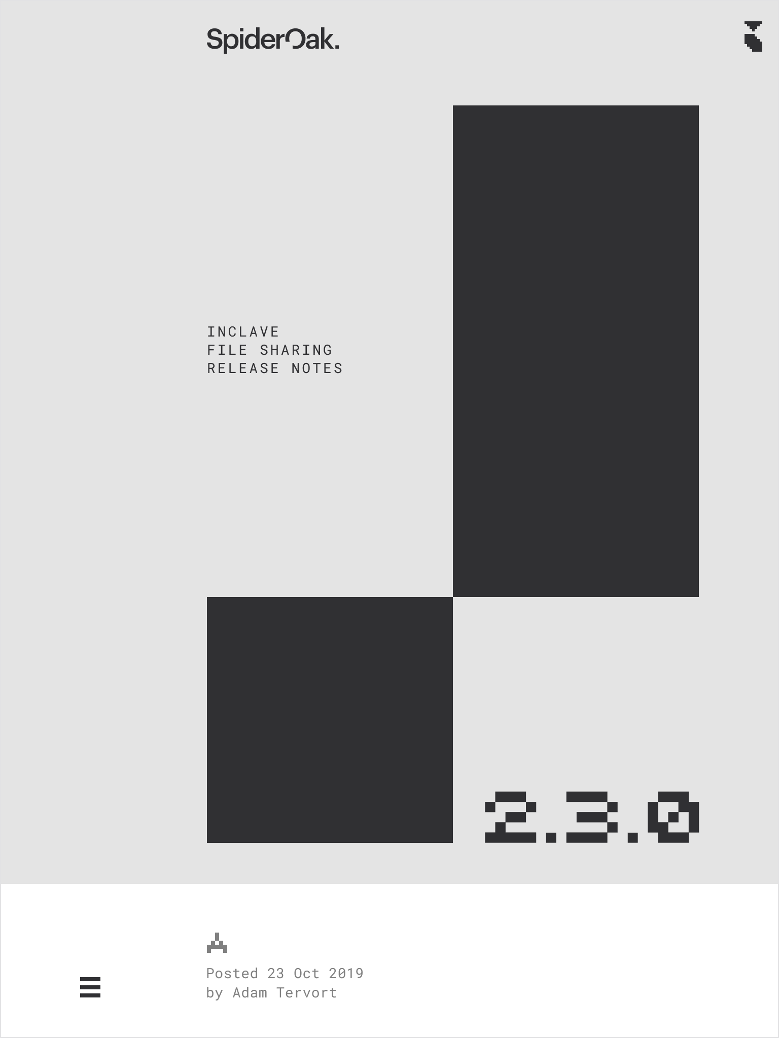
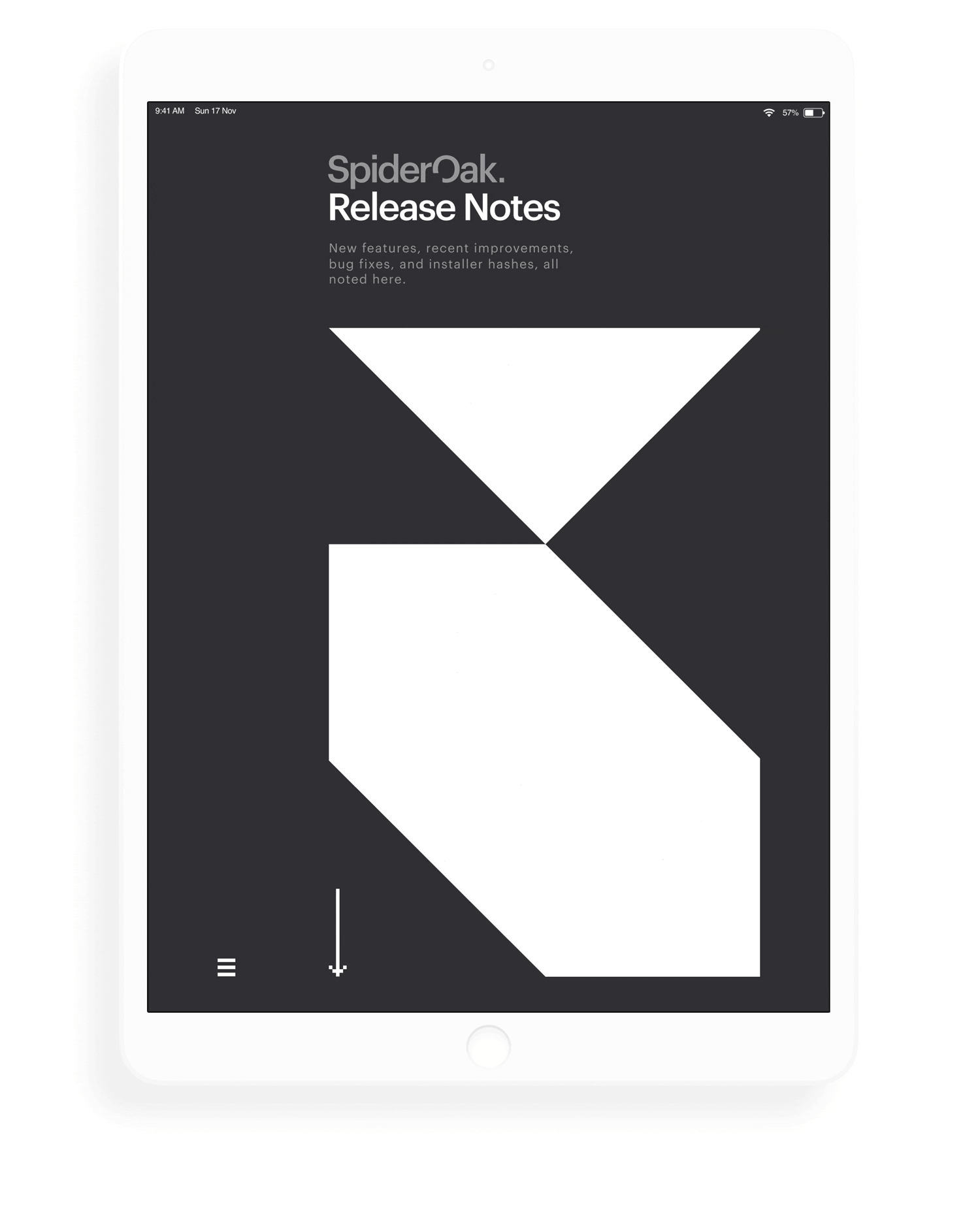
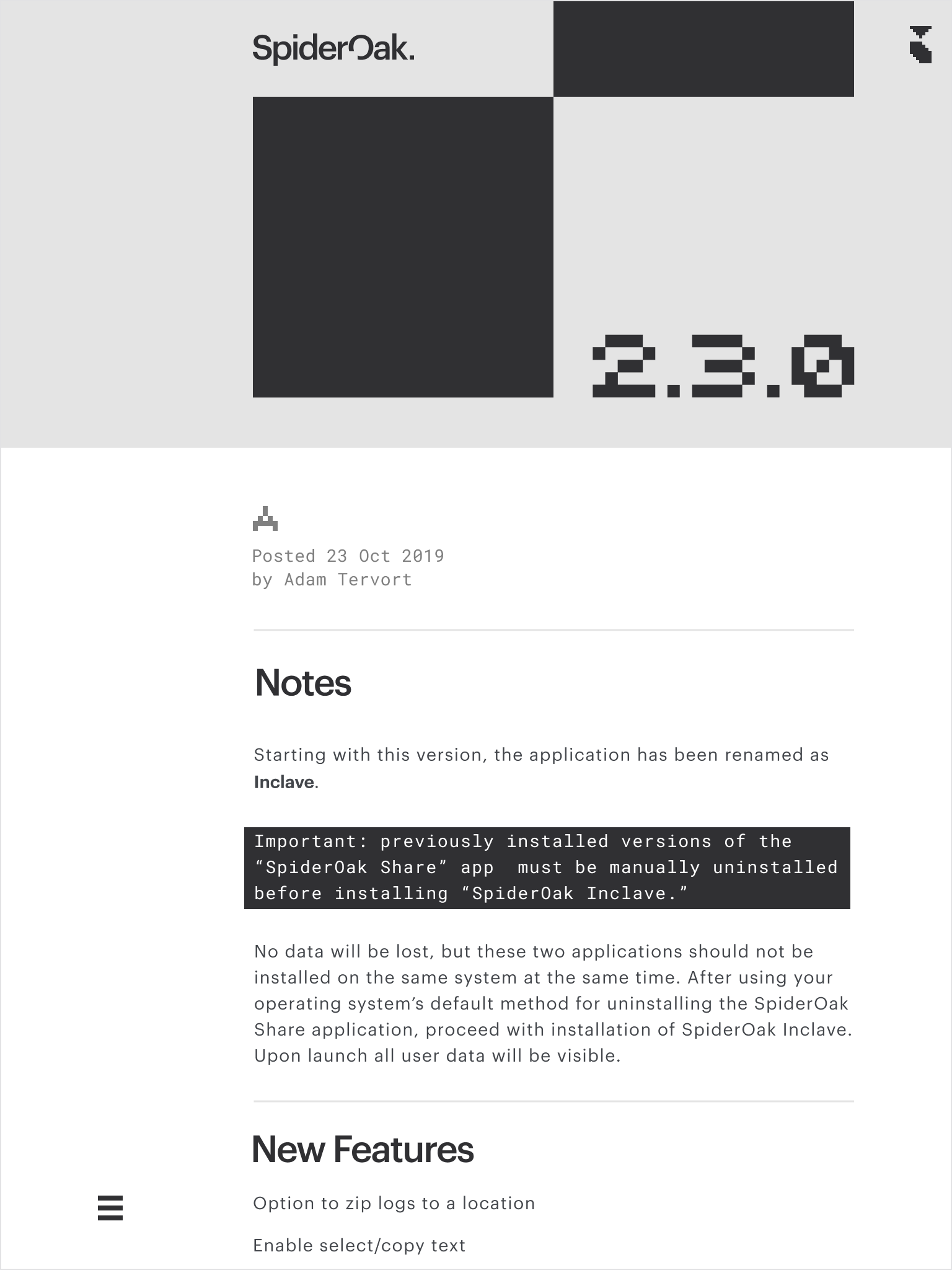
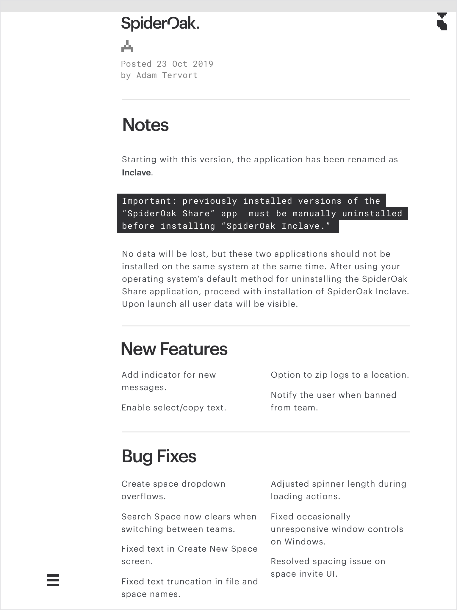
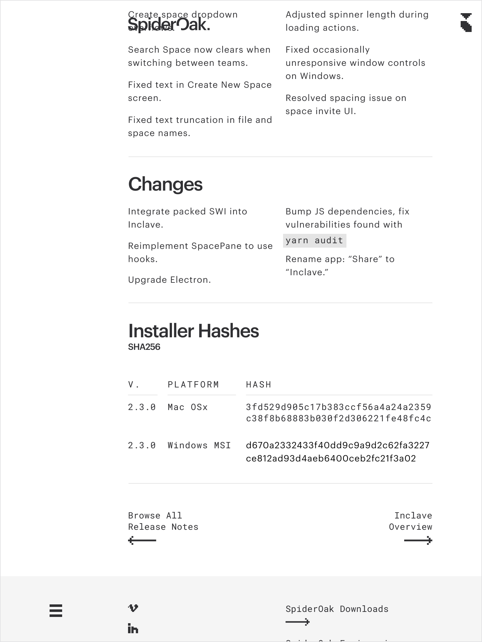
Release Notes
With software updates constantly underway, SpiderOak needed a way to keep Release Notes and downloadable versions current.
The website concept anticipated a workflow using the Hugo static site generator and collaborative development between Marketing and DevOps to enable continuous updates.
Creative Direction, Design

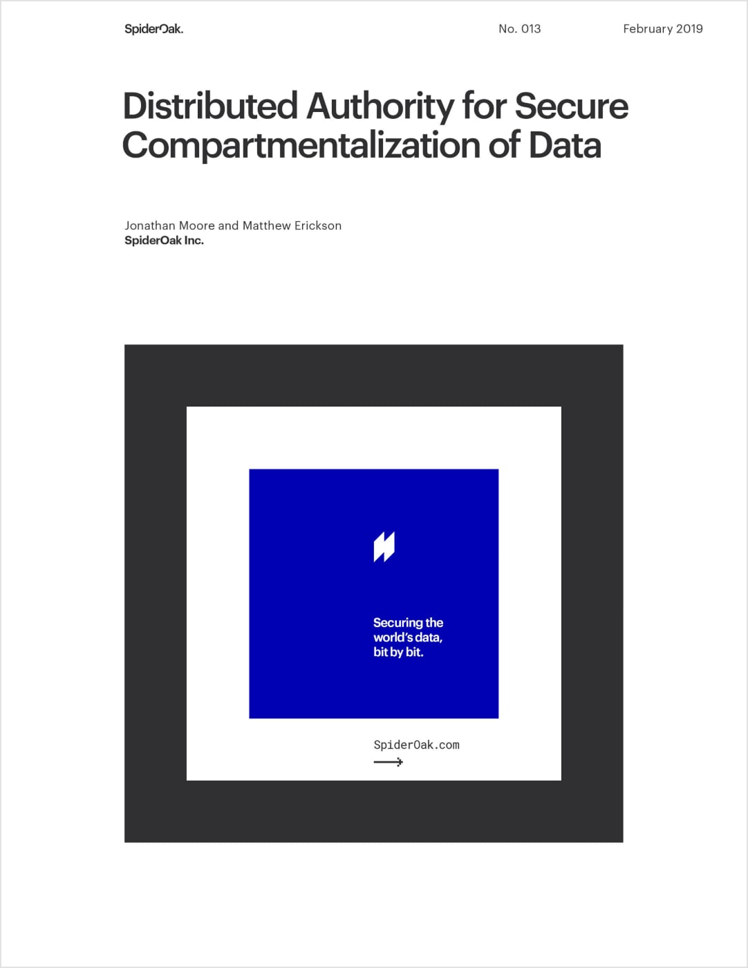
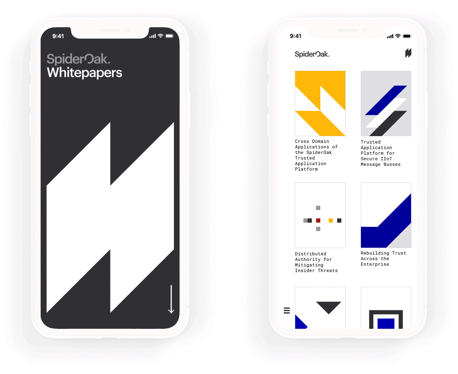
Whitepapers
Blockchain is no easy concept to explain, so SpiderOak’s marketing materials needed to be as digestible as possible.
Strongly gridded layouts, inspired by the International Typographic Style, helped to break content up into manageable blocks, improving comprehension, building trust, and providing yet another visual metaphor for the underlying blockchain technology.
Creative Direction, Design
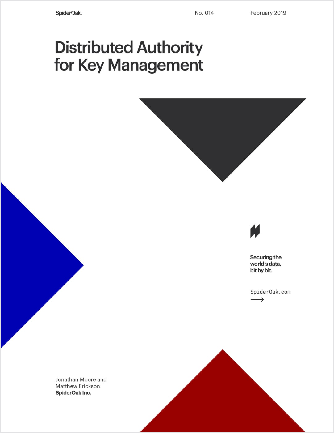
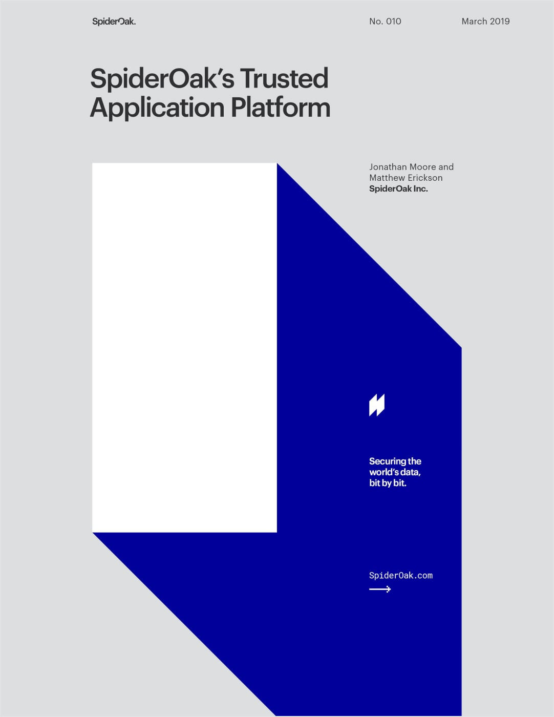
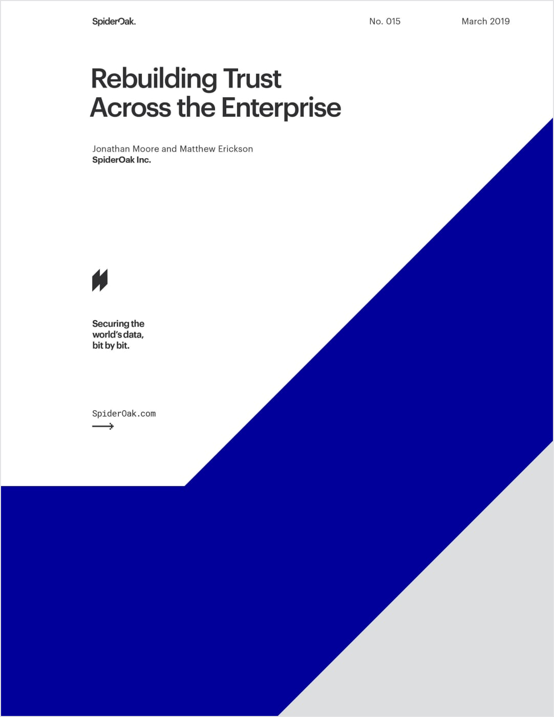
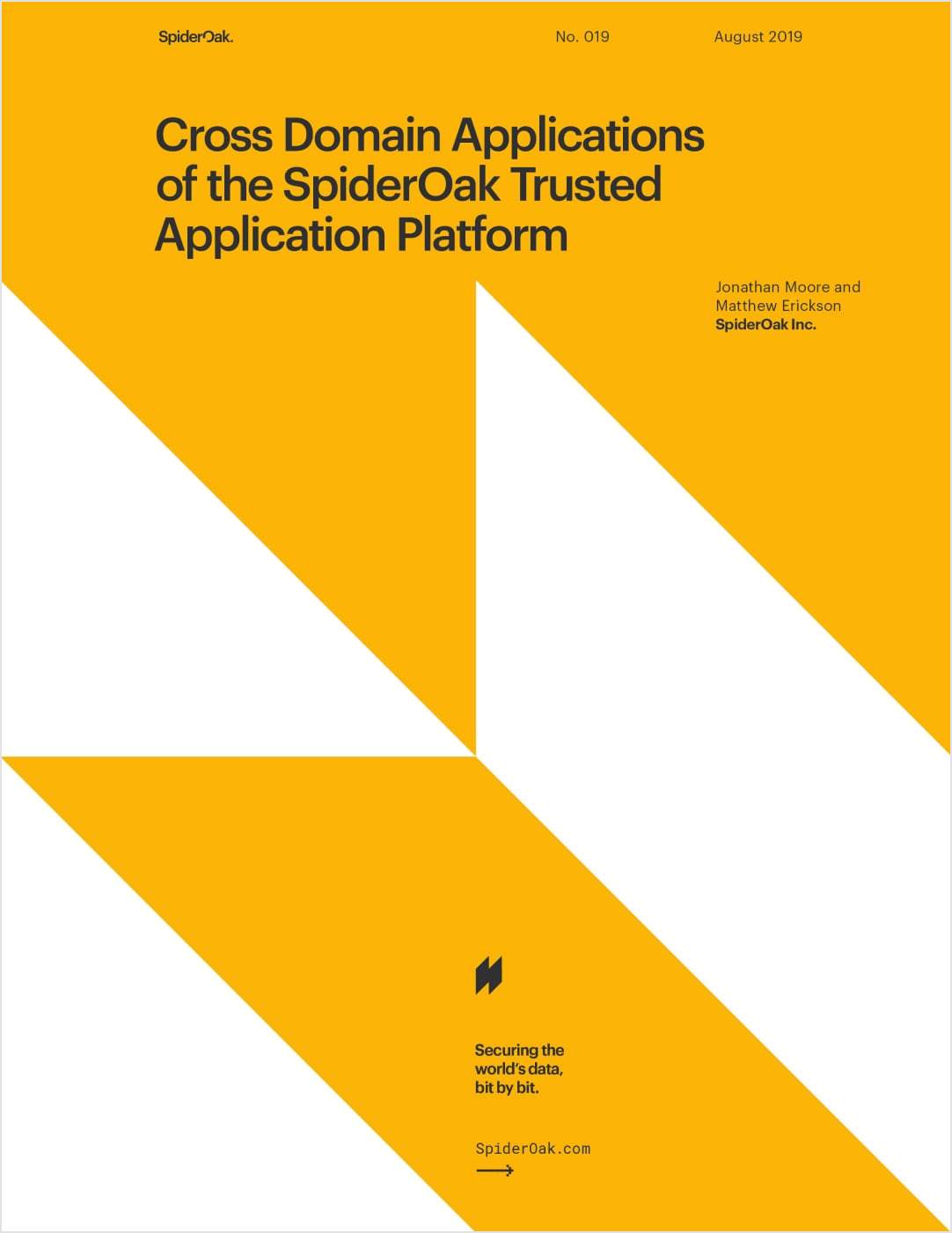
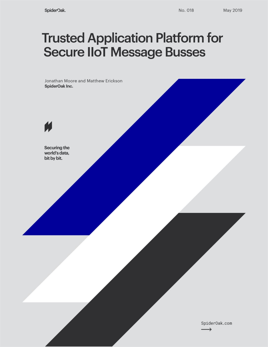
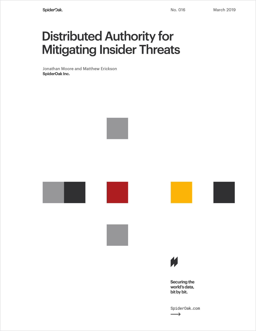
Effective grid systems also enabled consistent and flexible templates across print and web alike. Whitepaper covers were inspired by the timeless posters of Swiss Design.