


Bartini
a martini bar
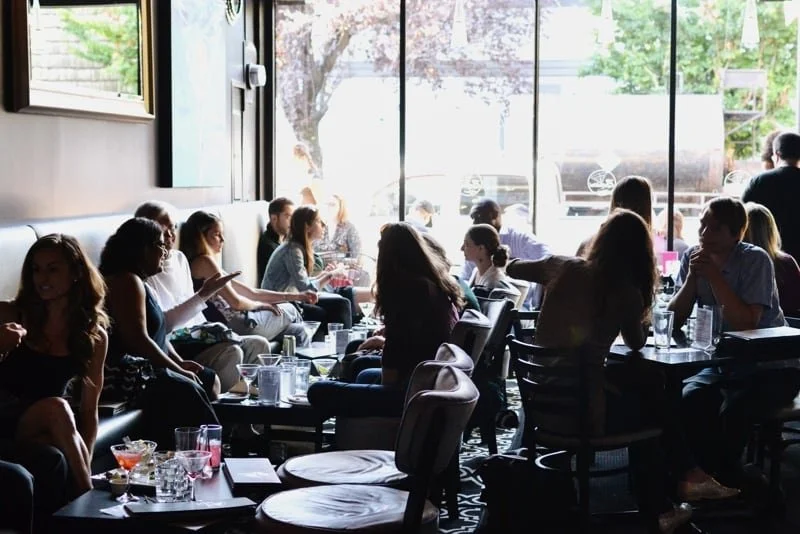
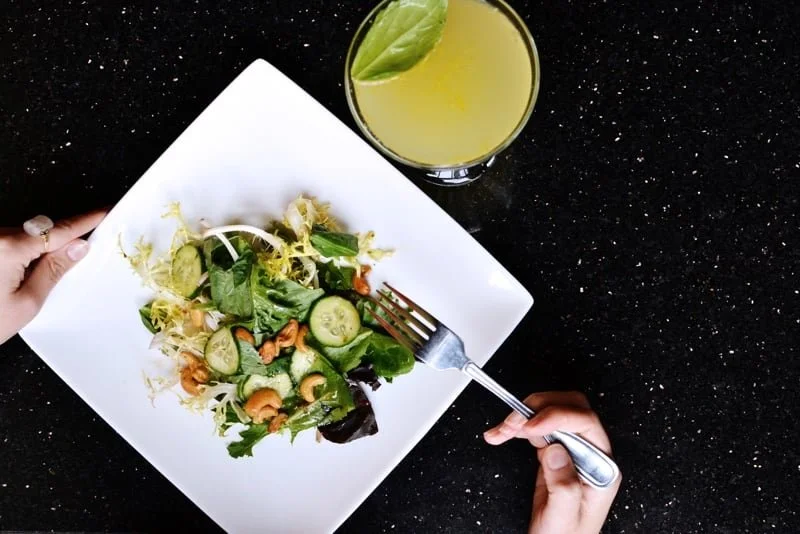
A bar known for its dozens of large, colorful cocktails and never-ending happy hour, Bartini appealed to a younger audience. Its marketing assets needed to be updated to reflect a more youthful energy.
2017
Rebranding
#colormetini
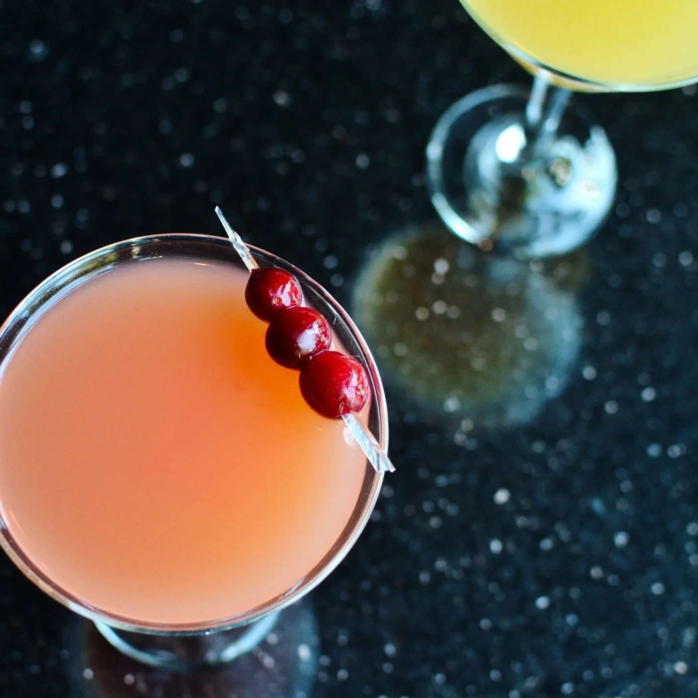
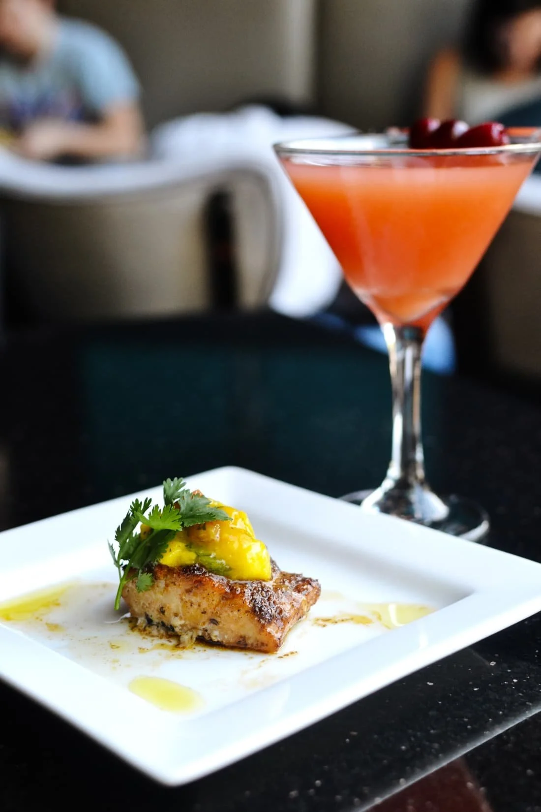
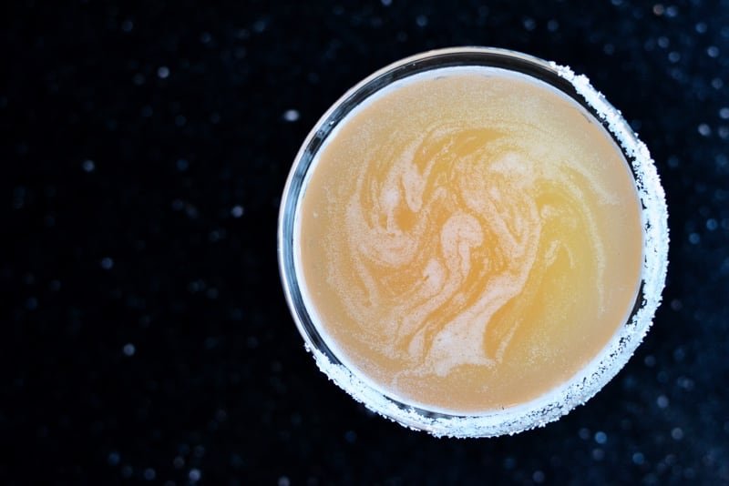
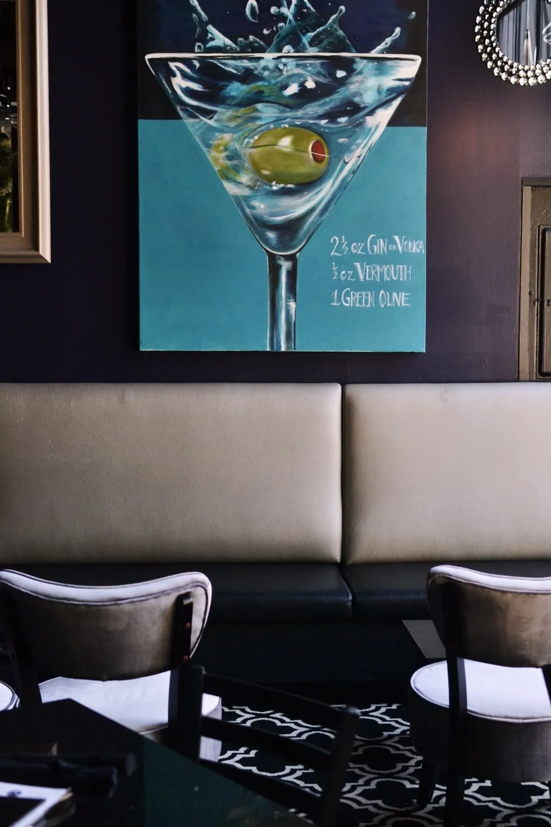
Boasting more than 100 specialty martini variations, Bartini wasn’t about the classic dry martini in a coupe.
These martinis were big, bold, and bursting with whatever flavors one could think of. The Oatmeal Cookie Martini and the Snickertini were especially popular.
Those who had been had their favorite already, making it an easy suggestion for a place to go again.
#colormetini
Brand Story
Creative Direction, Copywriting
Background
Bartini first opened its doors in late 2003 in Portland’s Northwest District, just off the bustling NW 21st Avenue.
Known for its colorful drinks and endless happy hour, it quickly became a go-to for students, young professionals, and bar-hoppers in the neighborhood.
tagline
icons
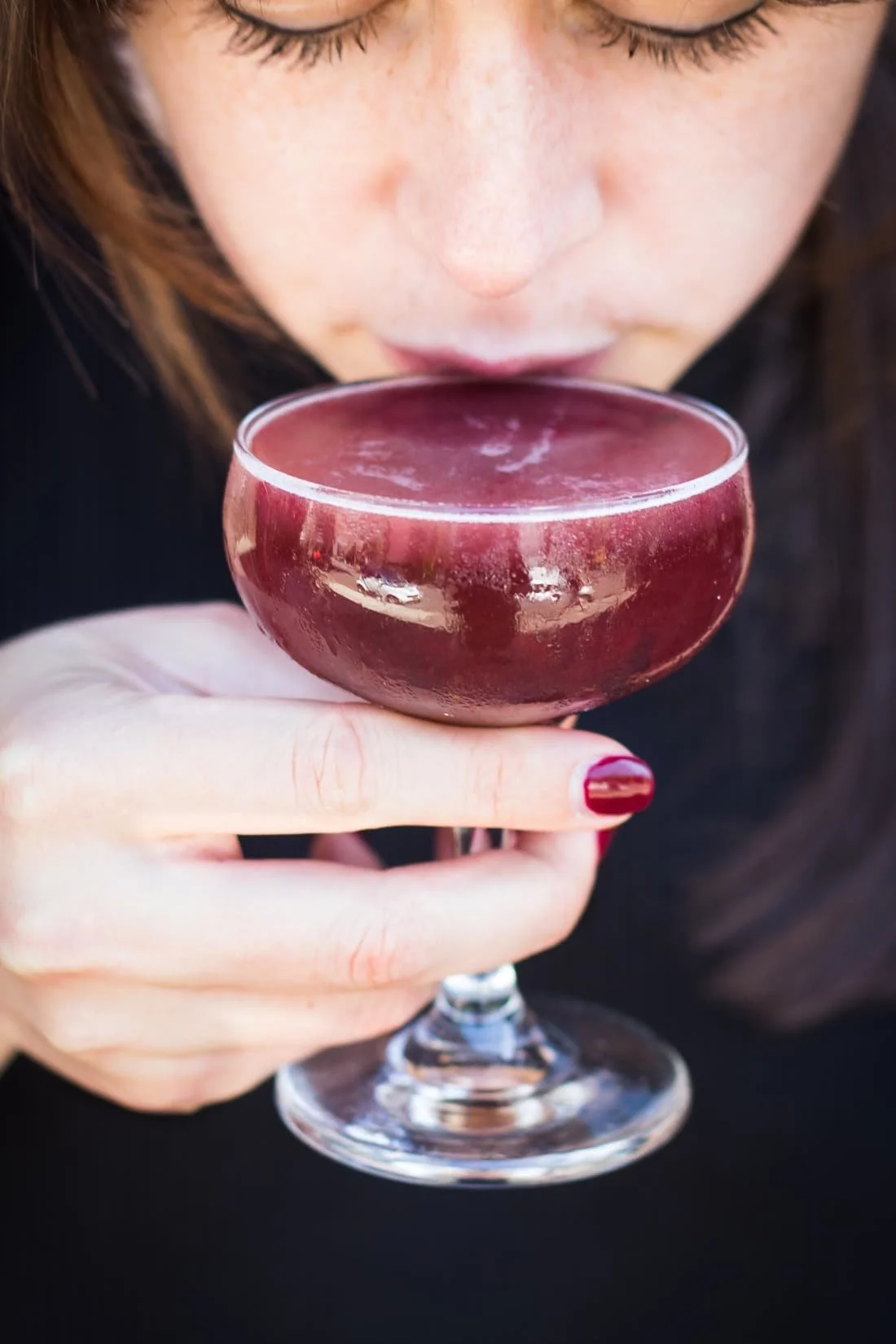
Bartini’s martini glasses were more like goblets, full of vibrant colors and a virtual buffet of ingredients and add-ins.
The signature bedecked martini glasses inspired the icon set: the countless flavorful martinis, a drink for every palette.
Creative Direction, Design

menus

Bartini’s dated menus needed more than just an update — they needed to match the youthful energy of the bar itself.
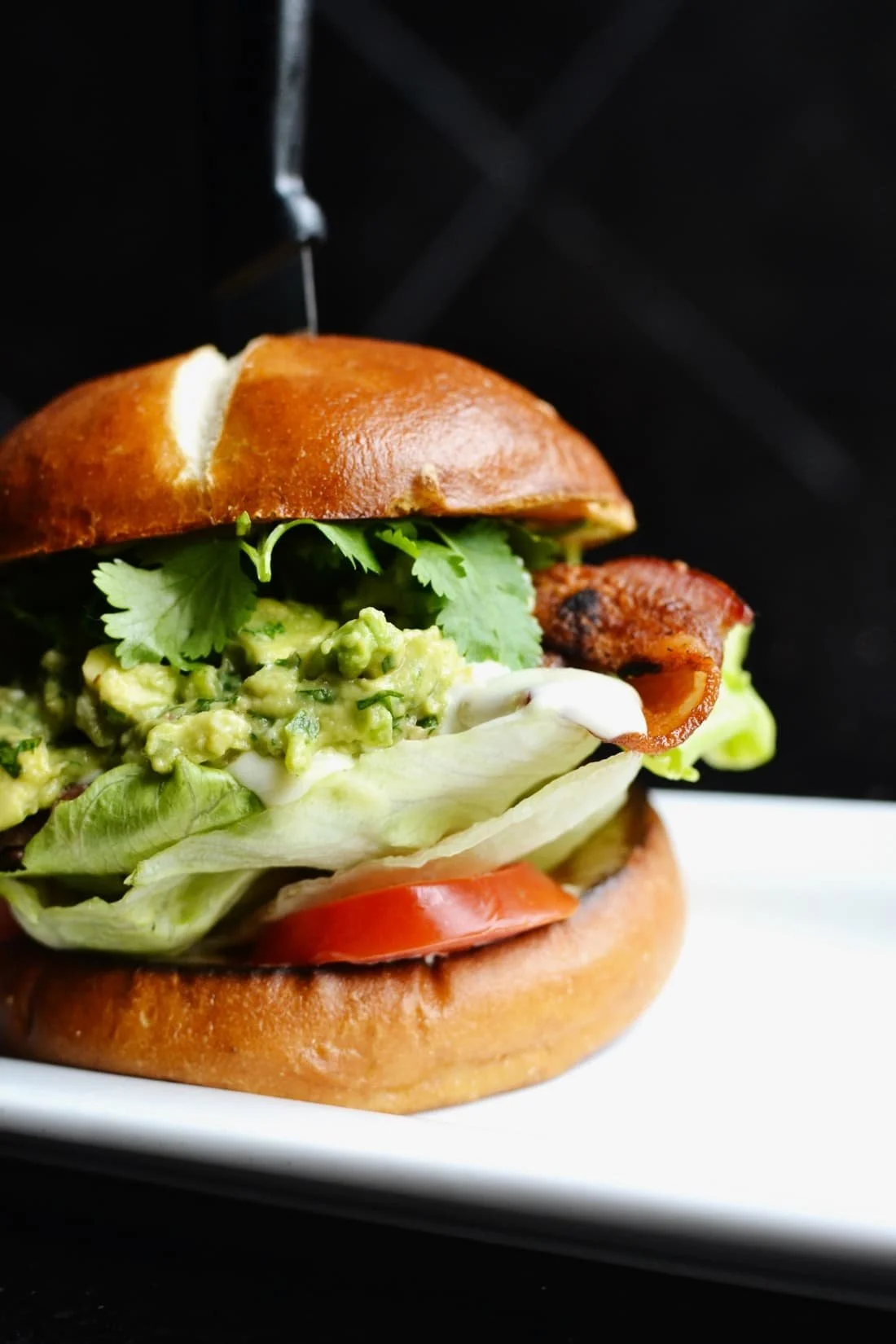
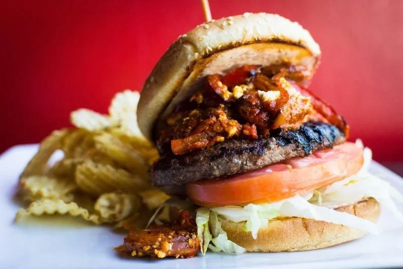
Guests weren’t there for fine dining; they were hopping between spots, snapping photos, and enjoying Bartini’s candy-colored cocktails.

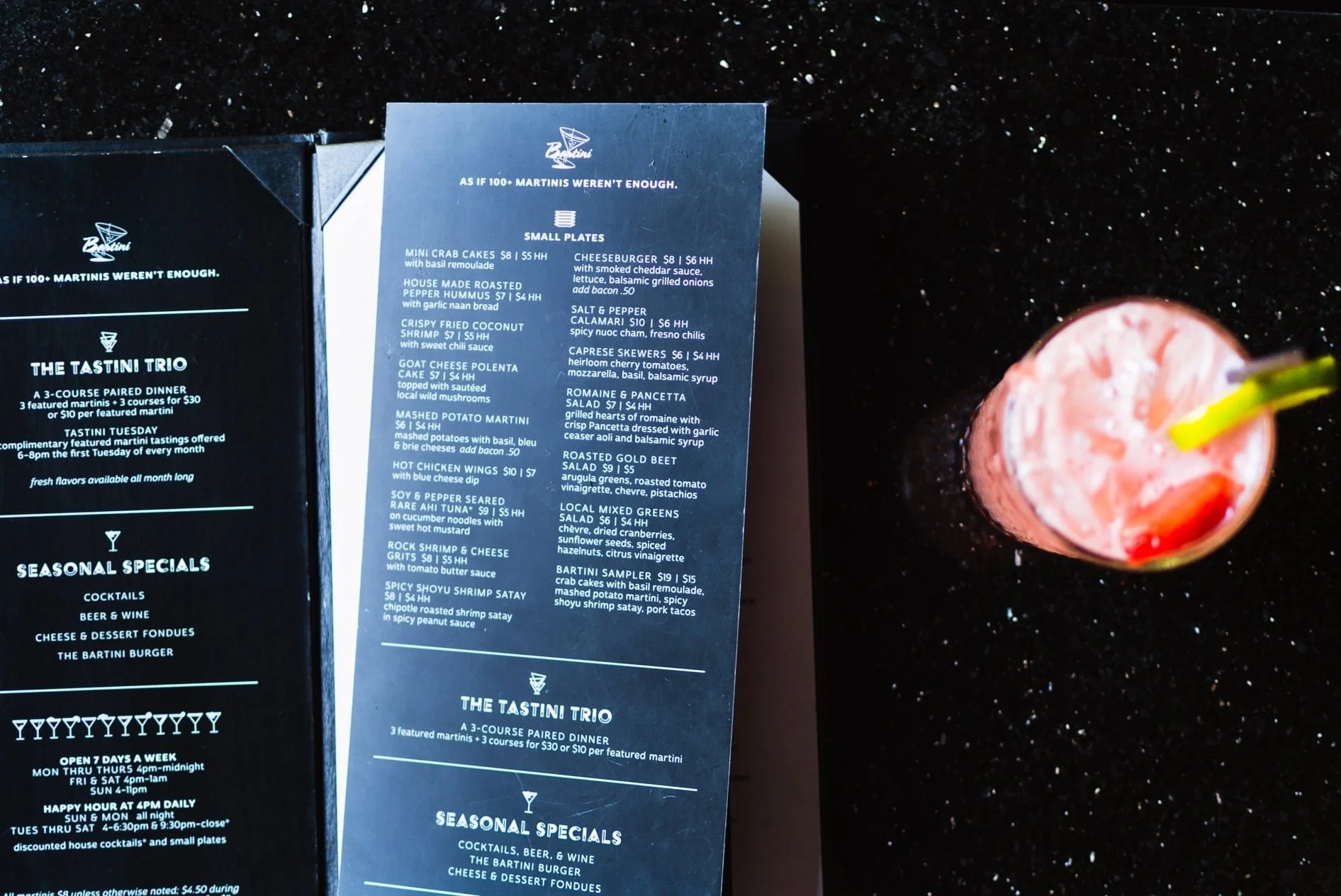
Before
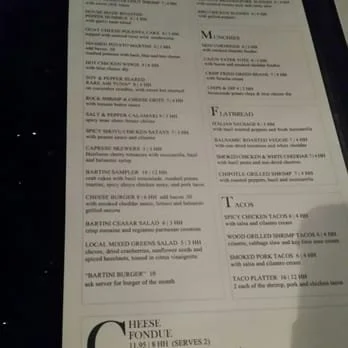
Images from Yelp
After
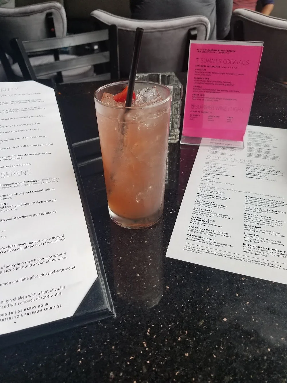
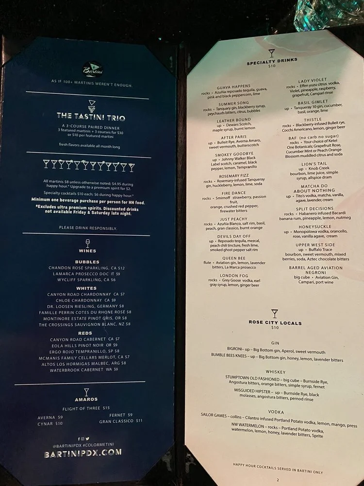
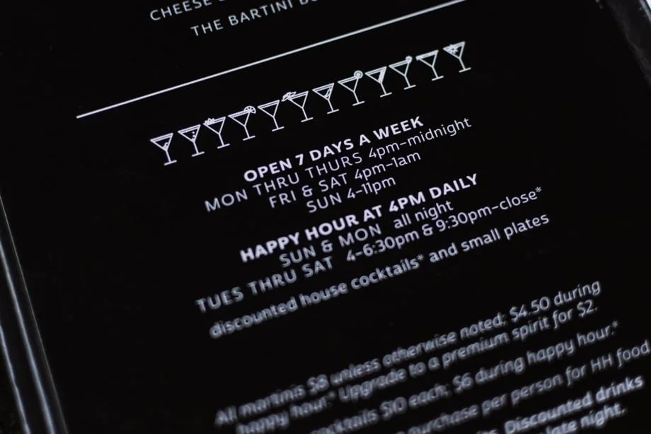
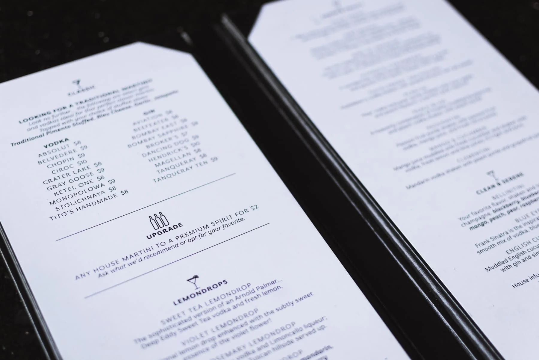
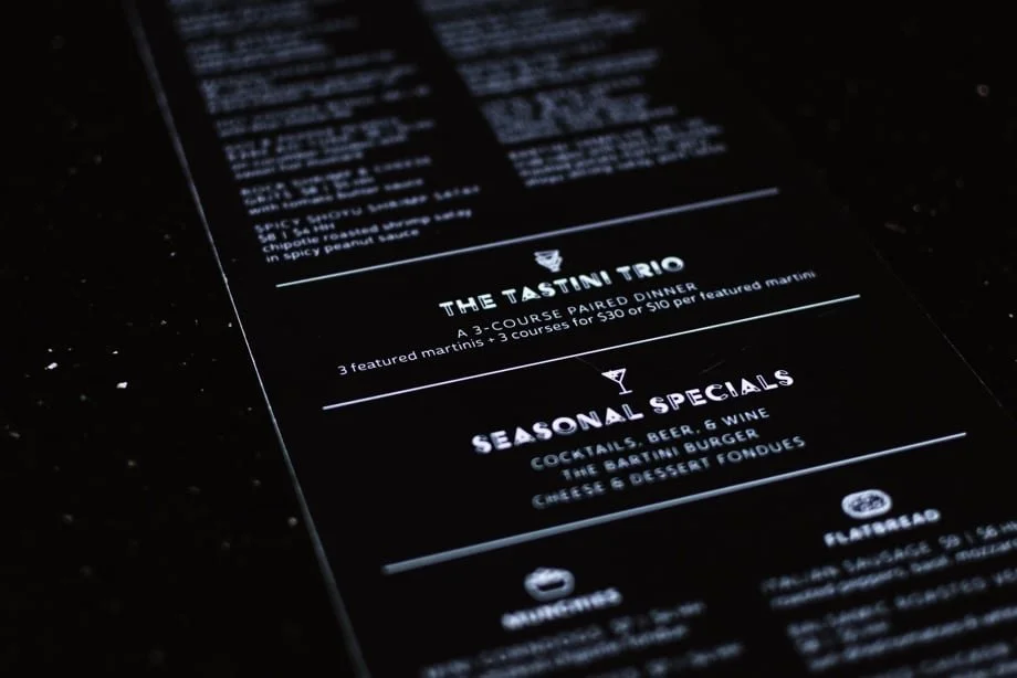
With five pages filled with drink options, these menu books were always on the table. Their thick hard covers kept the pages relatively clean, the front page advertising Bartini's signature specials.
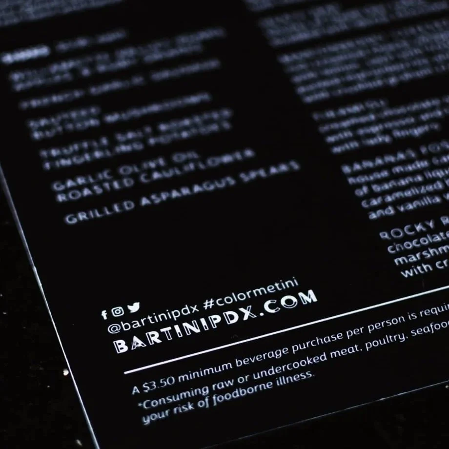
Printed front and back, the waterproof black food menus could be easily wiped off and shared between guests.
The black and white menus focused the attention on the vibrant drinks likely already on the table.

Creative Direction, Design, Photography
Images from Yelp

Website
Before
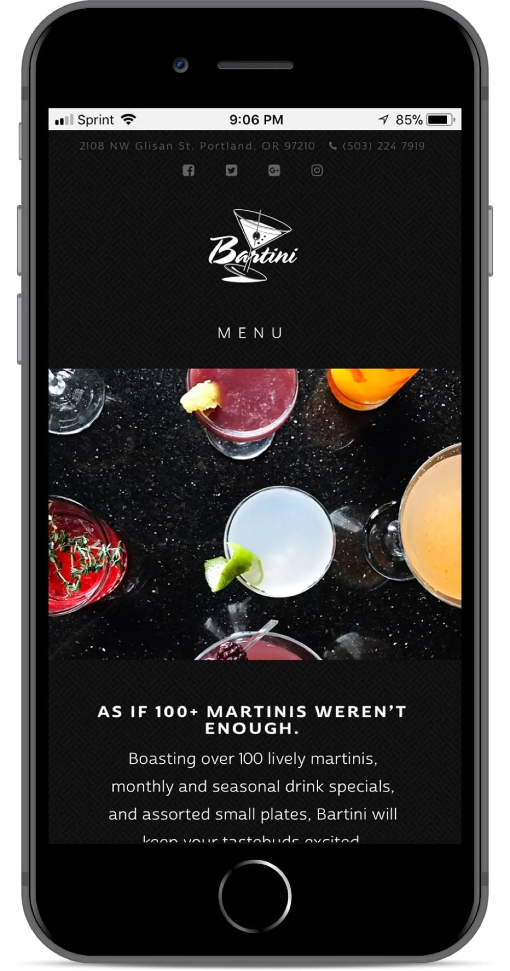
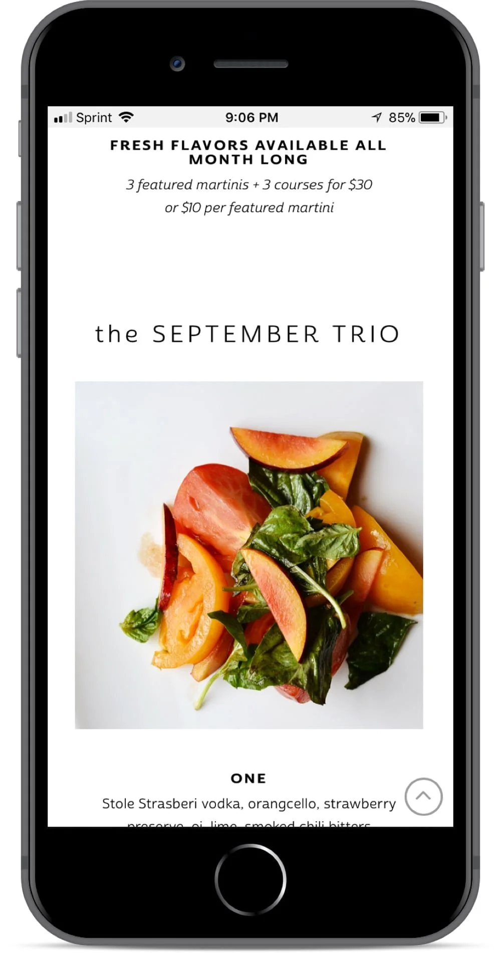
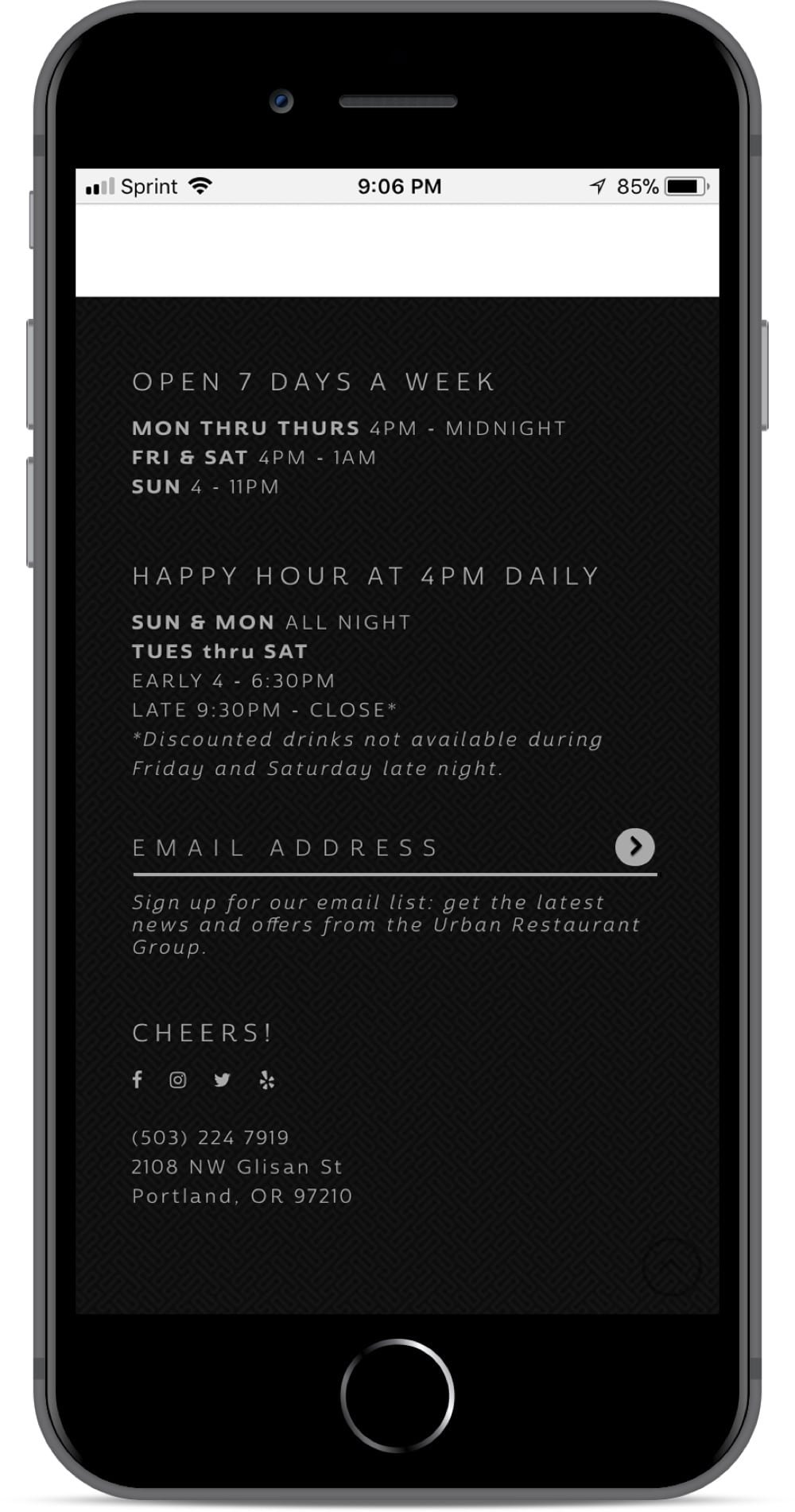
The archaic website was rarely updated and needed to pair with the newly updated menus now on all the tables. The physical place needed to be properly reflected online to attract potential new clientele, and thus, the website needed a revamp.
After
Creative Direction, Design, Photography, Web Development, Copywriting
Given its younger demographics, it was about time the website was optimized with mobile in mind.
Gallery
Art Direction, Photography


after
Taking cues from Swiss Design, black and white photography served as effective at-a-glance communication for objectivity and clarity.
Creative Direction, Design, Photography, Web Development, Copywriting
icons
Taking cues from Swiss Design, black and white photography served as effective at-a-glance communication for objectivity and clarity.
Creative Direction, Design
icons
Taking cues from Swiss Design, black and white photography served as effective at-a-glance communication for objectivity and clarity.
Creative Direction, Design
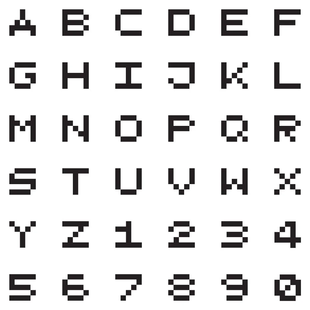
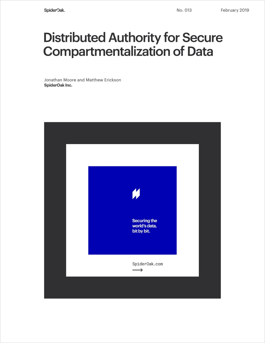
Alphabet
In need of a strong accessory headline font, a pixel-based character set seemed the logical choice.
The strong square shapes complement the logo system in a way that Roboto Mono, even bold, could not, as illustrated in the Release Notes.
Creative Direction, Design
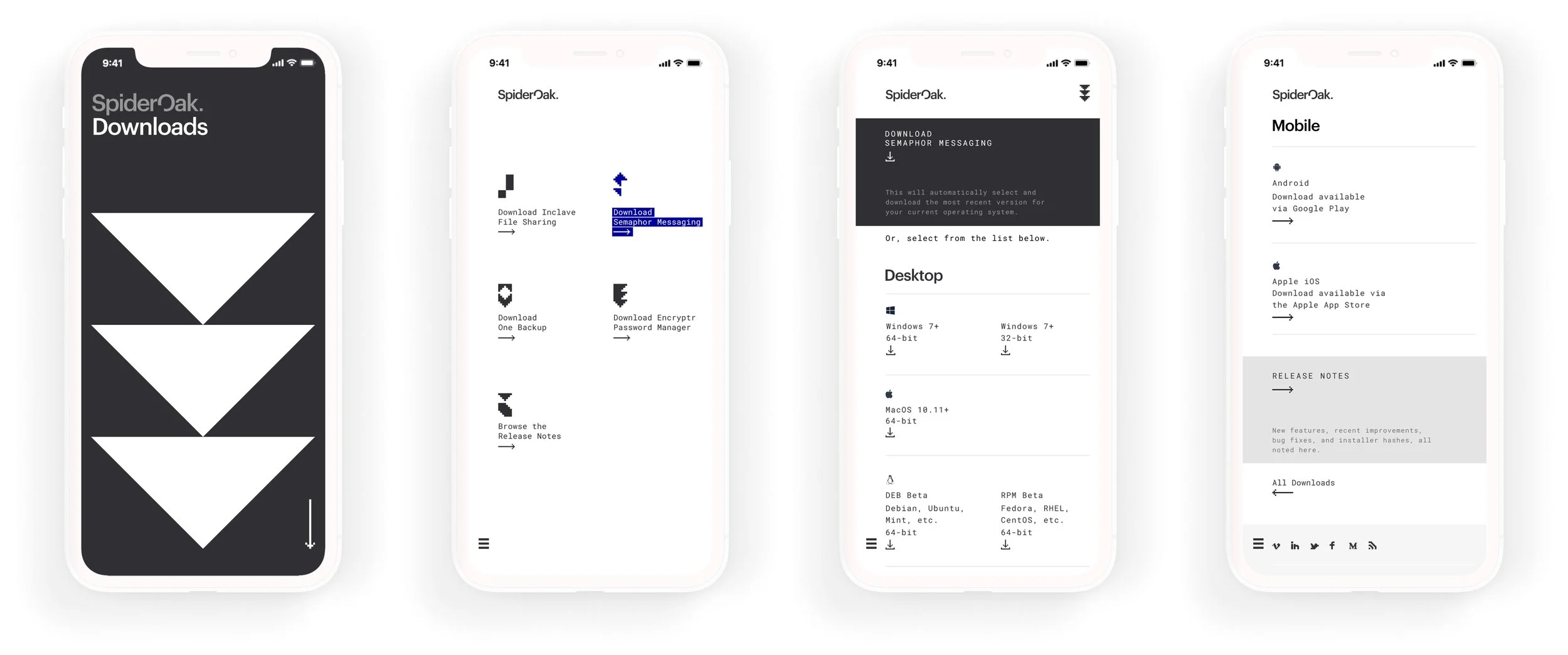
Downloads
With software updates constantly underway, SpiderOak needed a way to keep Release Notes and downloadable versions current.
The website concept anticipated a workflow using the Hugo static site generator and collaborative development between Marketing and DevOps to enable continuous updates.
Creative Direction, Design
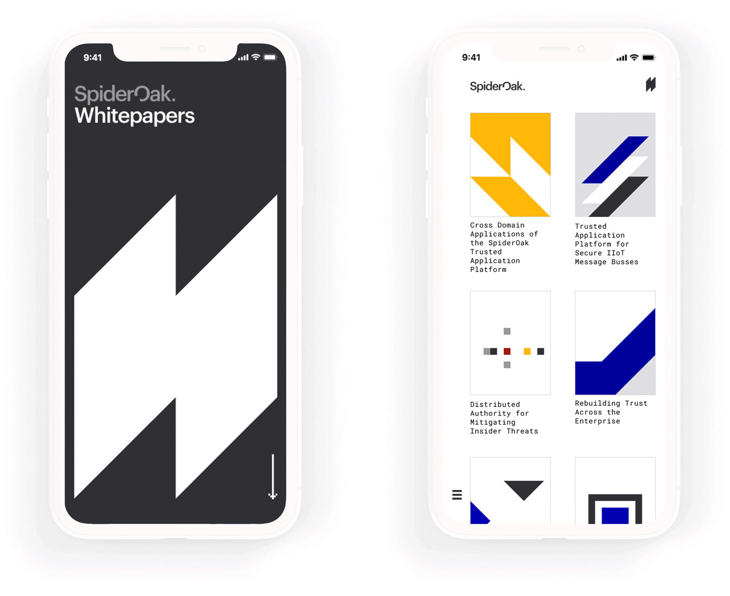
Whitepapers
Blockchain is no easy concept to explain, so SpiderOak’s marketing materials needed to be as digestible as possible.
Strongly gridded layouts, inspired by the International Typographic Style, helped to break content up into manageable blocks, improving comprehension, building trust, and providing yet another visual metaphor for the underlying blockchain technology.
Creative Direction, Design
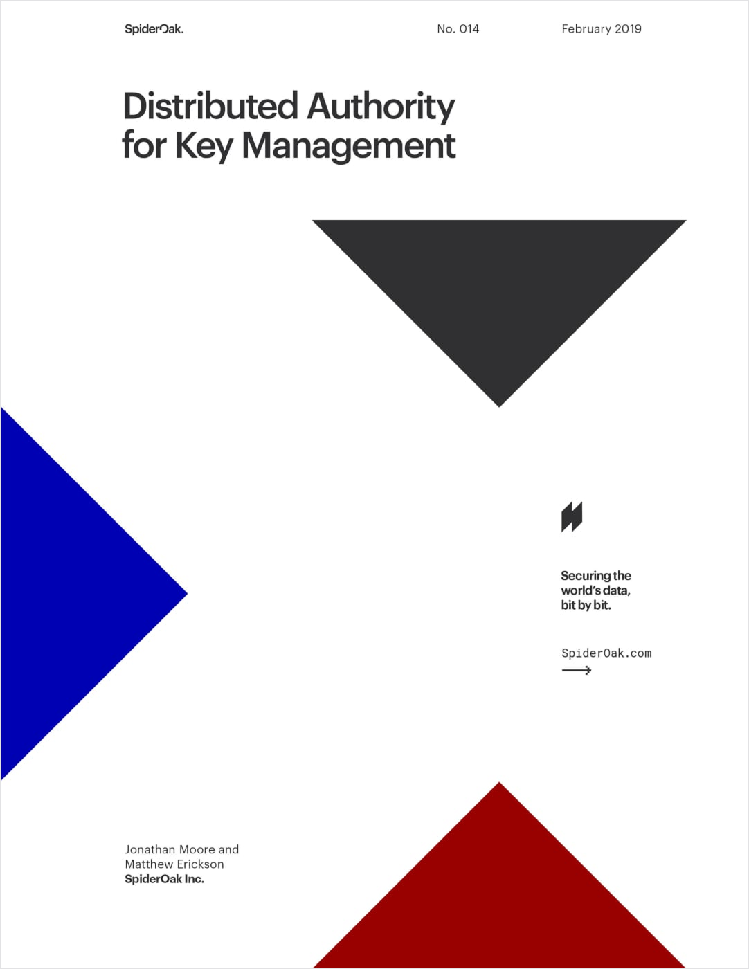
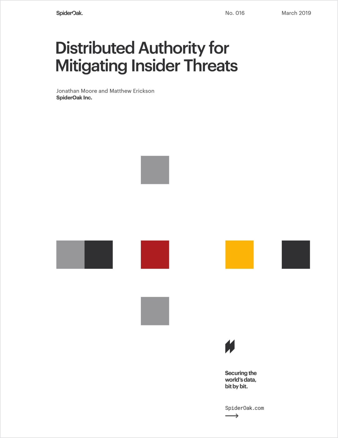
Effective grid systems also enabled consistent and flexible templates across print and web alike. Whitepaper covers were inspired by the timeless posters of Swiss Design.