Carlita’s
tacos, tequila, and whiskey
As an entirely new concept, I was invited to build the brand from the ground up. In need of a brand story around the name “Carlita’s,” I couldn’t help the rhymes that came to mind.
Brand STory
As I developed the brand story, rhymes surfaced naturally, shaping a playful tale around a fictional heroine, Carlita.
Carlita’s: Where the margaritas make everyone bonitas.
Señoritas prefer Carlita’s.
Muchachos like our tacos.
Carlita once knew a bad hombre or two. She would pull out her pistol and spin it ’round, and before yer knew it, he was flat on the ground.
All those señores knew she was mejores — the best in the land, the most courageous of heart and quickest of hand.
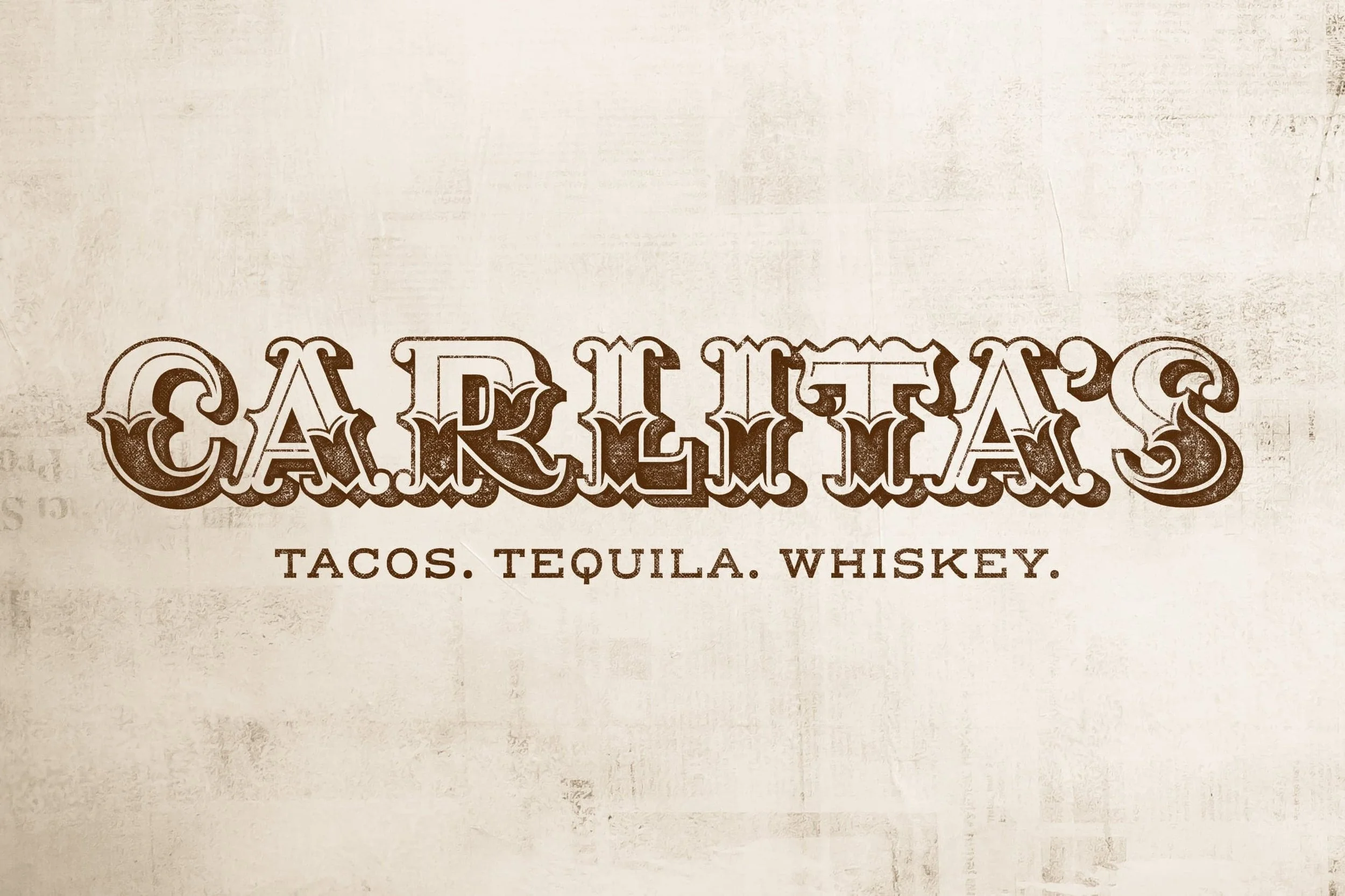
Logo Design
With no existing logo, I had the opportunity to design the visual identity from scratch.
When they said, 'Think Desperado, Wild West,' I seized the chance to create custom lettering.
In need of a secondary logo element, the pistol became a natural accessory in keeping with the brand story.
Art Direction, Design, Custom Lettering

Brand STory
As I developed the new brand story, rhymes surfaced naturally, shaping a playful tale around a fictional heroine, Carlita — “the best in the land, the most courageous of heart and quickest of hand.”
It started first with “Carlita’s: Where the margaritas make everyone bonitas” and was followed quickly by...
“Señoritas prefer Carlita’s.”
“Muchachos like our tacos.”
“Carlita once knew a bad hombre or two. She would pull out her pistol and spin it ’round, and before yer knew it, he was flat on the ground.”
“All those señores knew she was mejores — the best in the land, the most courageous of heart and quickest of hand.”
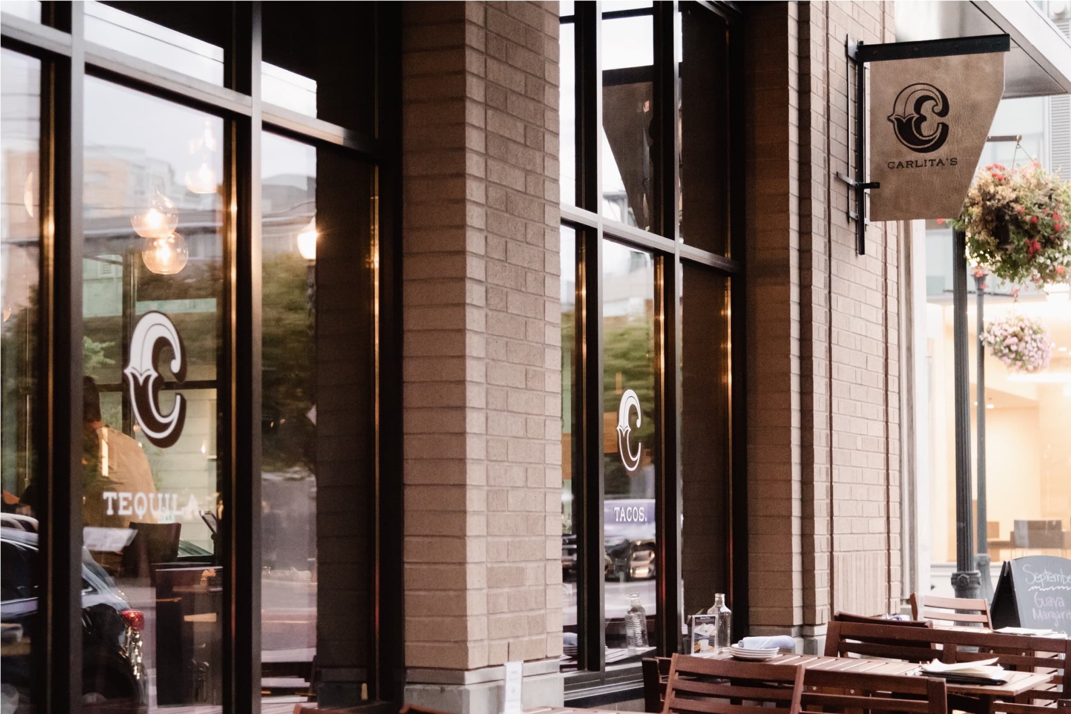
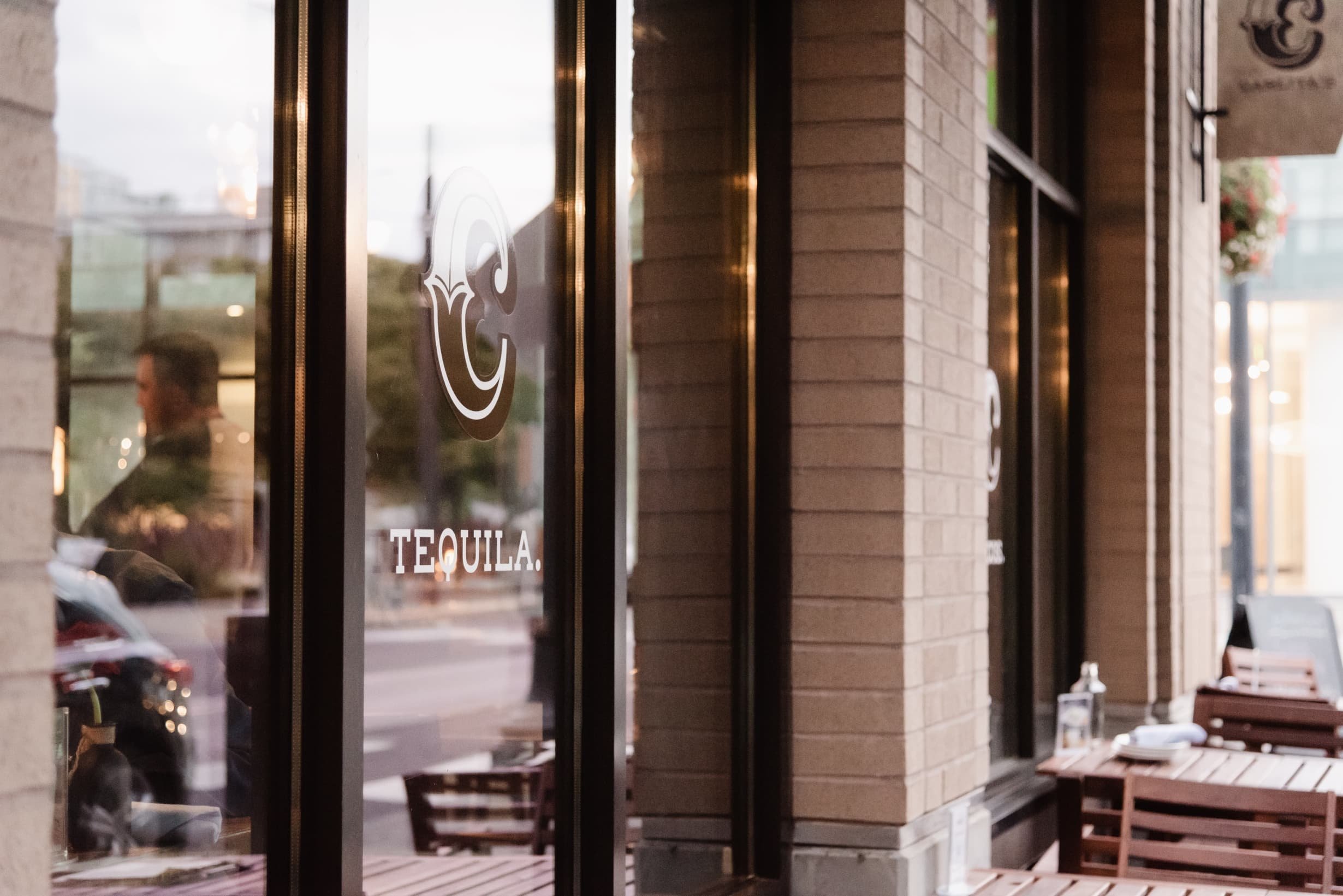
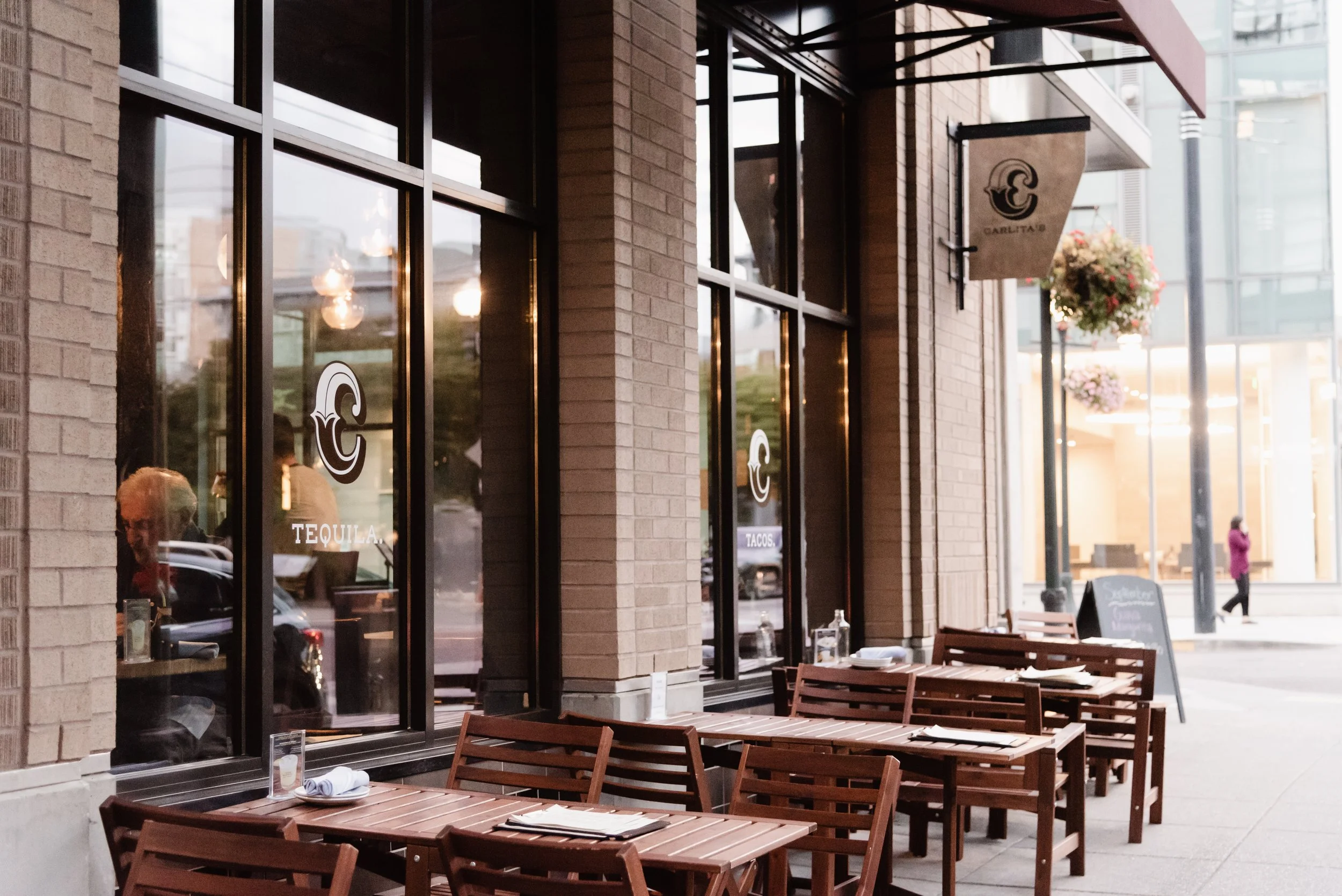
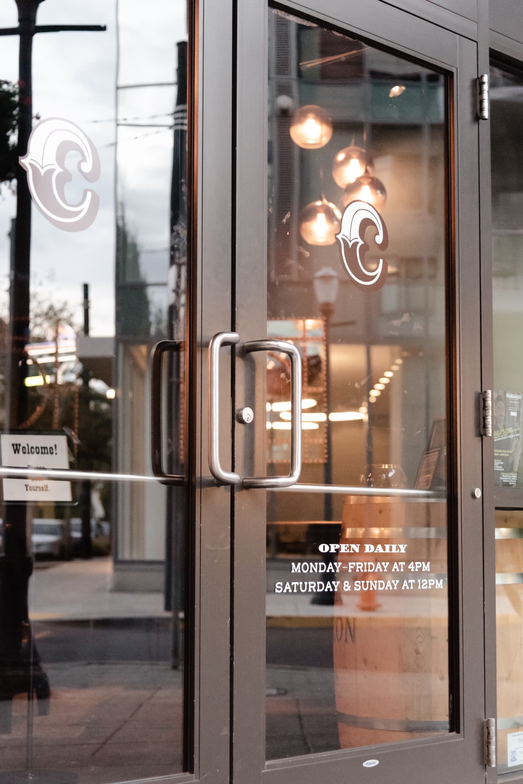
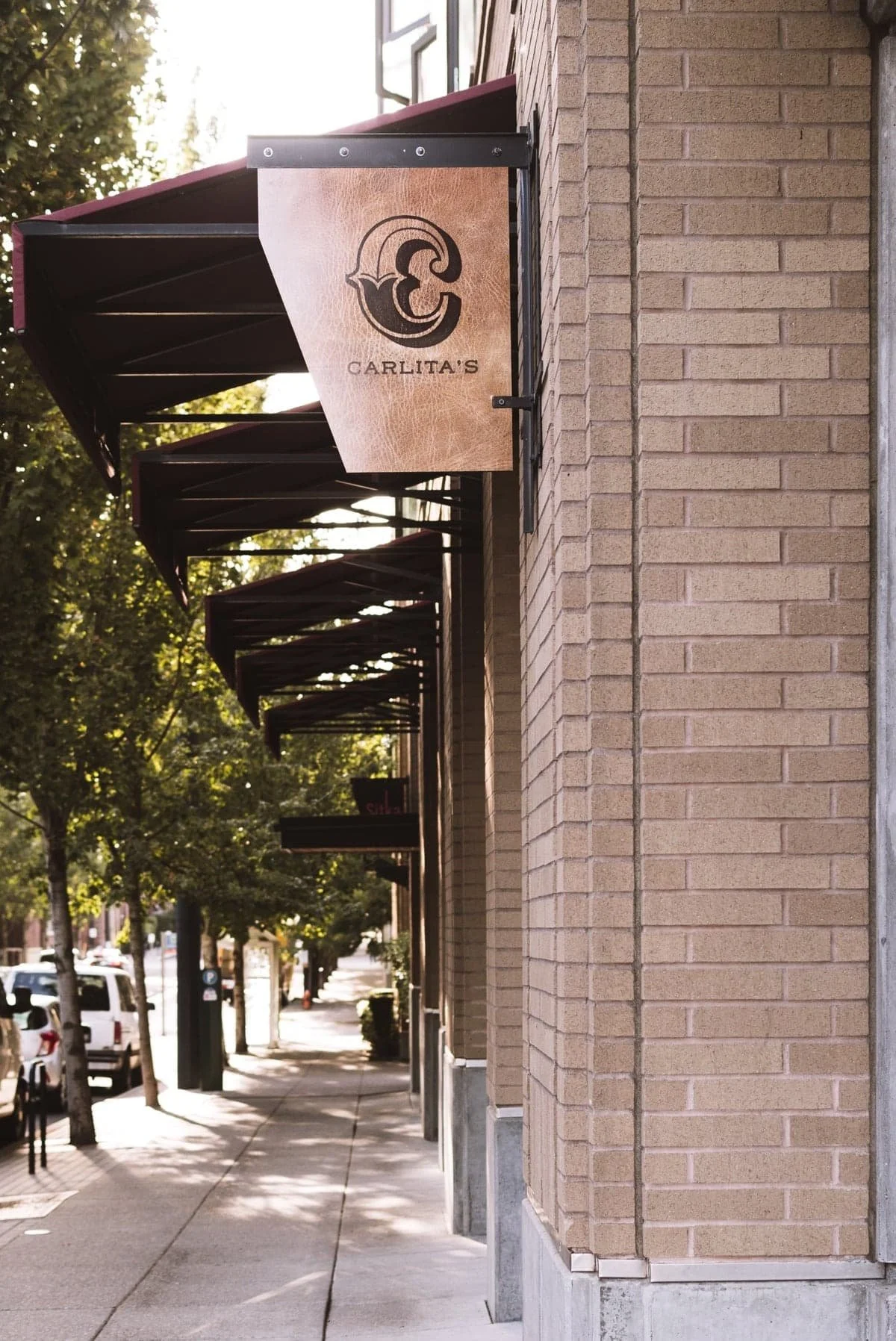
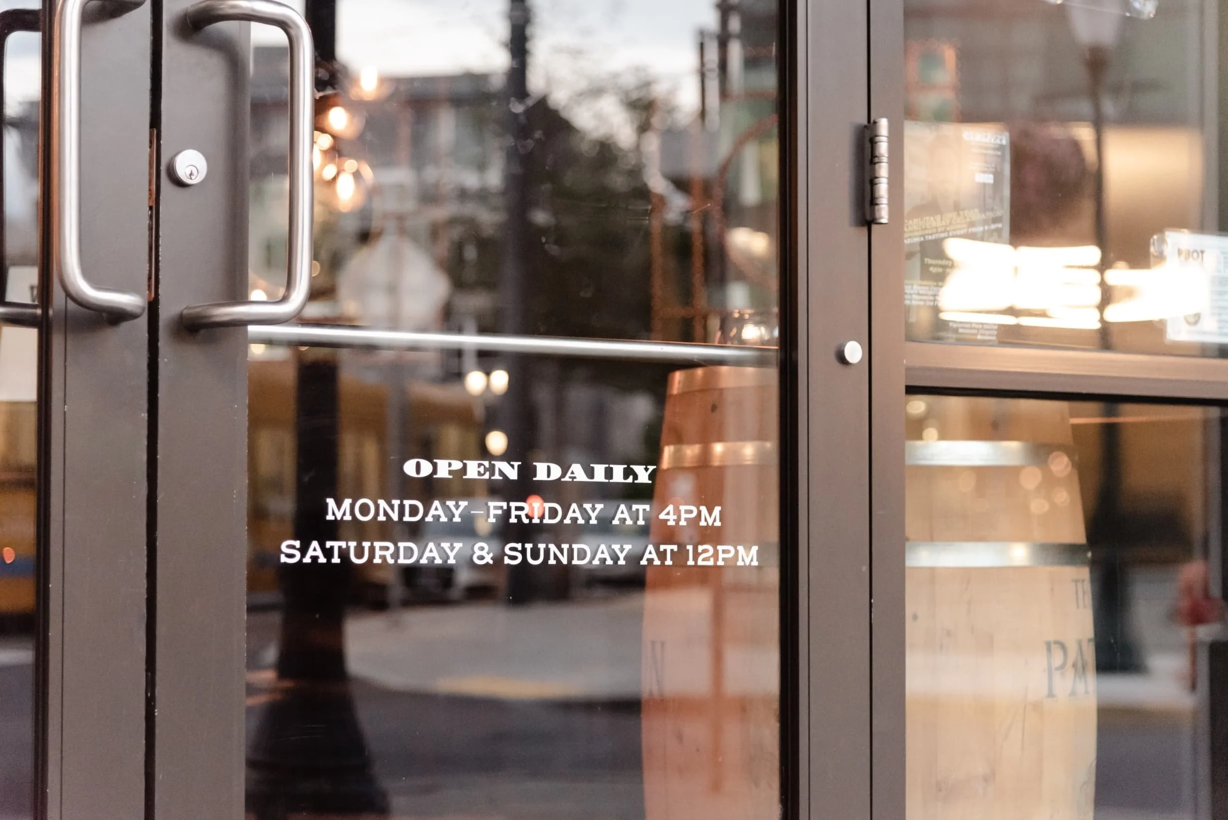
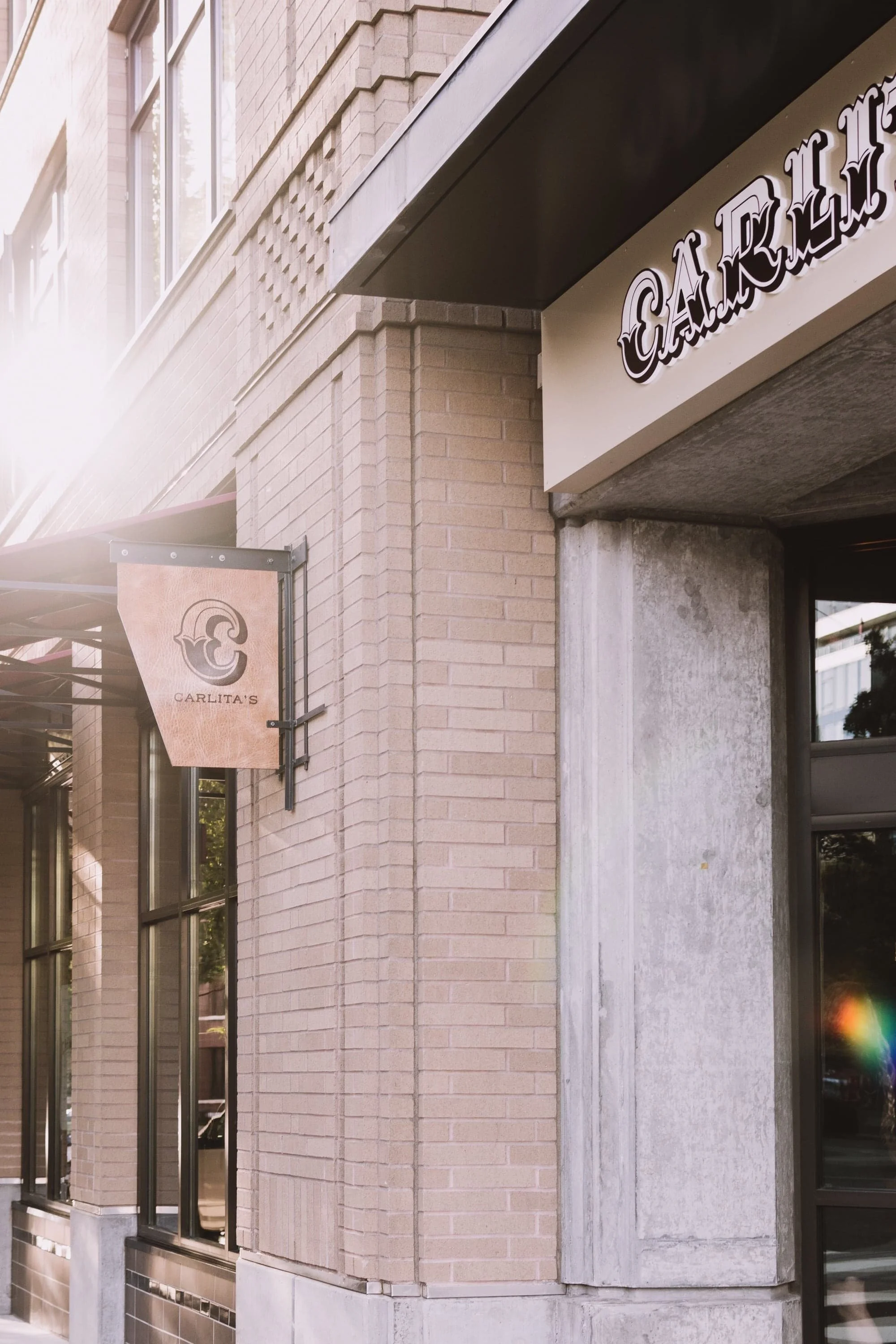
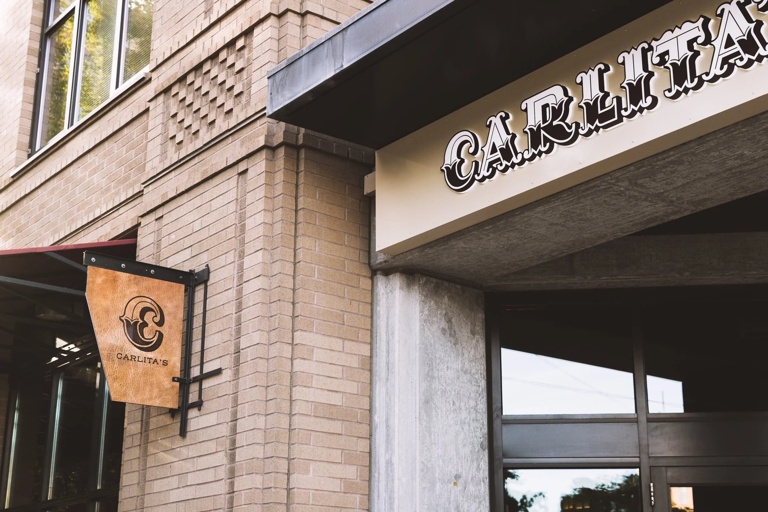
Signage
The initial “C” became emblematic on its own, making it the natural choice to have paired with the “Tacos. Tequila. Whiskey.” in vinyl across the three bays of windows along the sidewalk patio.
Design, Photography
Signage
The initial “C” became emblematic on its own, making it the natural choice to have paired with the “Tacos. Tequila. Whiskey.” in vinyl across the three bays of windows along the sidewalk patio.
Design, Photography
Signage
The initial “C” became emblematic on its own, making it the natural choice to have paired with the “Tacos. Tequila. Whiskey.” in vinyl across the three bays of windows along the sidewalk patio.
Design, Photography
Signage
The initial “C” became emblematic on its own, making it the natural choice to have paired with the “Tacos. Tequila. Whiskey.” in vinyl across the three bays of windows along the sidewalk patio.
Design, Photography

Signage
The initial C became emblematic on its own, making it the natural choice to have paired with the “Tacos. Tequila. Whiskey.” in vinyl across the three bays of windows along the sidewalk patio.
Design, Photography
Signage
The initial “C” became emblematic on its own, making it the natural choice to have paired with the “Tacos. Tequila. Whiskey.” in vinyl across the three bays of windows along the sidewalk patio.
Design, Photography

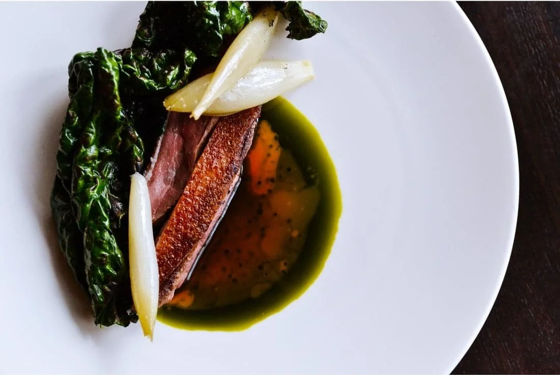
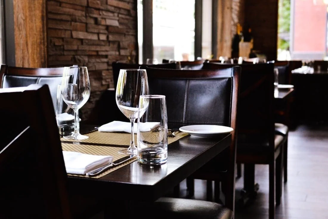
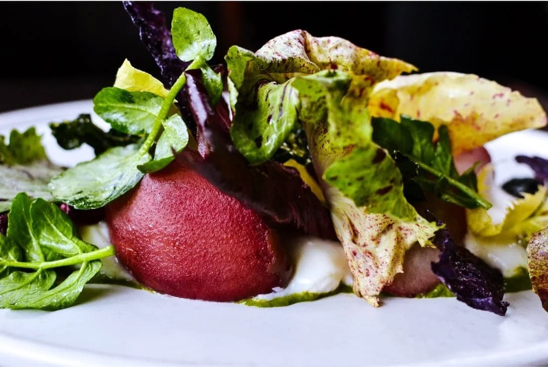
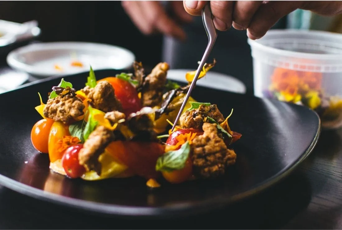
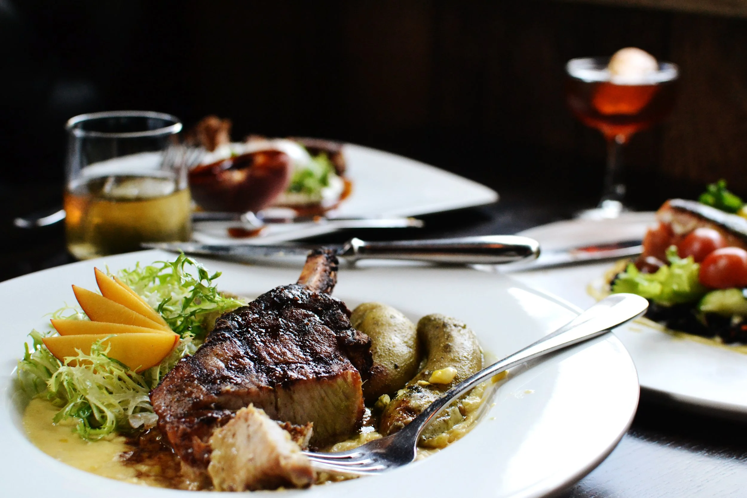
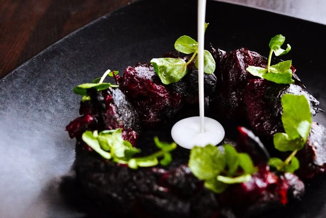
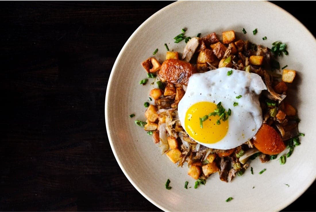
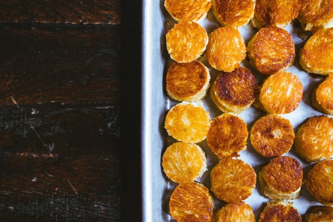
Swank
Restaurant
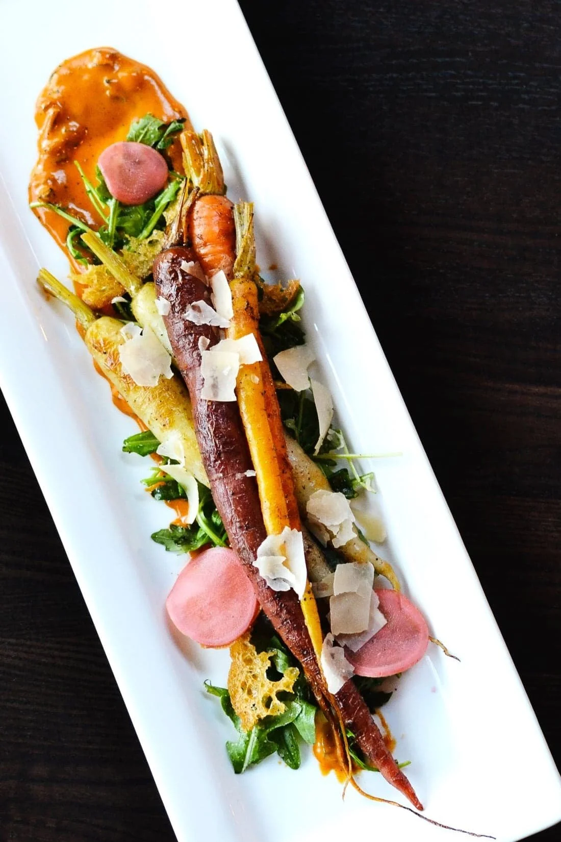
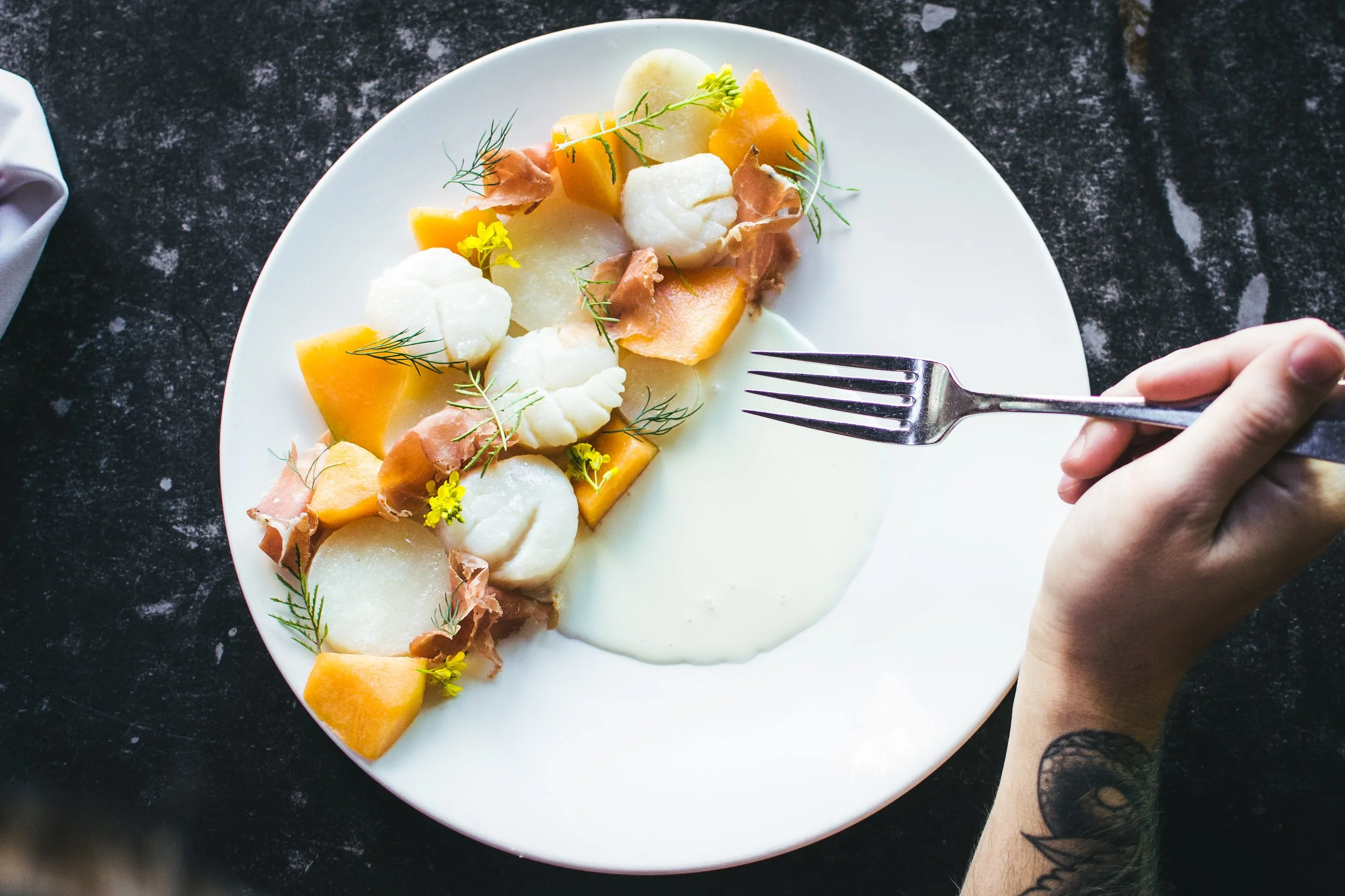
Priding itself in “a farm-to-table focused menu that changes
as often as the weather.”
Swine Moonshine
& Whiskey Bar
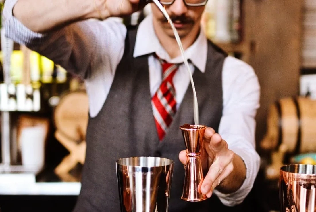
Boasting one of the largest
whiskey collections in the city.
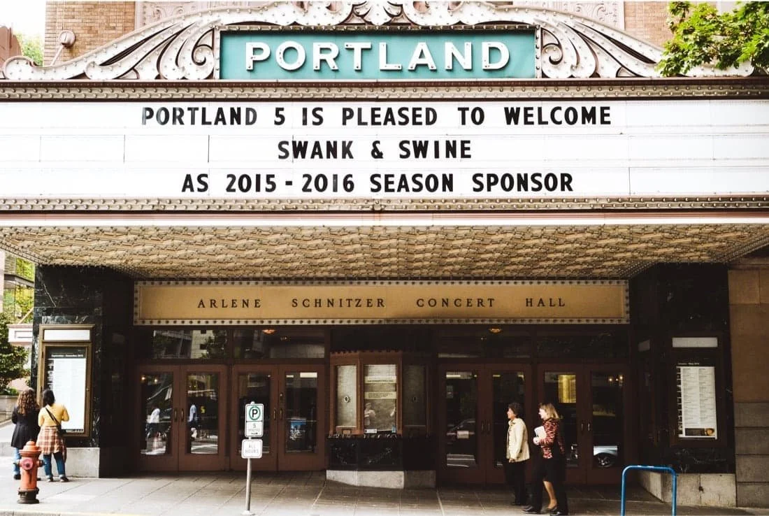
located in downtown Portland, OR
In the Paramount Hotel at SW Park and Taylor, nestled between Director’s Park and Portland’s green Park Blocks
Before
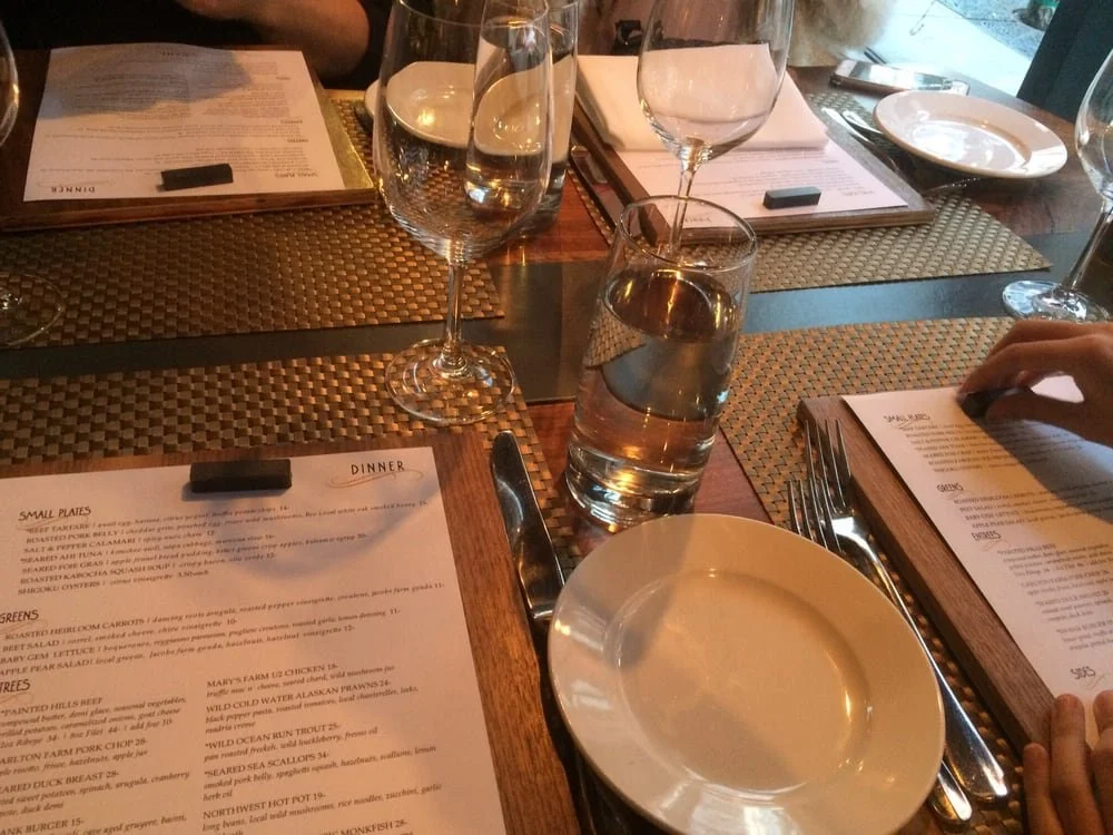
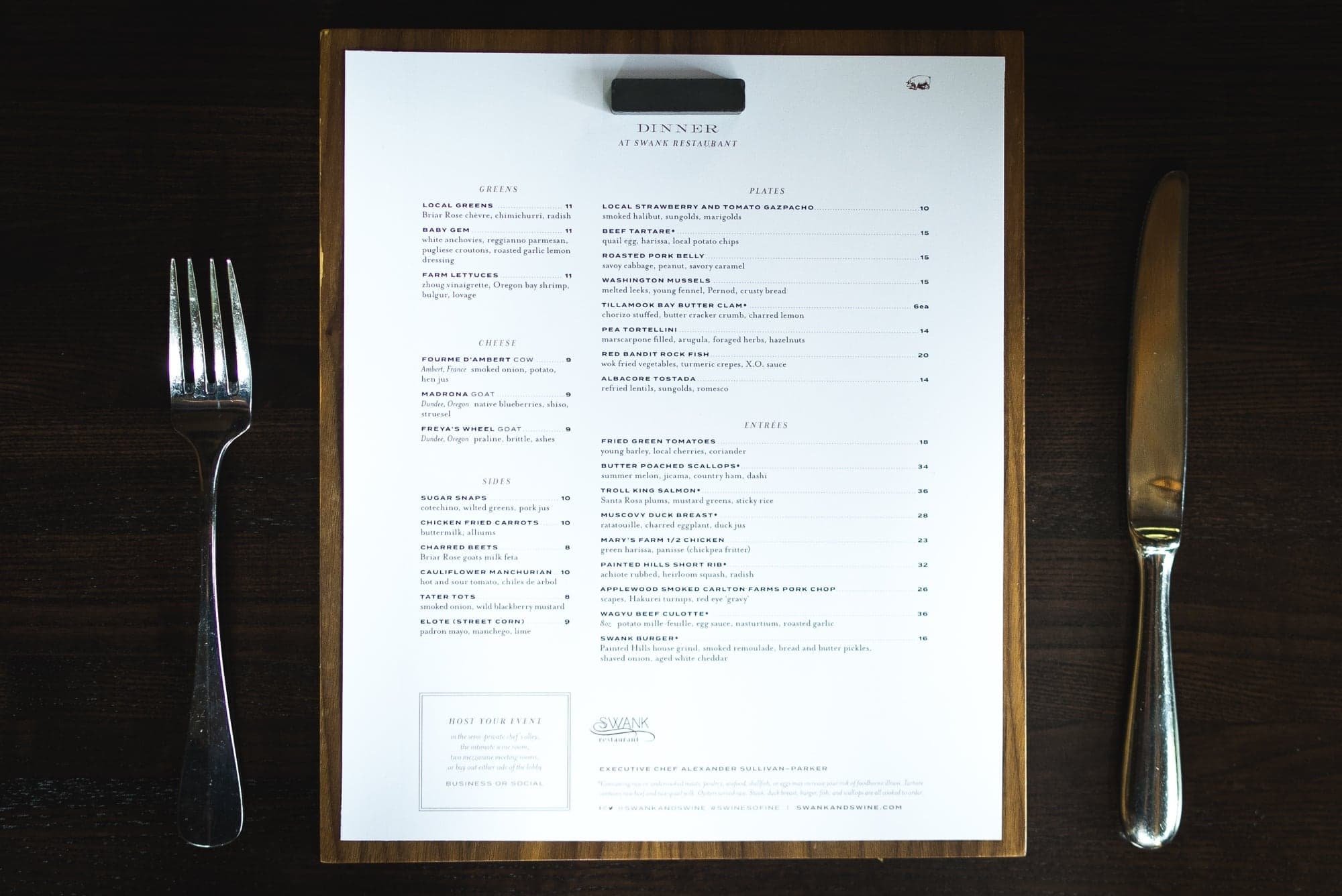
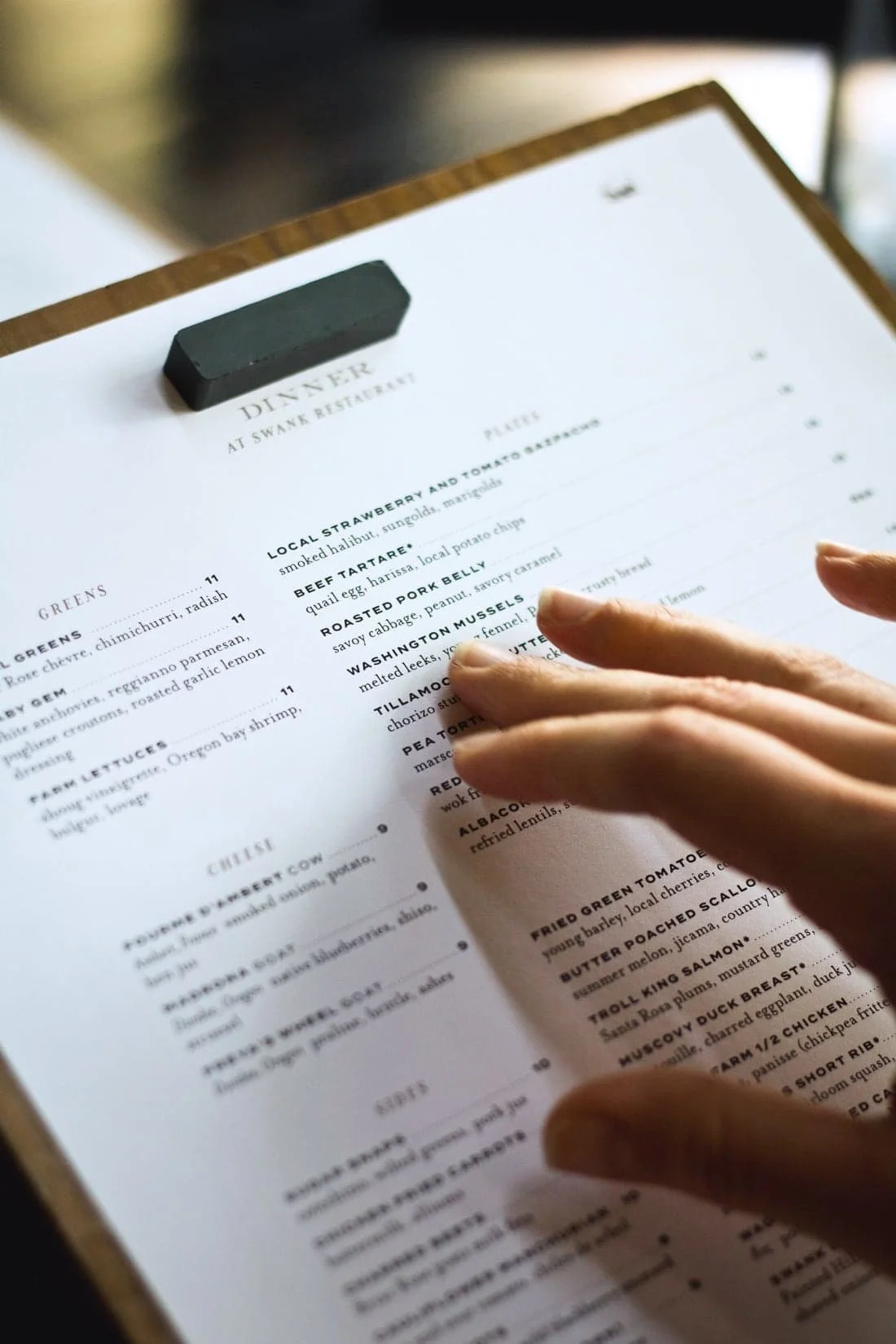
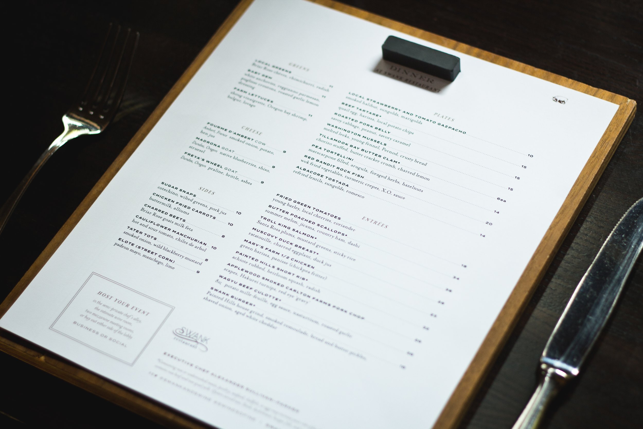
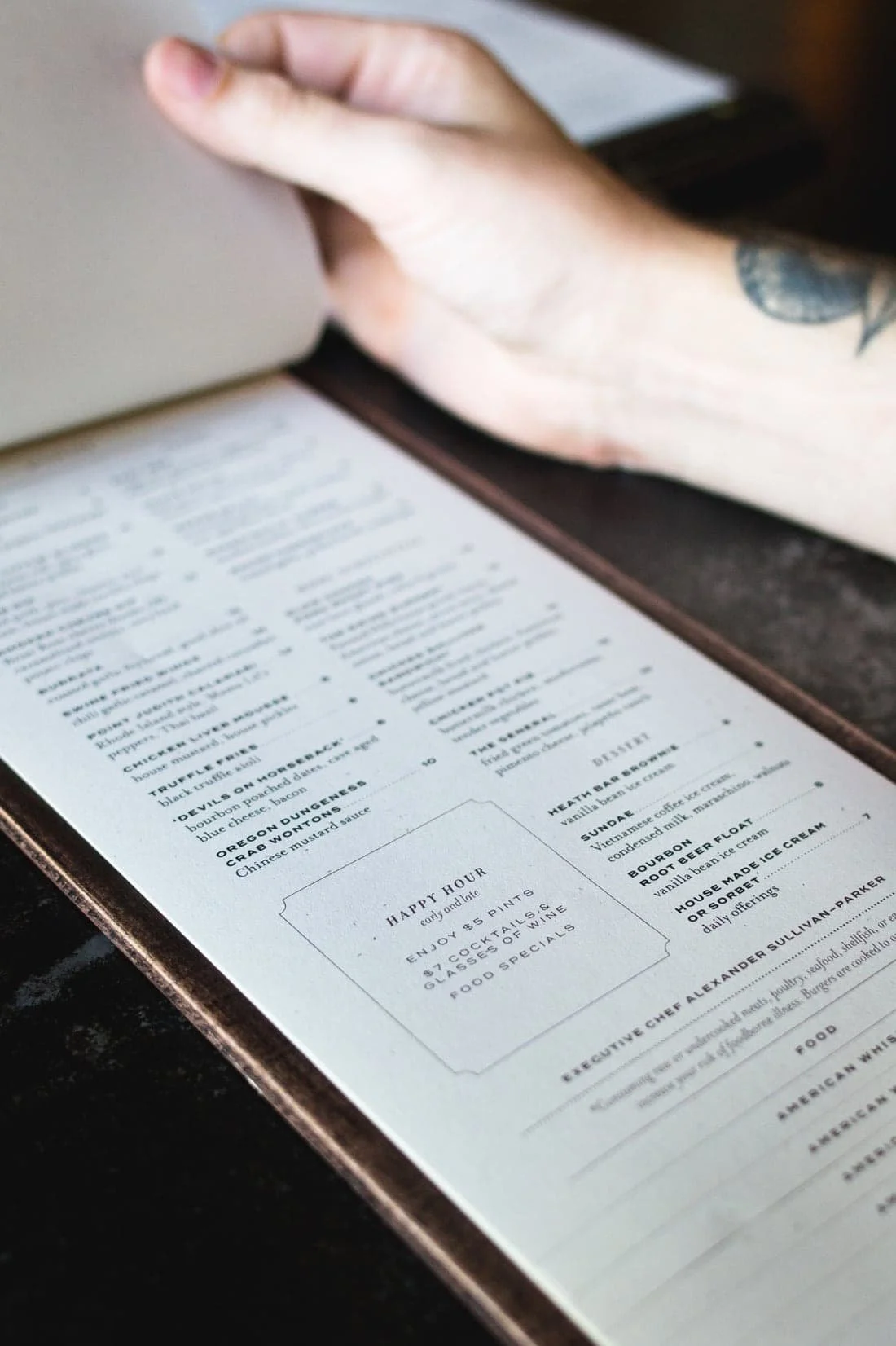
The restaurant menus needed a refresh to match the sophistication of the dishes leaving the kitchen.
Because the chef updated the offerings daily, dinner menus in multiple formats had to be reprinted and trimmed to size each afternoon before service.
images from Yelp
AFTER
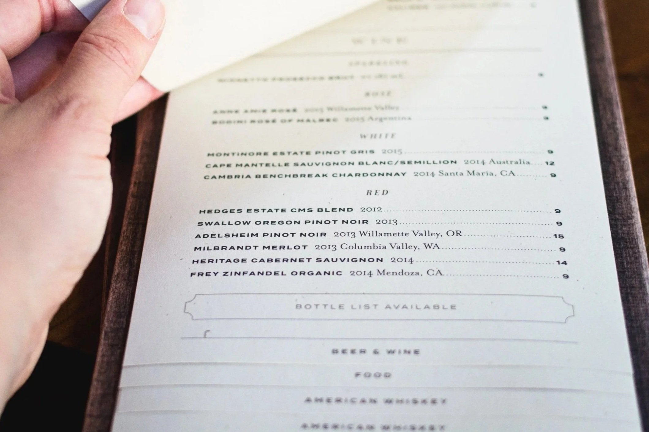
We simplified production by resizing the layouts to reduce trimming and better suit the wooden boards. Since the menus were fastened with a magnet, we adjusted the text to sit neatly within the final frame.
With the dinner menus resolved, we carried the refinements through the rest for a cohesive set.
libations menu for cocktails,
beer, and wine by the glass
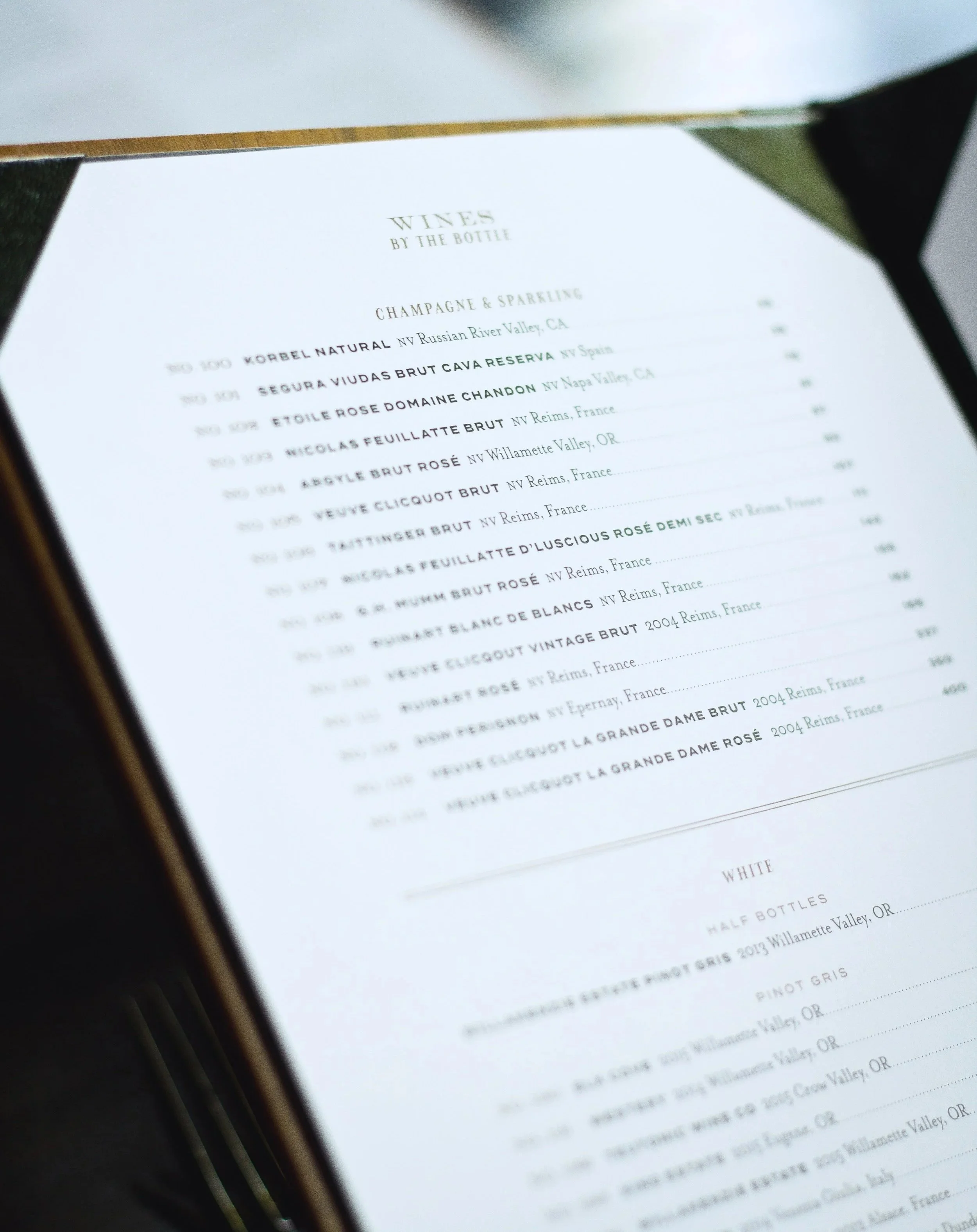
wine list
dinner menu
SWINE MOONSHINE
& WHISKEY BAR
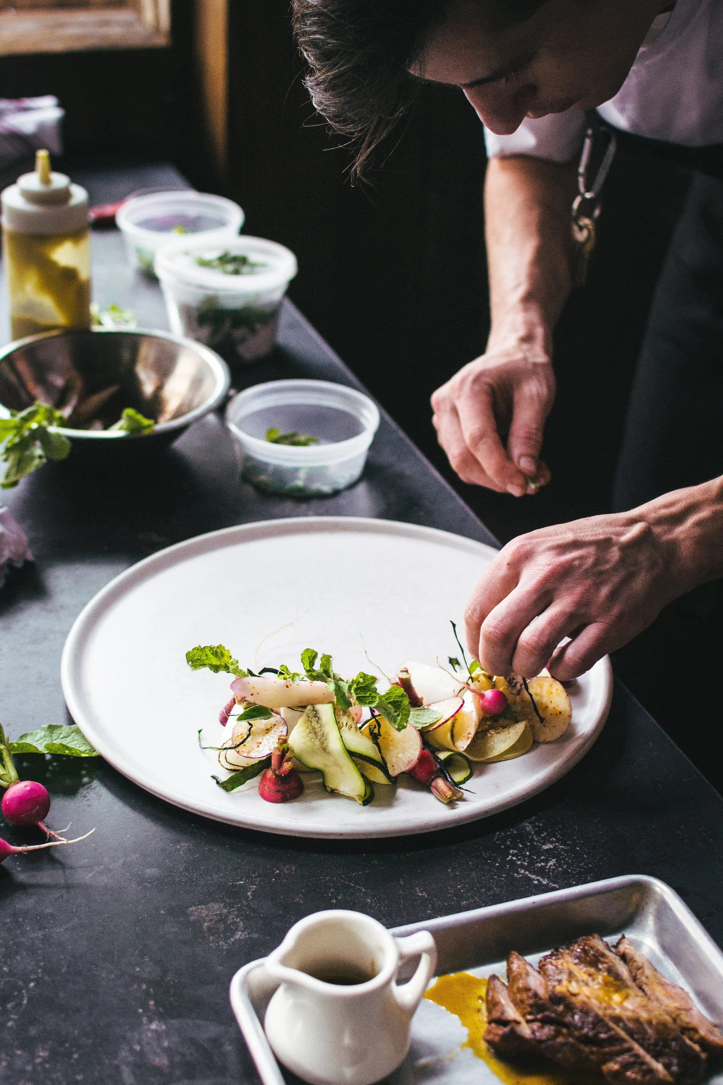
Art Direction, Photography

Menus for Swine
Moonshine & Whiskey Bar
Art Direction, Design, Photography
Before
images from Yelp
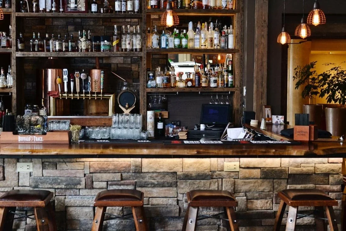
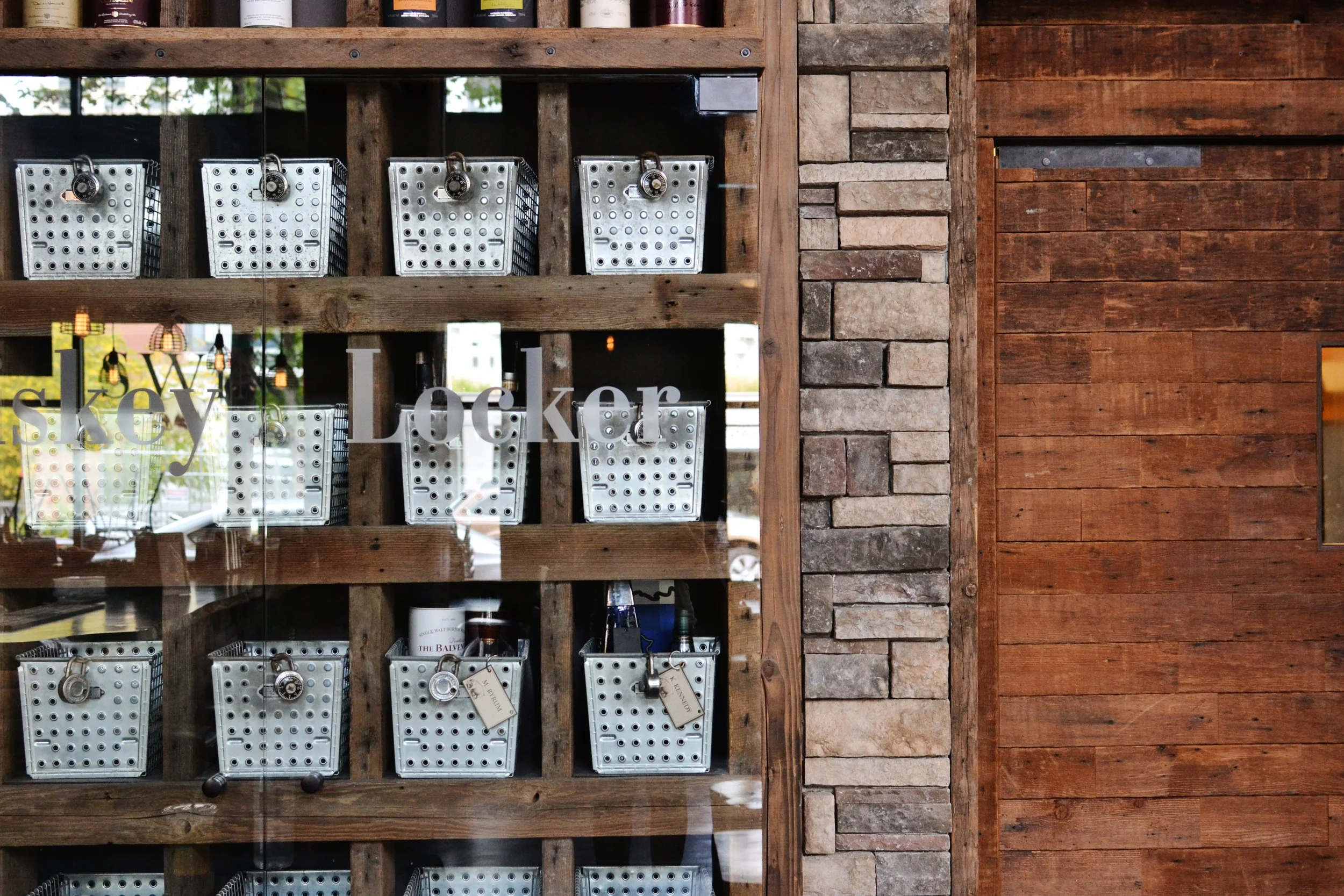
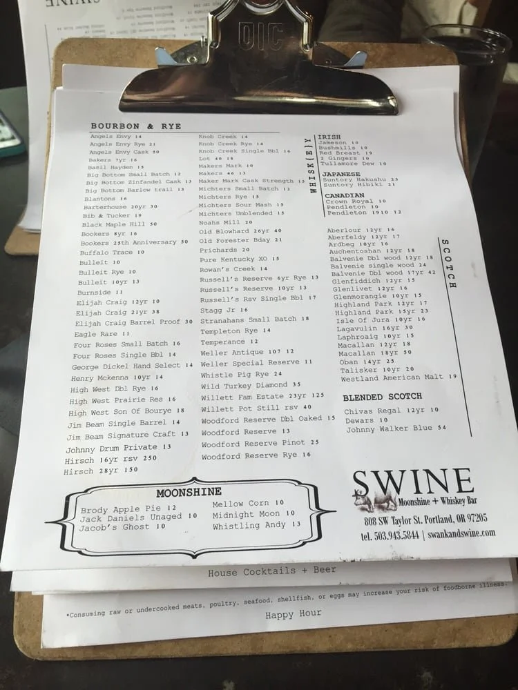
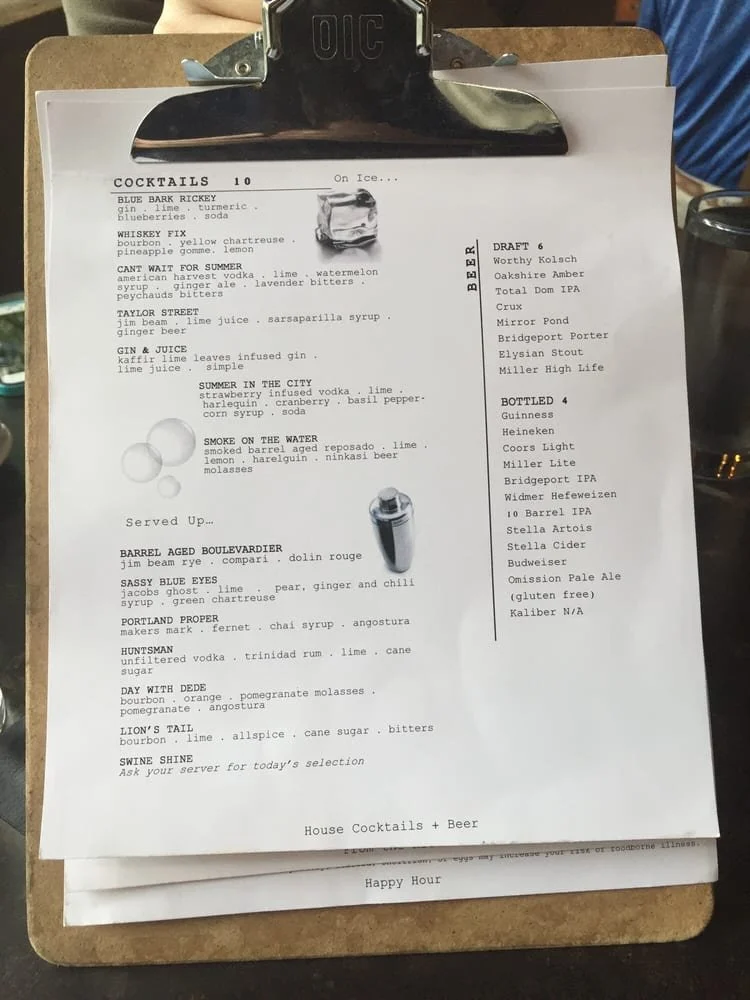
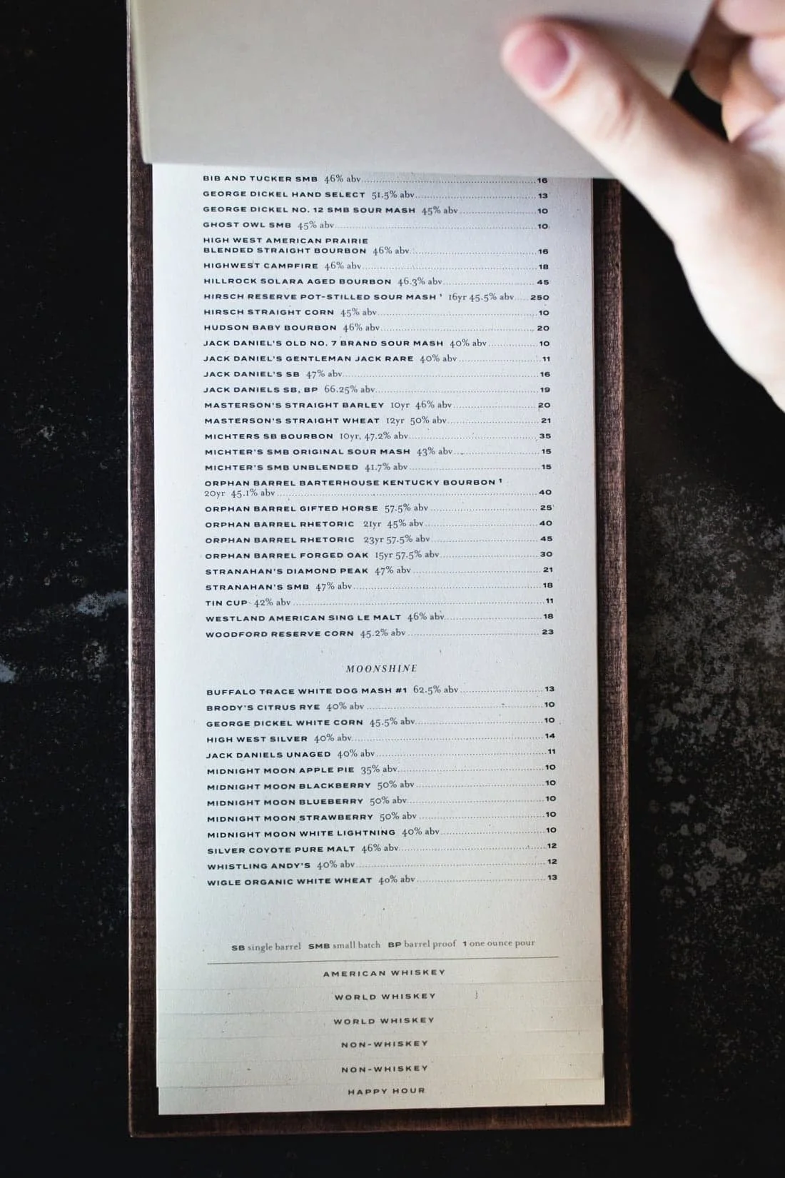
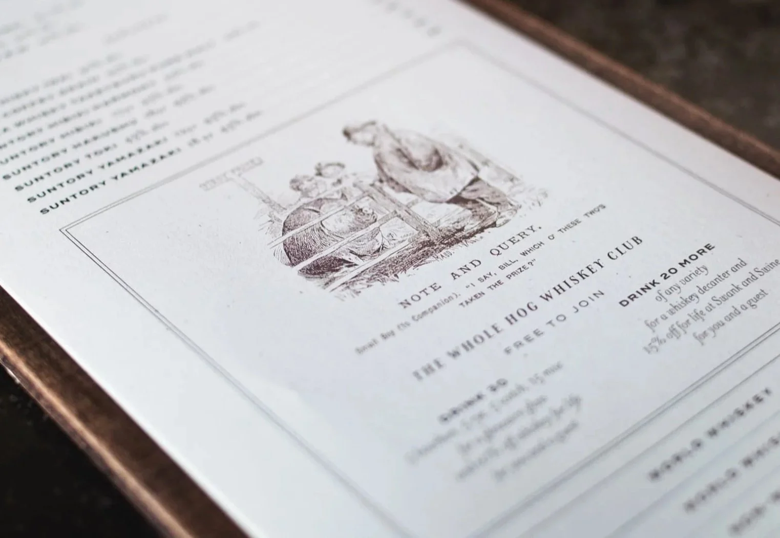
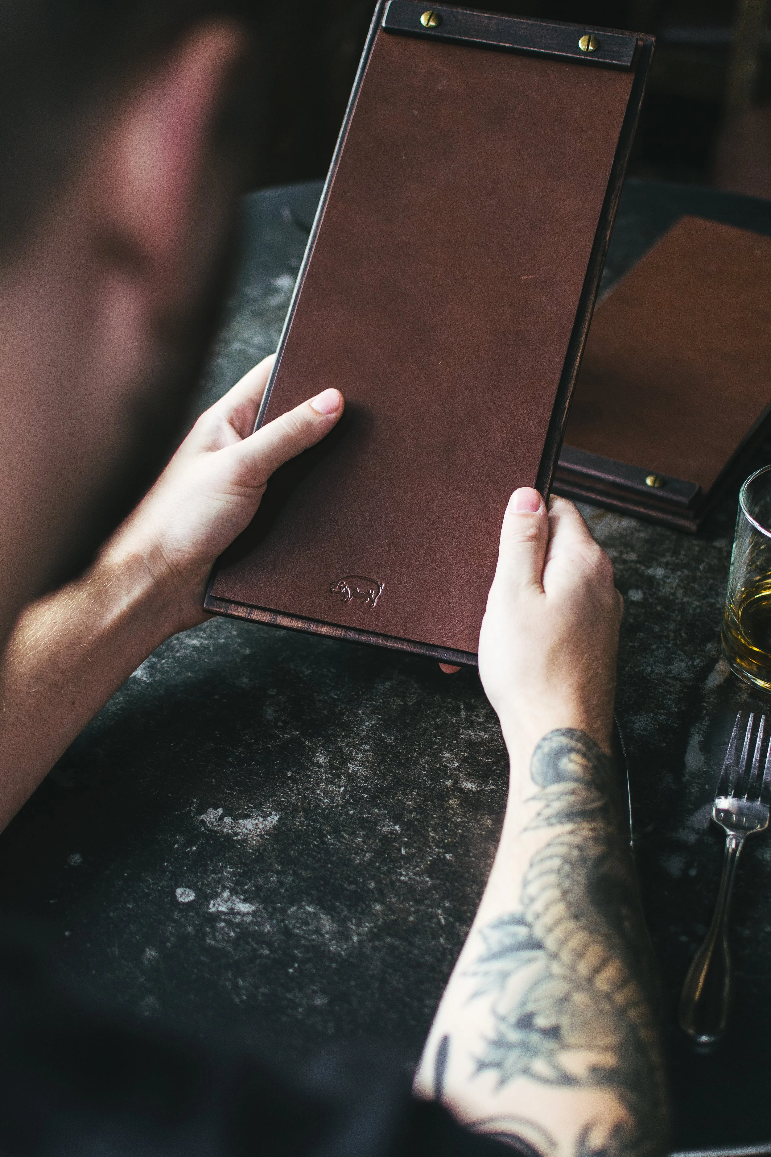
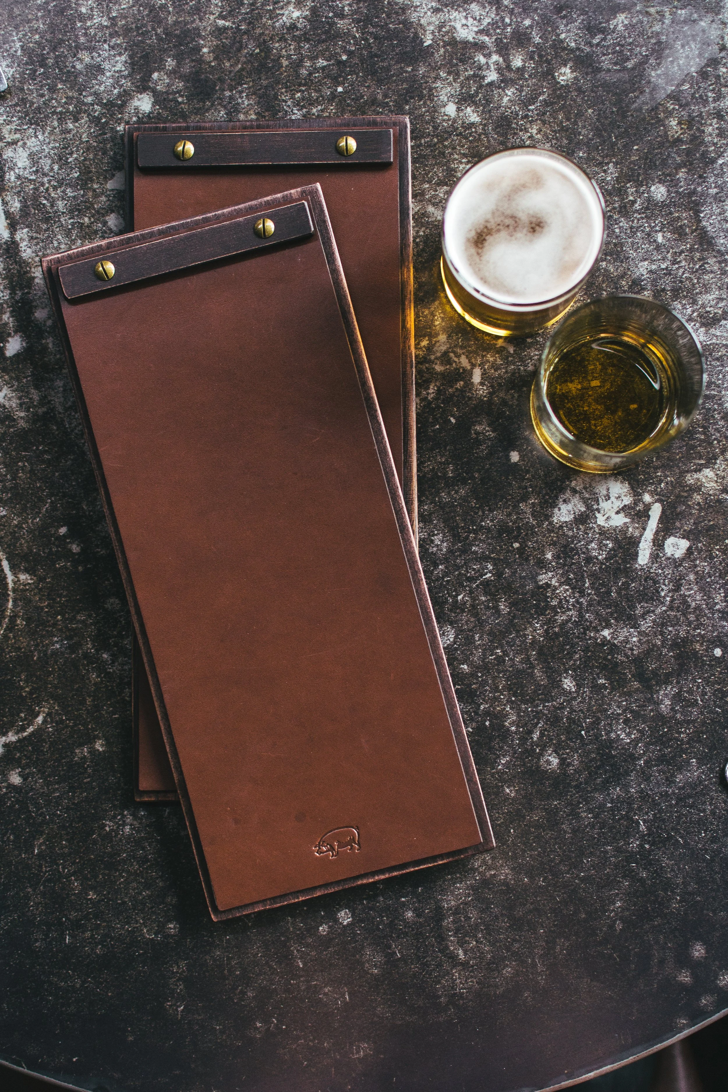
Swine Moonshine and Whiskey Bar needed a proper menu to showcase its extensive backbar.
The original clipboards left pages stained, out of order, and constantly in need of reprinting — hardly the impression of a serious whiskey destination.
AFTER
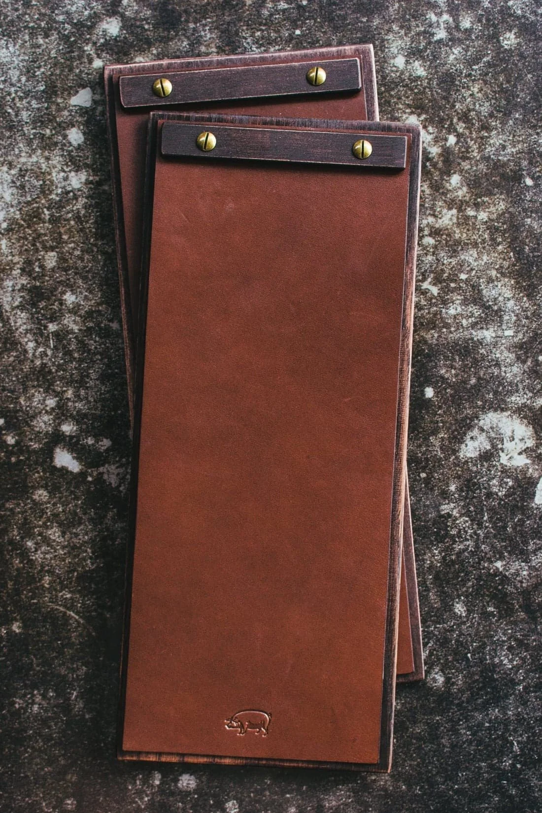
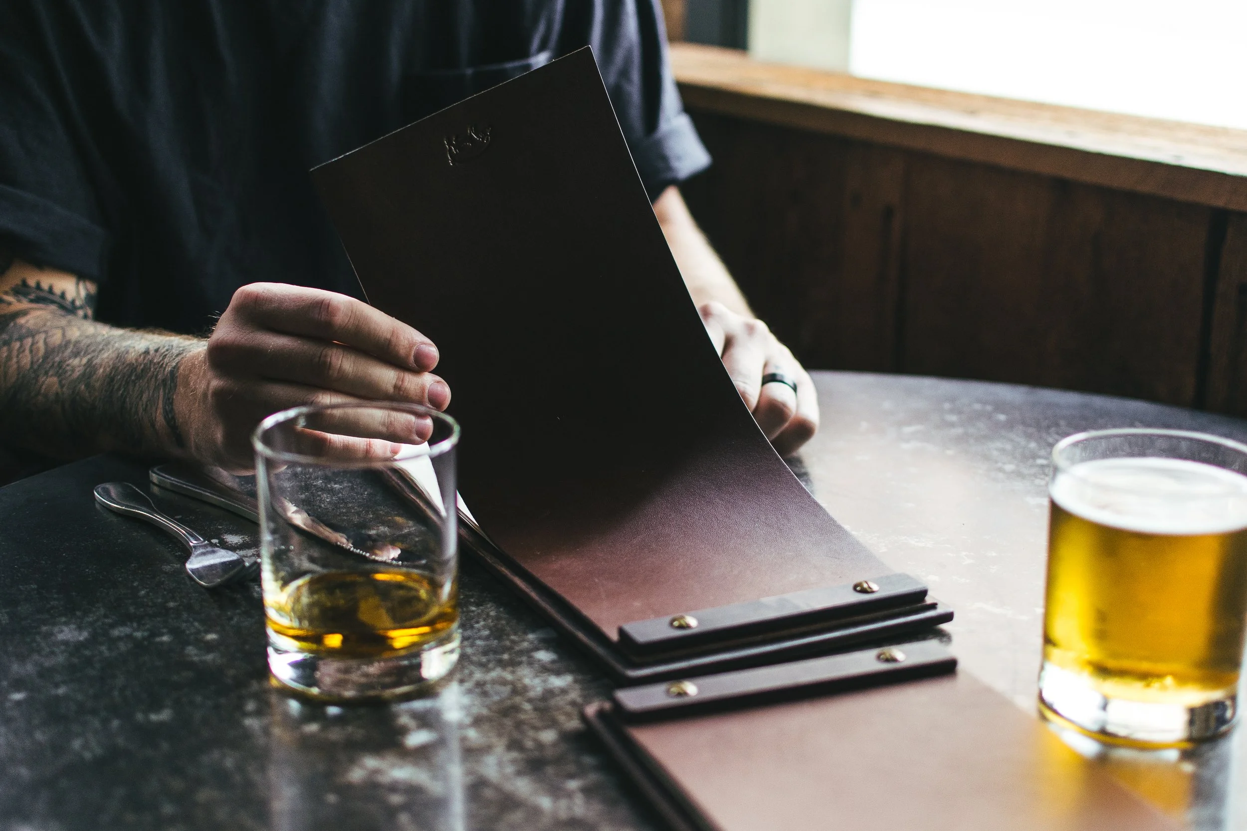
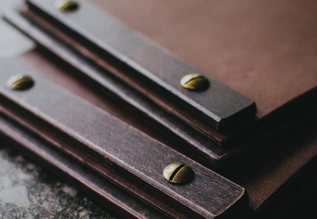
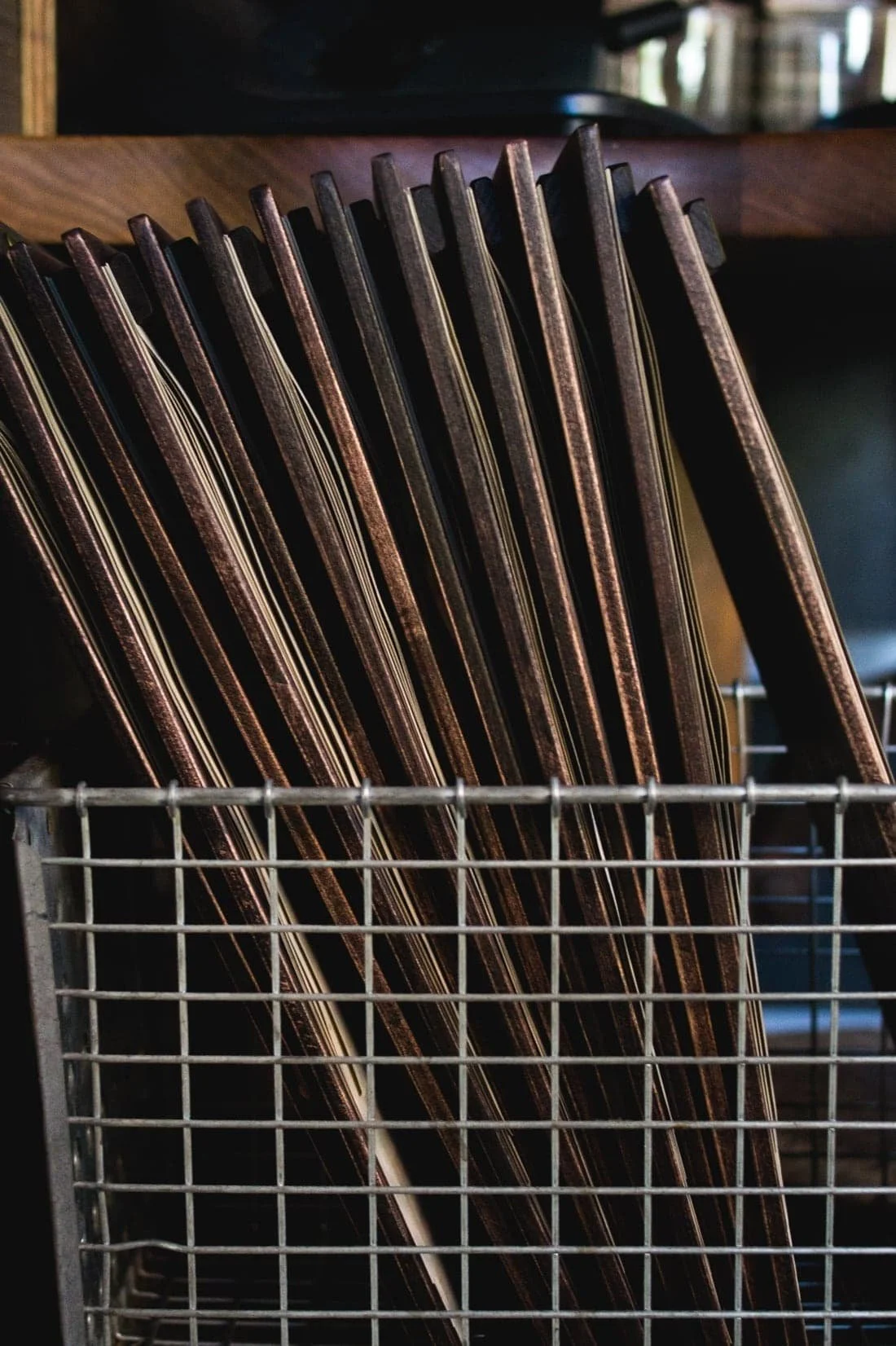
We redesigned the menus from the ground up.
Partnering with local craftsman Hankbuilt, we commissioned custom wooden clipboards, then worked with Tanner Goods to add custom leather tops that kept the pages secure and orderly. To weave in character, we included vintage pig-and-whiskey themed cartoons that reinforced the bar’s story.

Website for
Swank n’ Swine
Art Direction, Design, Photography, Copywriting, Web Development
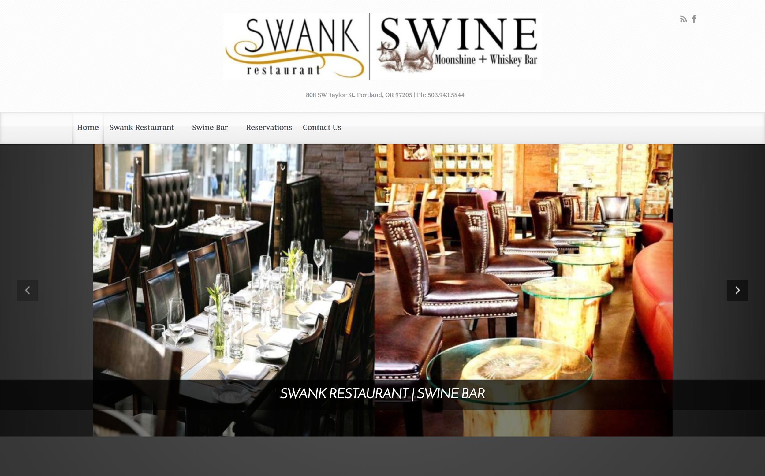
Before
The original website was clunky, visually unappealing, and not optimized for web or search. Poor photography and confusing navigation left it struggling to attract visitors, averaging not even 400 sessions per month.

AFTER
Through a complete creative overhaul — fresh photography, clear messaging, a streamlined user experience, and a modern design system — the site was transformed into a compelling digital presence.
Within the first month of launch, traffic increased tenfold to over 4,000 sessions per month. Within six months, it achieved first-page Google search results for “Portland whiskey.”
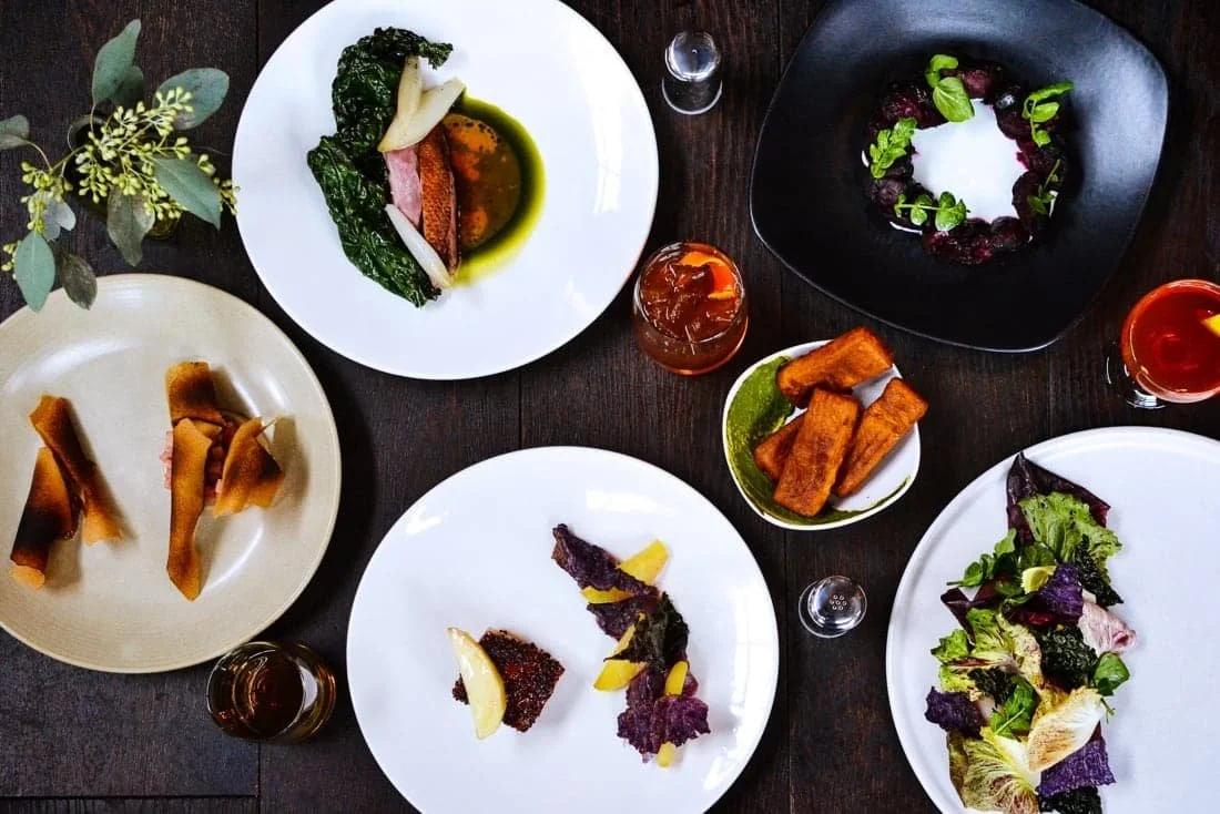
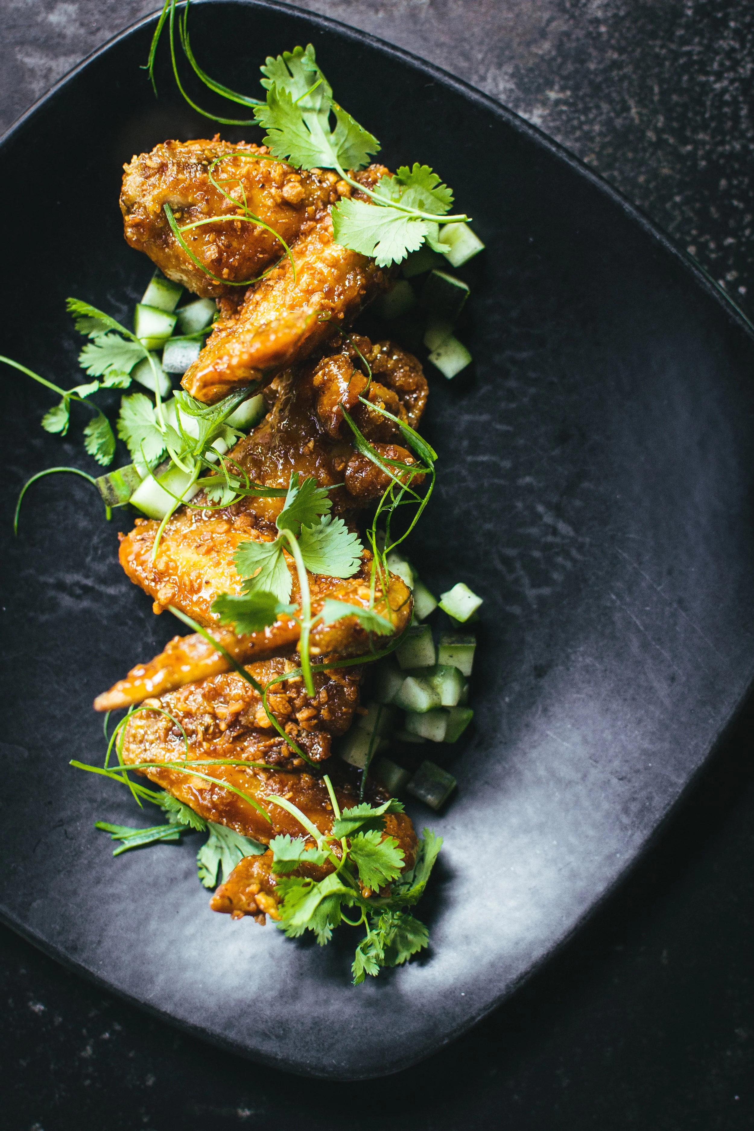
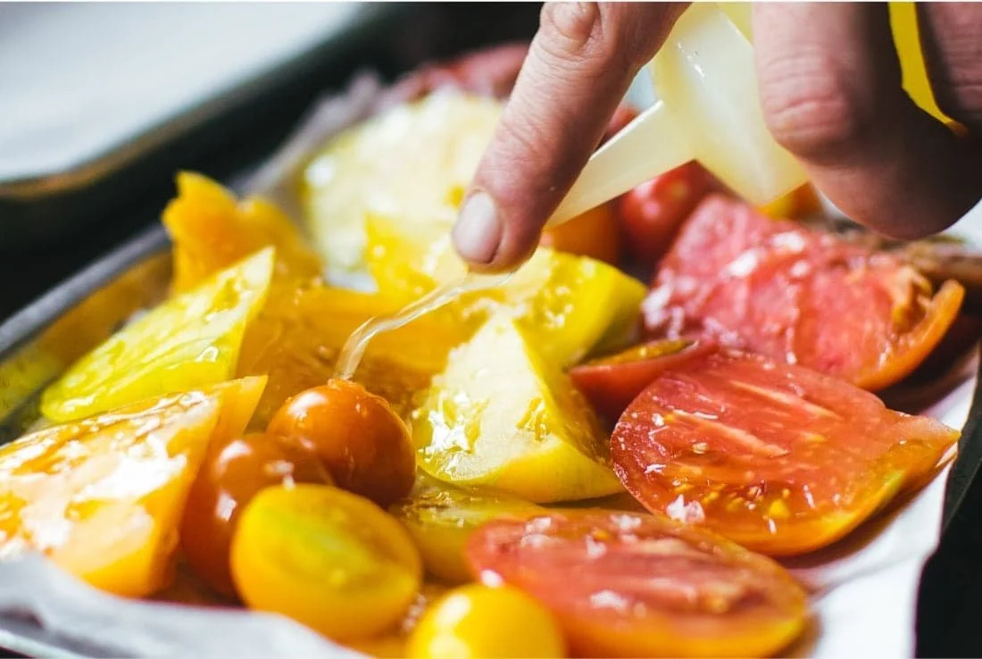
Gallery for
Swank n’ Swine
Art Direction, Photography