SpiderOak
Secure Software
After years of building niche backup tools for privacy enthusiasts, SpiderOak set its sights on a bigger stage: government security.
The new brand concept stripped things down to the essentials — no frivolities, just clarity and trust.
2019
Rebranding concept

“Securing the world’s data, bit by bit.”
Bit by bit, or, little by little.
A “bit” being the smallest unit of data in a computer, the line is also a nod to the small startup’s scrappy resilience, managing to do more with less in the face of numerous hurdles throughout the years.
The very nature of 8-bit is simplification, and SpiderOak had been struggling for years not to come across as too technical.
What better visual metaphor for blockchain than 8-bit styling with its tiny clusters of squares — a chain of blocks in the form of pixels.
Pivoting sharply from the consumer market it had known for over a decade, SpiderOak sought to position itself as indispensable technology for defense and intelligence communities within the United States government.
This new business-to-government direction required a straight-forward, no-nonsense approach in all of the company’s brand and marketing communications.
Early SpiderOak brand designs were even based on old school 8-bit styles.
Recalling the earliest days of computers, when pixel icons were first created to make the incomprehensible technology more intuitive and user friendly, SpiderOak needed a similarly simplified “less is more” approach to connect current and future audiences with its innovative security-first blockchain technology.
To anchor this idea visually, the new logo ends with a simple square “bit” — a single block that ties the brand’s story back to its foundation in data, pixels, and blockchain.
Brand Story
Creative Direction, Copywriting
Background
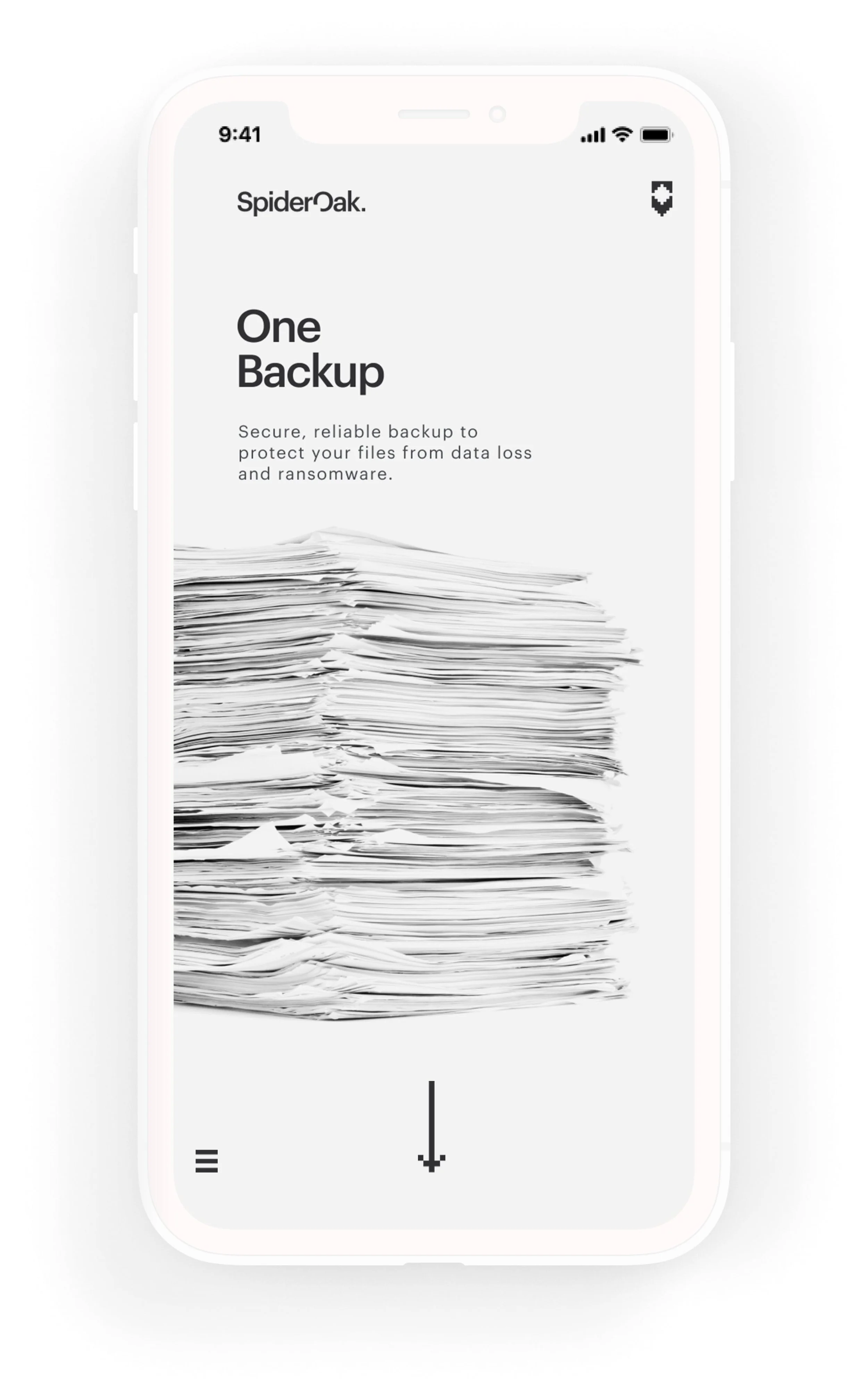
Despite a loyal following among security enthusiasts for SpiderOak’s flagship One Backup product, the response to the proprietary applications in the years that followed was sorely underwhelming.
With the redevelopment of its private blockchain platform, the company was looking to take things in a new direction.
tagline
Logo Redesign
The old “keyhole oak tree” mark felt too literal — and increasingly out of step with the company’s pivot toward government security. Its chunky typography carried weight, but not the precision the brand now needed.
The redesign introduced a lighter, crisper cut of Graphik and shifted the focus back to the name itself. By carving a small square “bit” from the “O” and echoing it as a final block at the end of the wordmark, the logo now tied directly into the brand story — data secured, bit by bit.
Creative Direction, Design
Before
Keyhole oak logo
After
Precision and clarity, bit by bit
Logo System
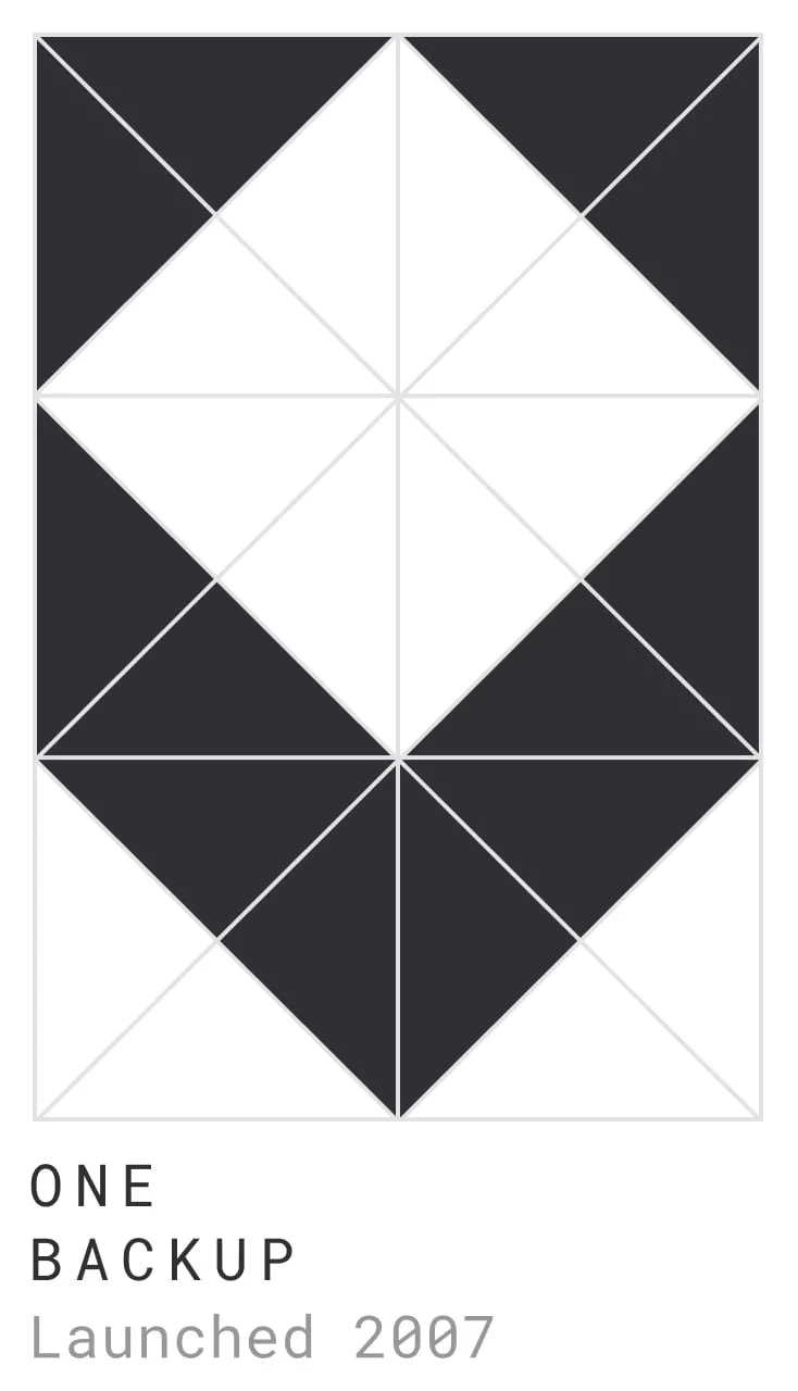
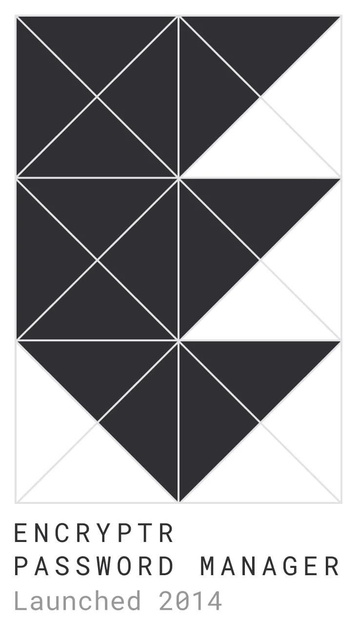
Although the SpiderOak brand had struggled to find solid footing over the years, the original three product logos, at least, had never changed.
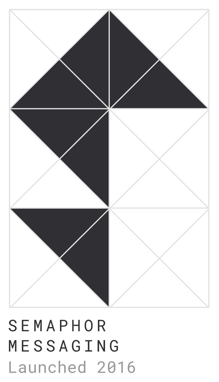
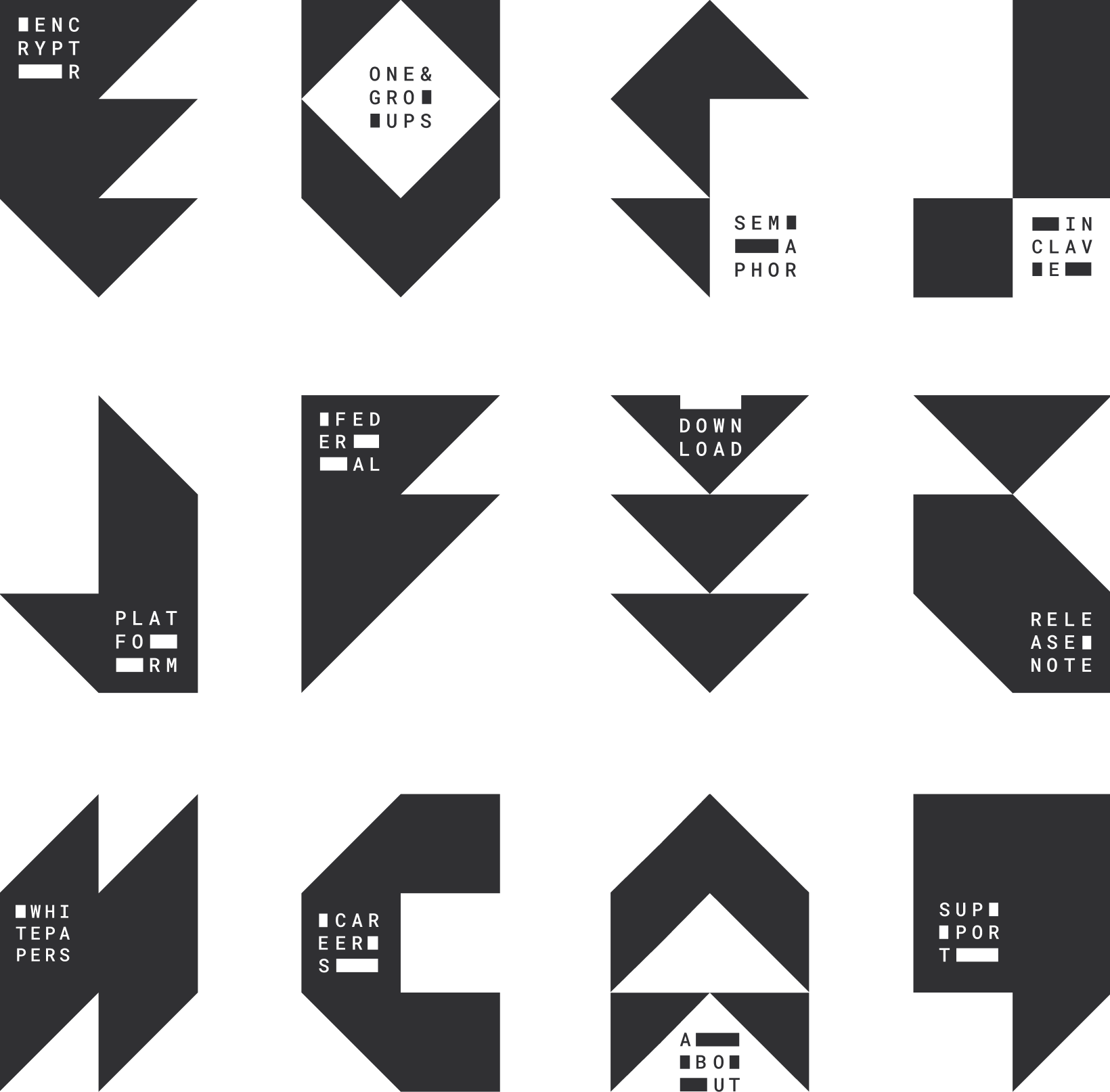
Wanting to maintain some continuity between these mainstays and the newest branding concept, the logo system naturally expanded using the same geometric grid of precise triangles and squares.
Using this same grid, numerous other aspects of the brand could be built out with a unique identifying mark while still fitting cohesively within the larger brand system.
Creative Direction, Design
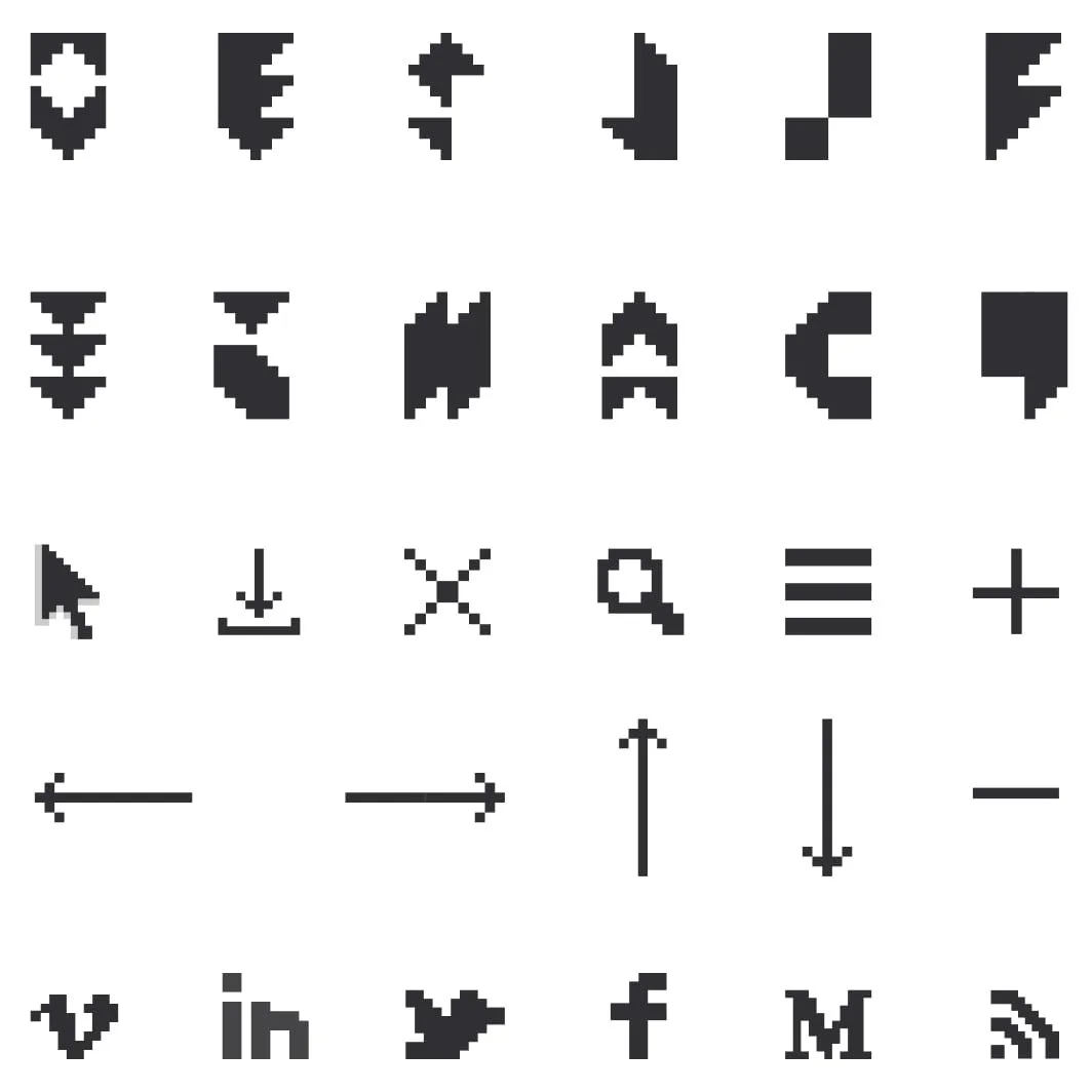
icons
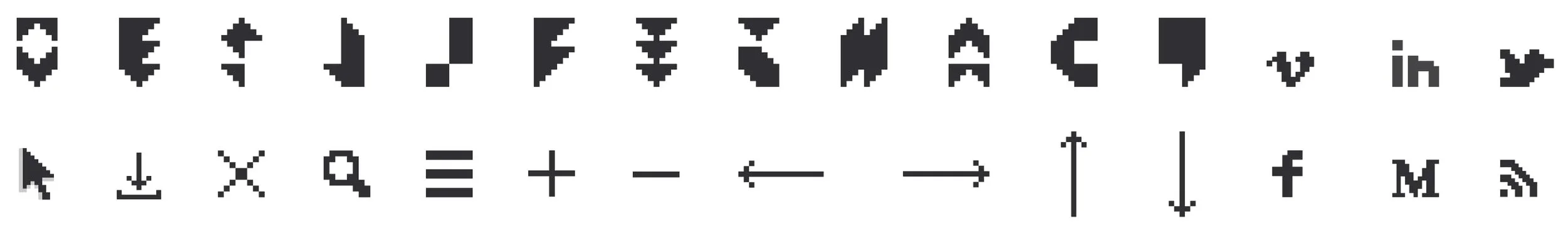
The 8-bit icons, often coupled with Roboto Mono, are used throughout the brand concept to indicate points of user interaction.
Such “clickable” elements appear throughout the website to signal interactive points for users.
Creative Direction, Design
In print, they serve as intentional accents, highlighting the company website or emphasizing a pull quote.
Alphabet
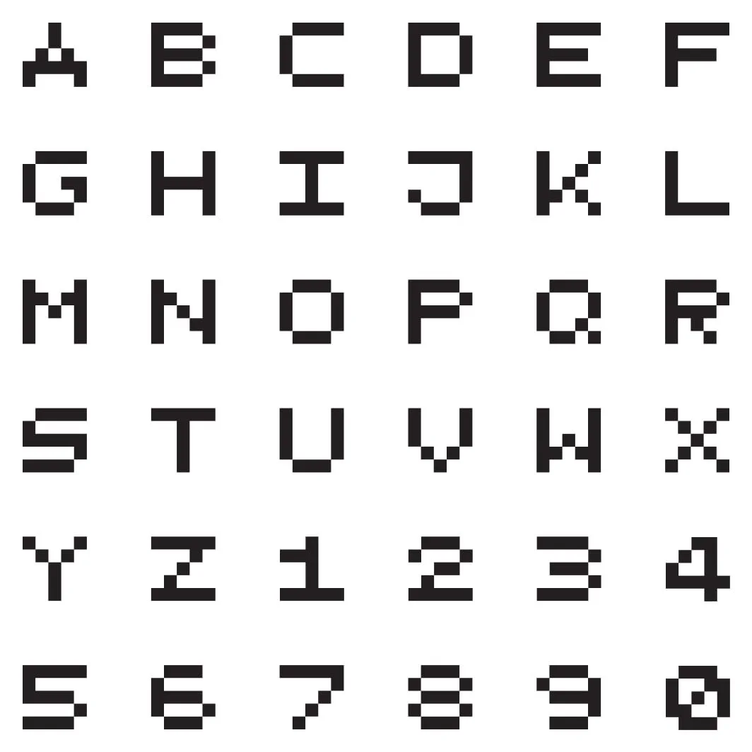
In need of a strong accessory headline font, a pixel-based character set seemed the logical choice.
The strong square shapes complement the logo system in a way that Roboto Mono, even bold, could not, as illustrated in the Release Notes.
Creative Direction, Design
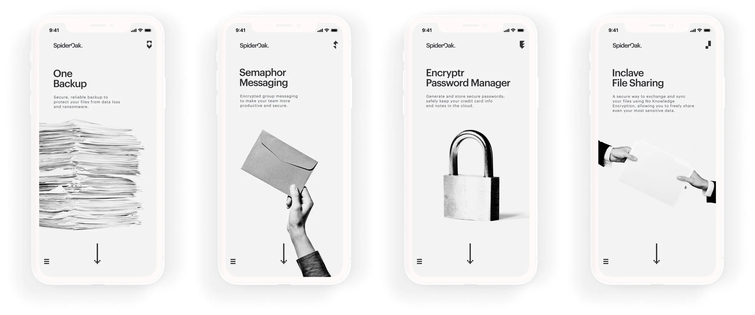
Products
Taking cues from Swiss Design, black and white photography served as effective at-a-glance communication for objectivity and clarity.
Creative Direction, Design
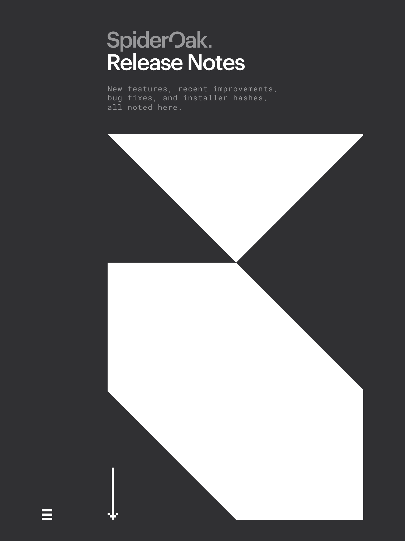
Downloads
With software updates constantly underway, SpiderOak needed a way to keep Release Notes and downloadable versions current.
The website concept anticipated a workflow using the Hugo static site generator and collaborative development between Marketing and DevOps to enable continuous updates.
Creative Direction, Design
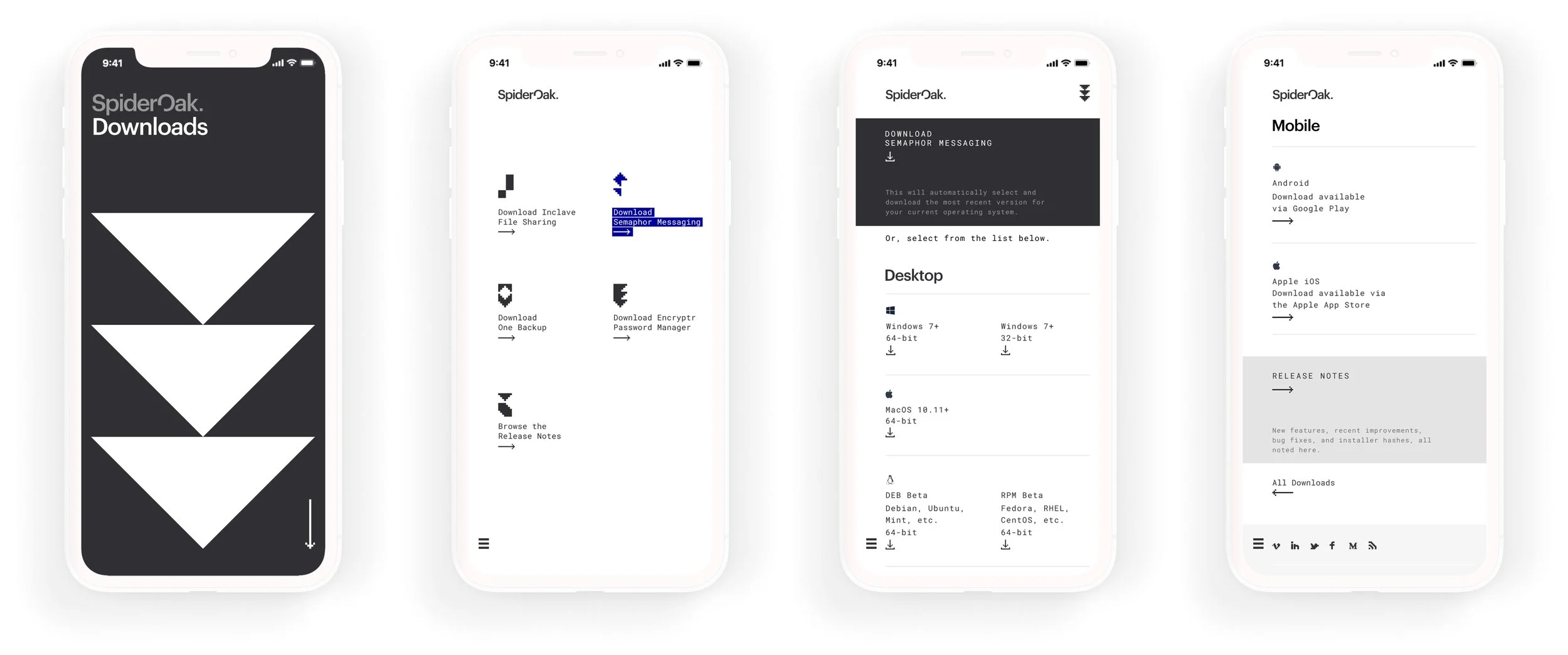
Release Notes
With software updates constantly underway, SpiderOak needed a way to keep Release Notes and downloadable versions current.
The website concept anticipated a workflow using the Hugo static site generator and collaborative development between Marketing and DevOps to enable continuous updates.
Creative Direction, Design


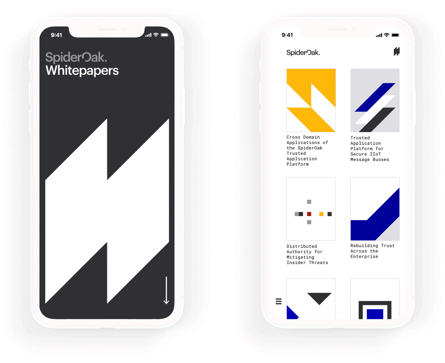
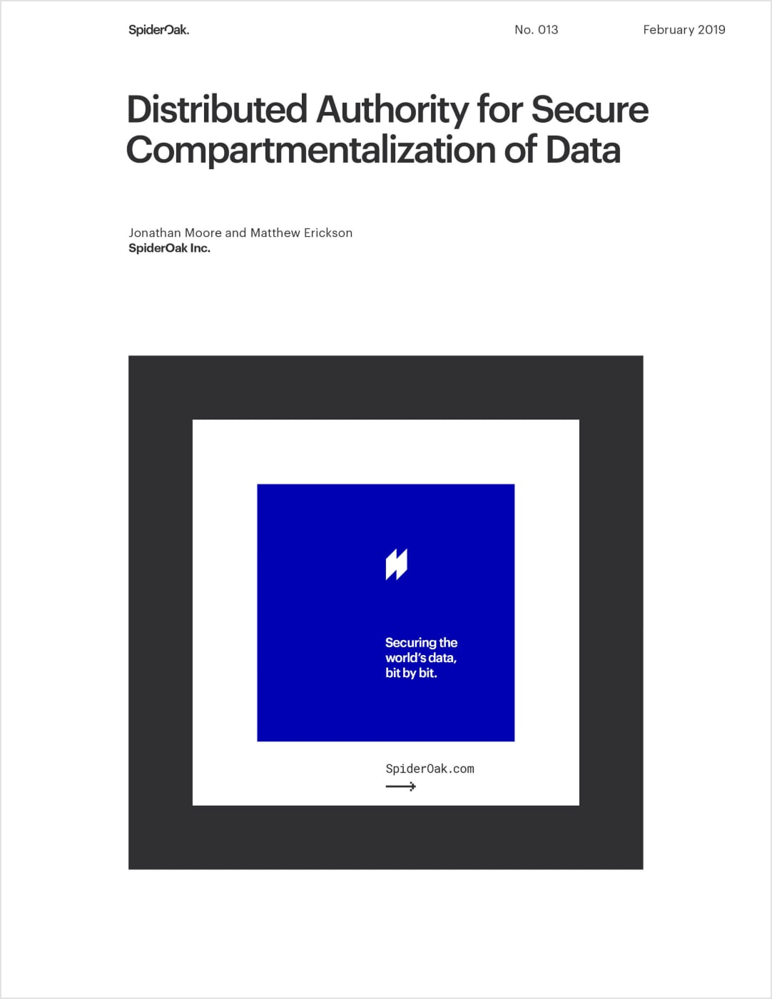
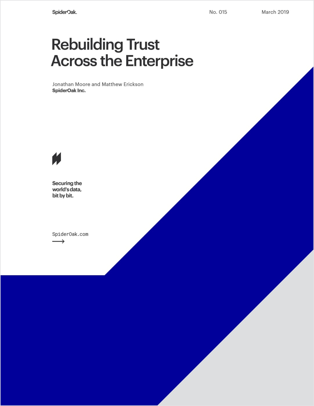
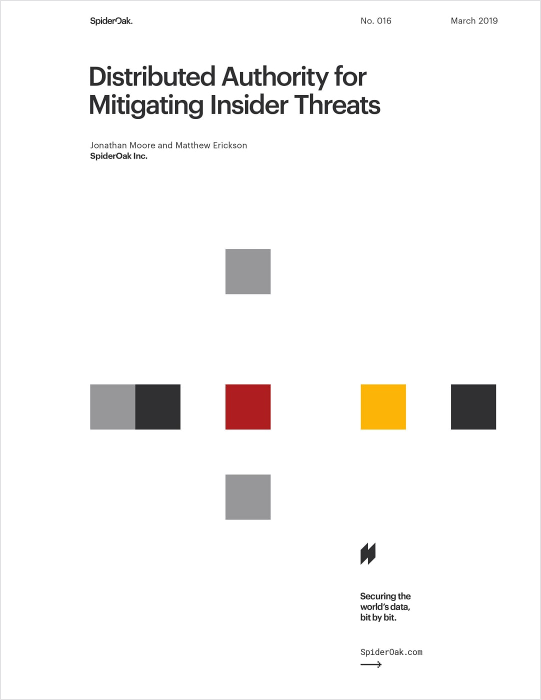
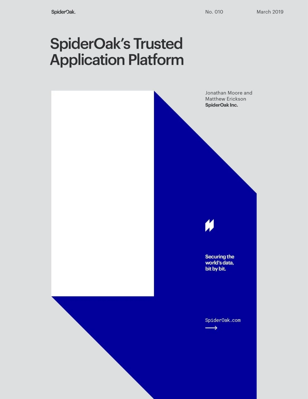
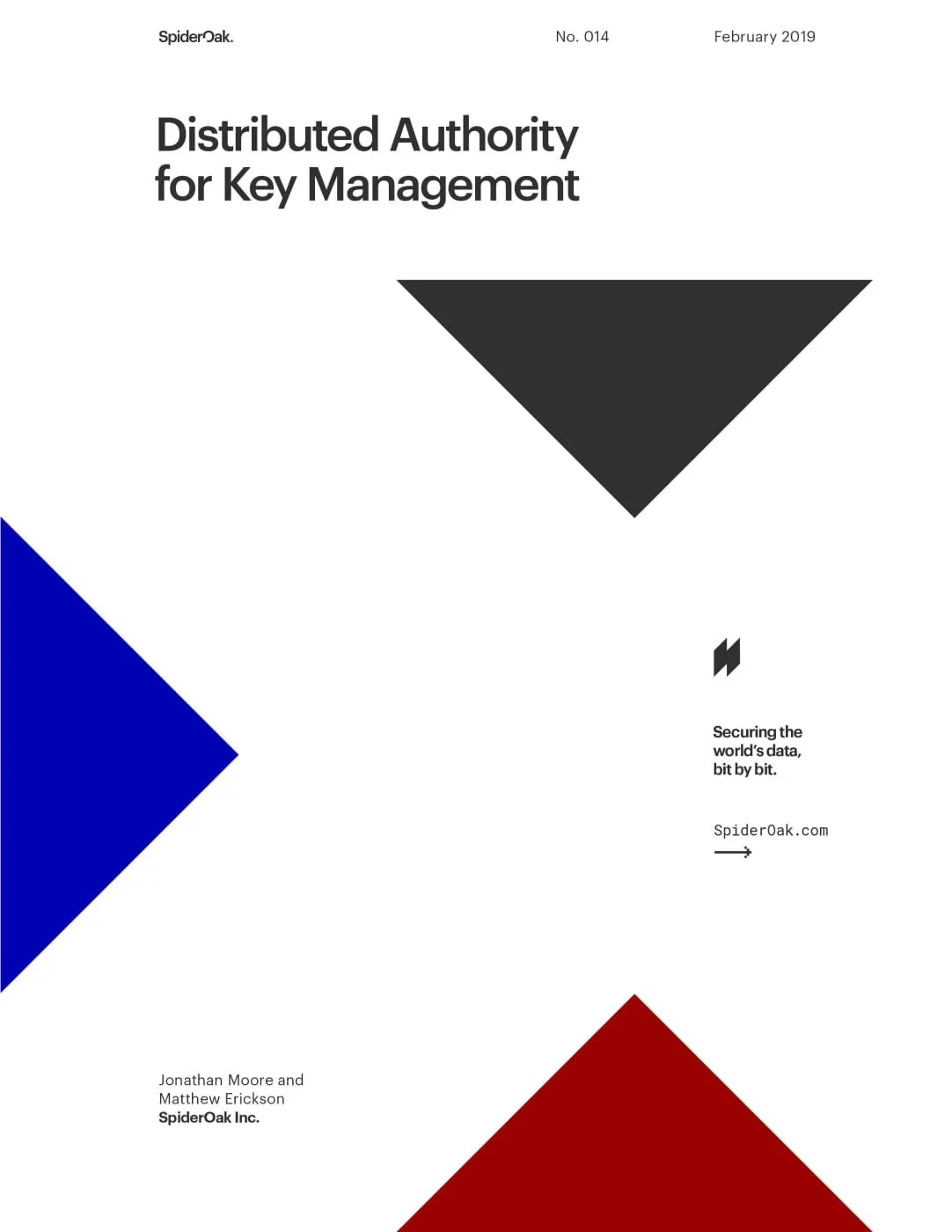
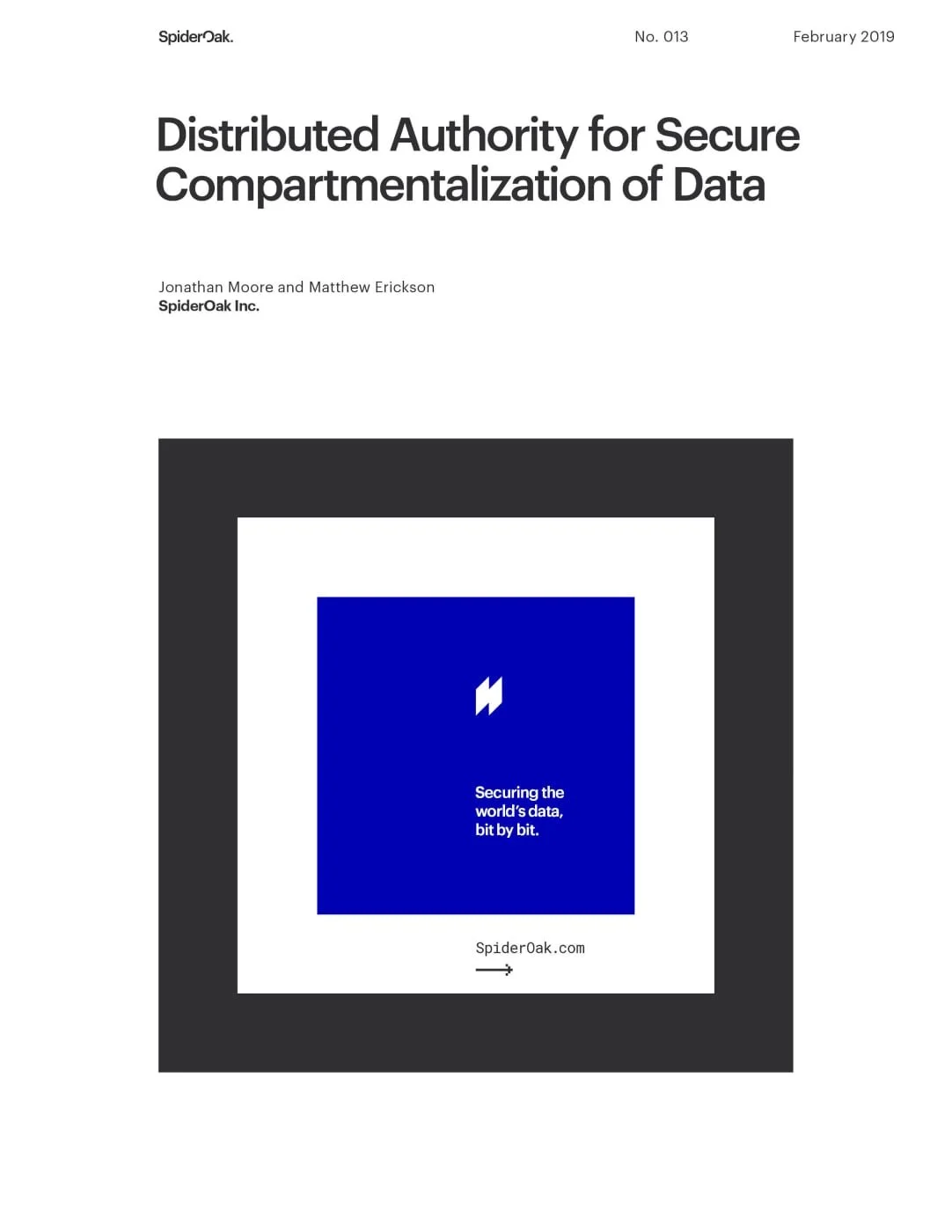
Whitepapers
Blockchain is no easy concept to explain, so SpiderOak’s marketing materials needed to be as digestible as possible.
Strongly gridded layouts, inspired by the International Typographic Style, helped to break content up into manageable blocks, improving comprehension, building trust, and providing yet another visual metaphor for the underlying blockchain technology.

Creative Direction, Design


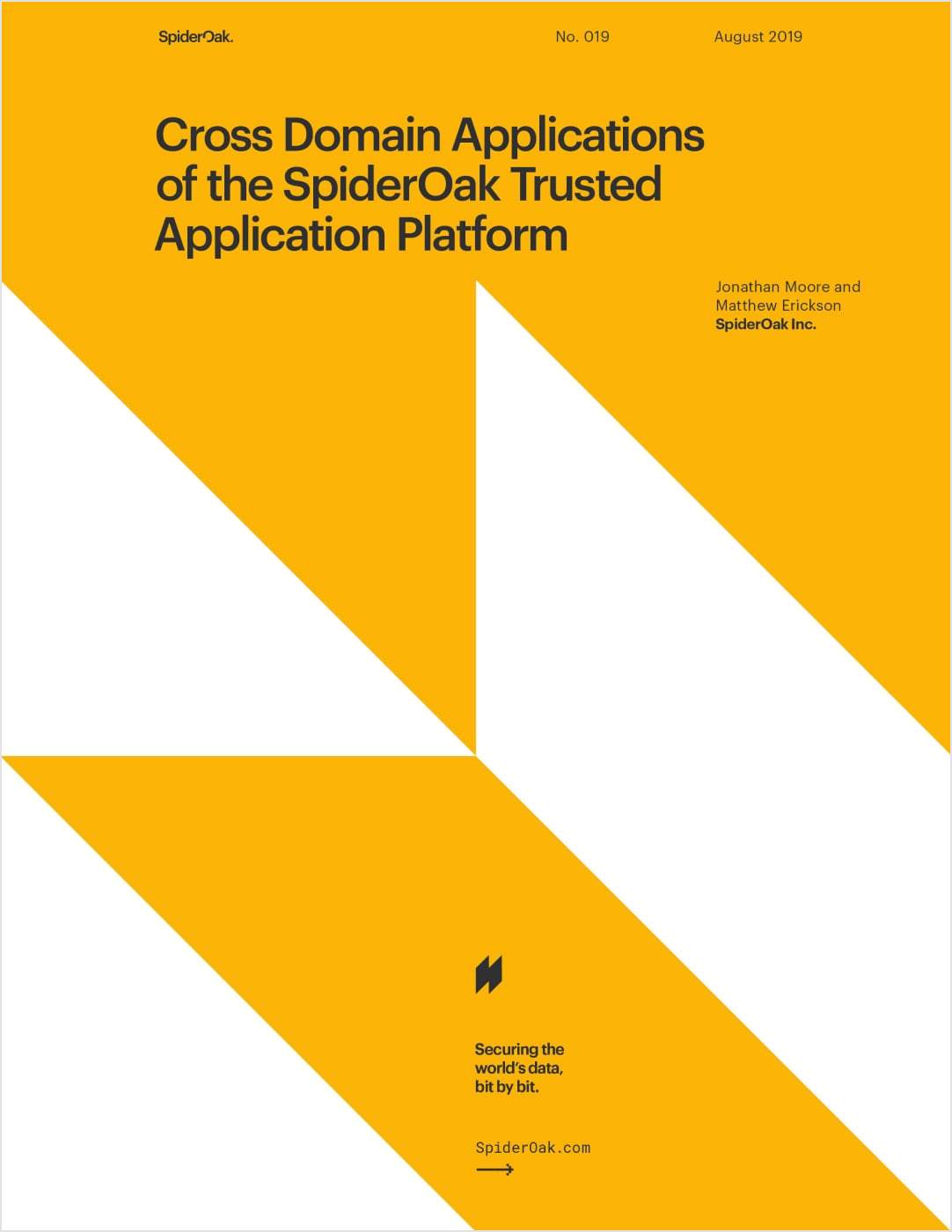
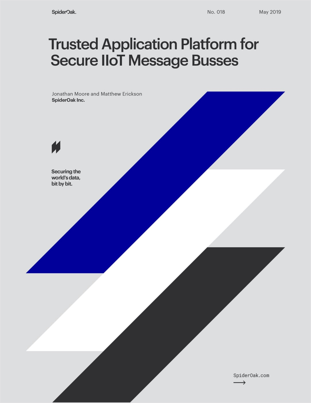

Effective grid systems also enabled consistent and flexible templates across print and web alike. Whitepaper covers were inspired by the timeless posters of Swiss Design.
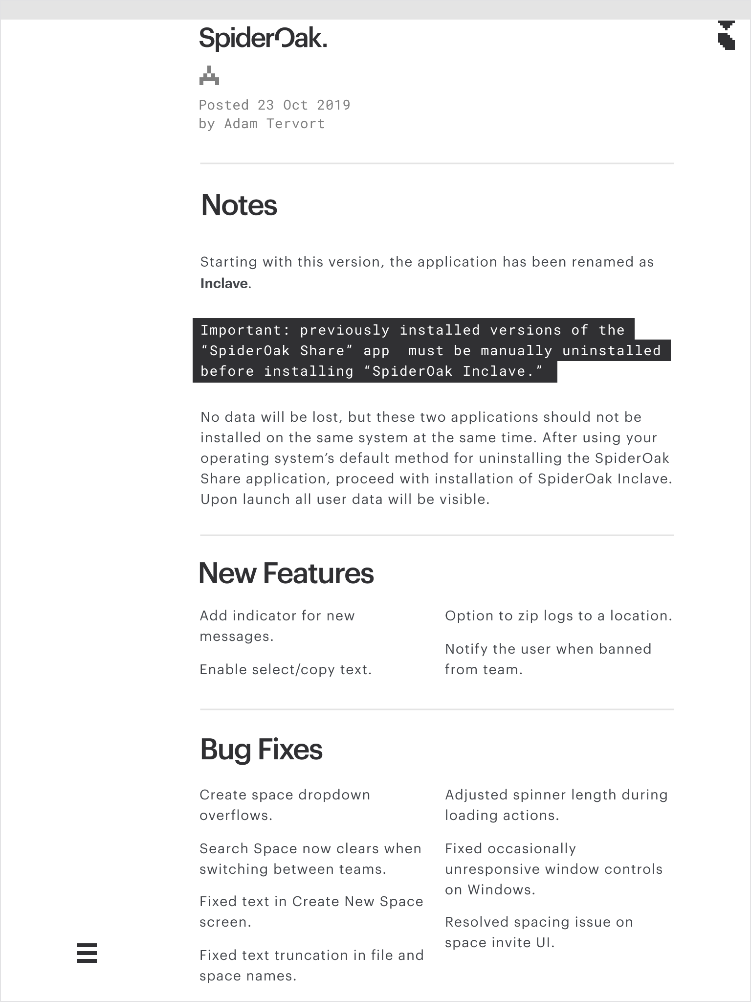
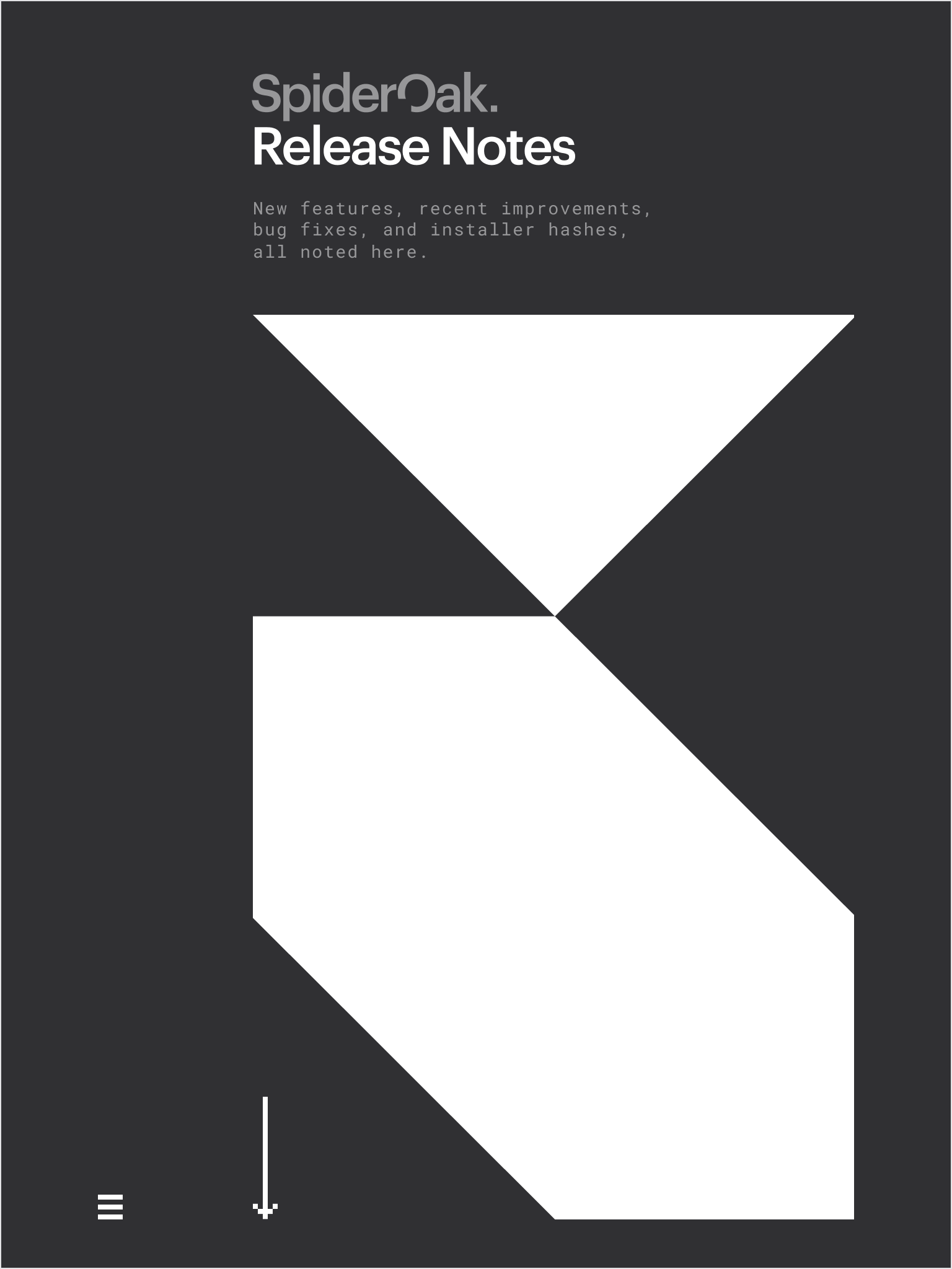
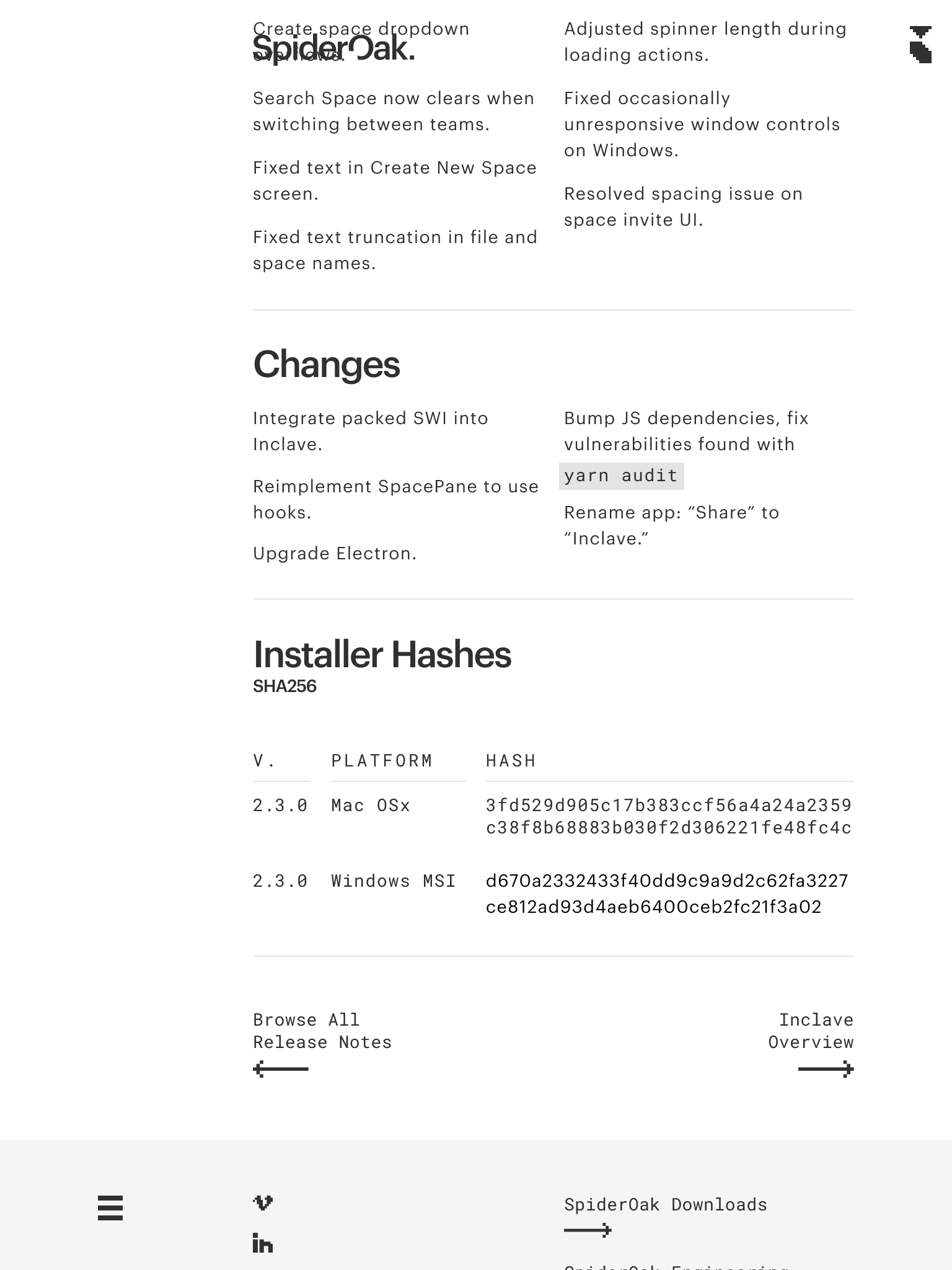
Release Notes
With software updates constantly underway, SpiderOak needed a way to automatically publish the latest Release Notes and downloadable versions.
The Hugo static site generator and some clever collaborative coding between Marketing and DevOps enabled continuous deployment for easy updates.
Creative Direction, Design, Web Development
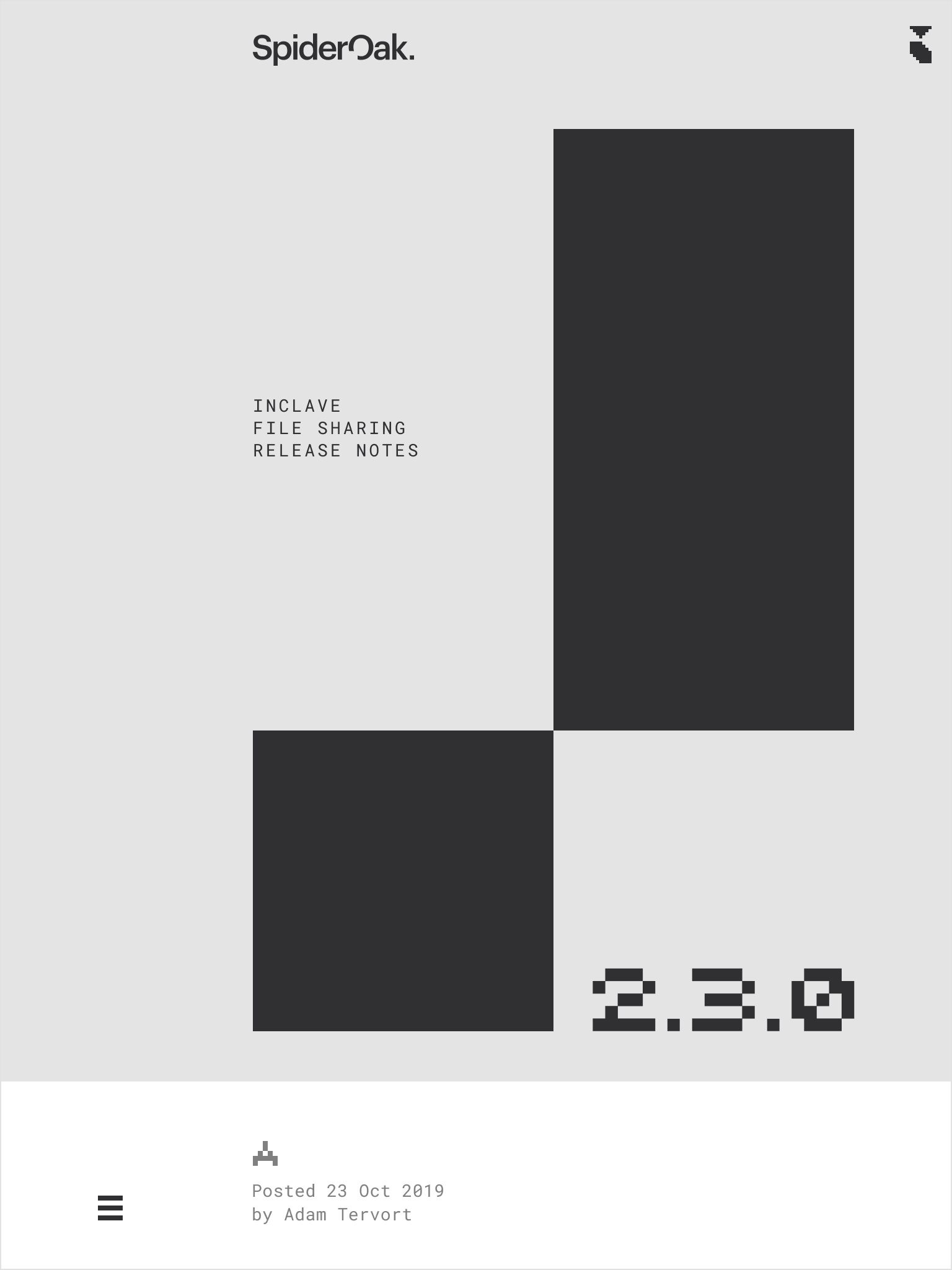
Release Notes
With software updates constantly underway, SpiderOak needed a way to keep Release Notes and downloadable versions current.
The website concept anticipated a workflow using the Hugo static site generator and collaborative development between Marketing and DevOps to enable continuous updates.
Creative Direction, Design, Web Development
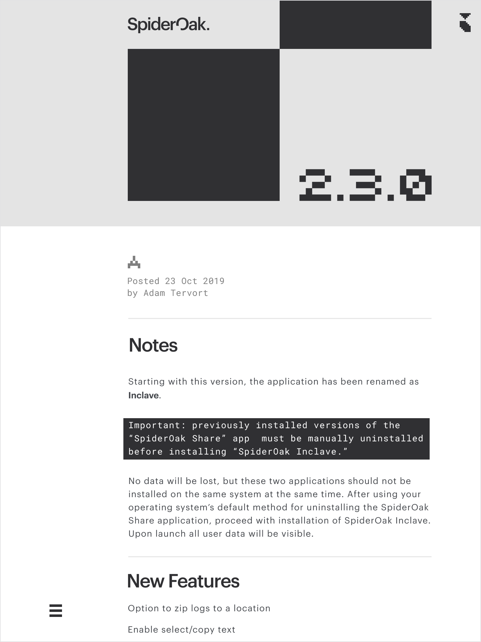
Release Notes
With software updates constantly underway, SpiderOak needed a way to automatically publish the latest Release Notes and downloadable versions.
The Hugo static site generator and some clever collaborative coding between Marketing and DevOps enabled continuous deployment for easy updates.
Creative Direction, Design, Web Development
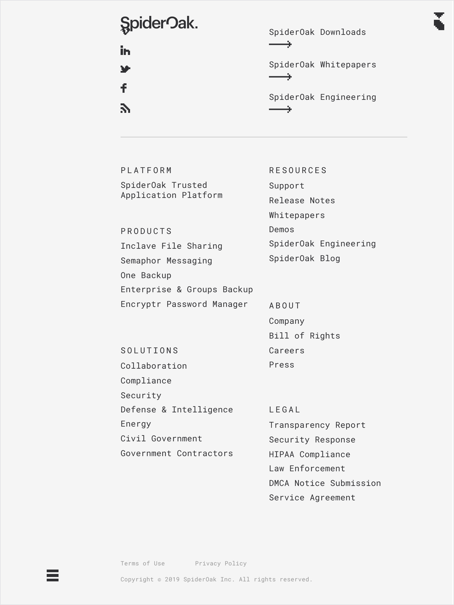
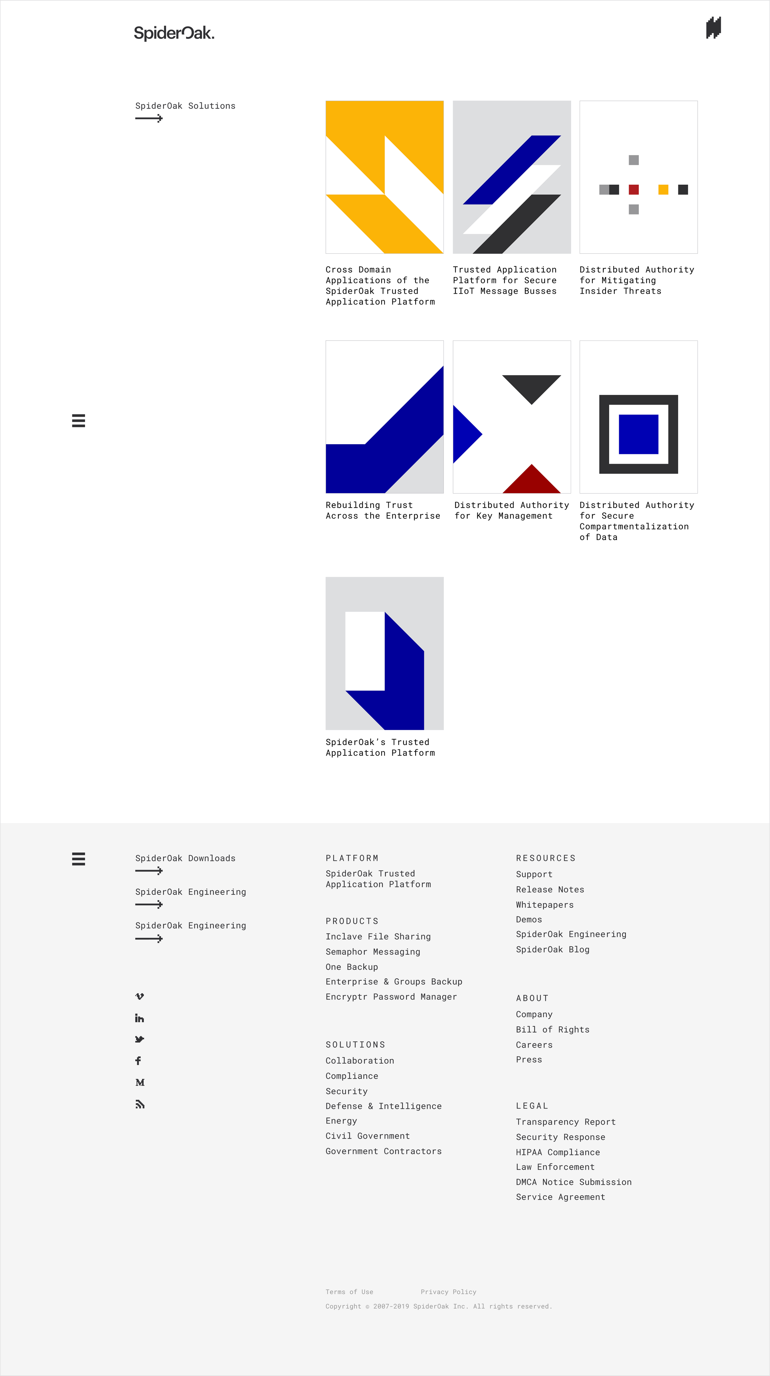
Icon Collection
The 8-bit icons, often coupled with Roboto Mono, are used throughout the brand concept to indicate points of user interaction.
Such “clickable” elements feature prominently throughout the website, of course, while acting as more intentional accessories in print — listing the company website, for instance, or calling attention to a pull quote.
Creative Direction, Design
Release Notes
With software updates constantly underway, SpiderOak needed a way to automatically publish the latest Release Notes and downloadable versions.
The Hugo static site generator and some clever collaborative coding between Marketing and DevOps enabled continuous deployment for easy updates.
Creative Direction, Design, Web Development

Whitepapers
Blockchain is no easy concept to explain, so SpiderOak’s marketing materials needed to be as digestible as possible.
Strongly gridded layouts, inspired by the International Typographic Style, helped to break content up into manageable blocks, improving comprehension, building trust, and providing yet another visual metaphor for the underlying blockchain technology.
Effective grid systems also enabled consistent and flexible templates across print and web alike. Whitepaper covers were inspired by the timeless posters of Swiss Design.
Creative Direction, Design
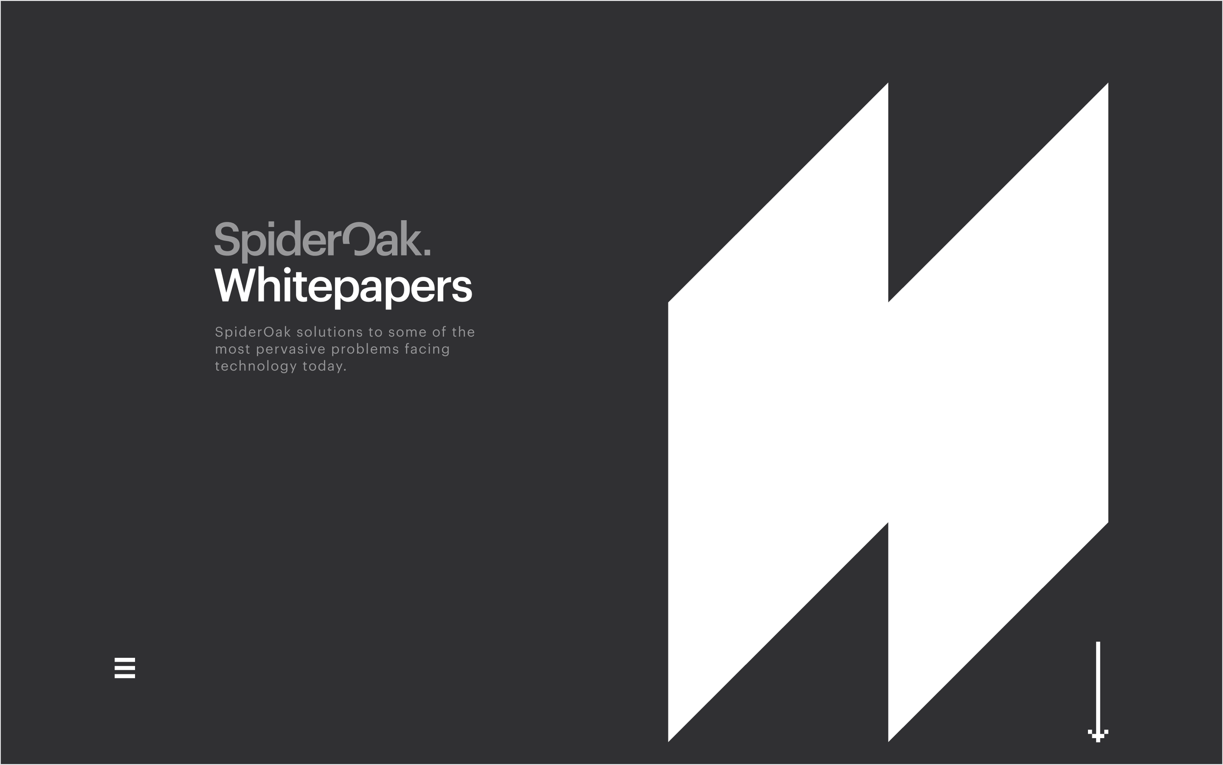
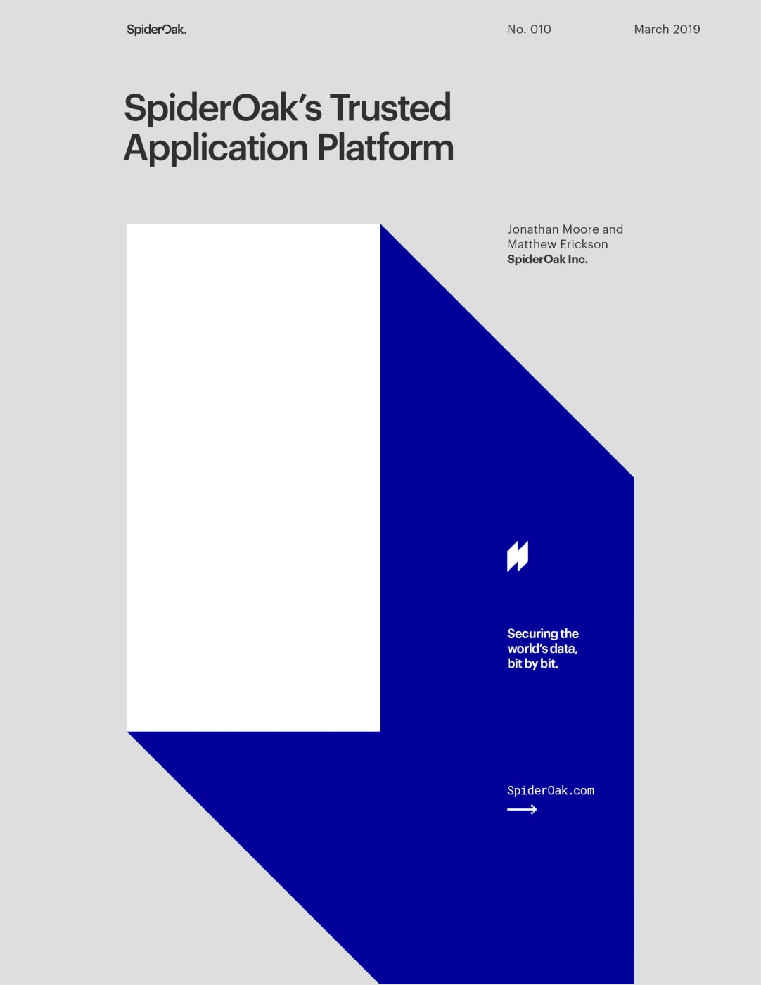

Release Notes
With software updates constantly underway, SpiderOak needed a way to automatically publish the latest Release Notes and downloadable versions.
The Hugo static site generator and some clever collaborative coding between Marketing and DevOps enabled continuous deployment for easy updates.
Creative Direction, Design, Web Development

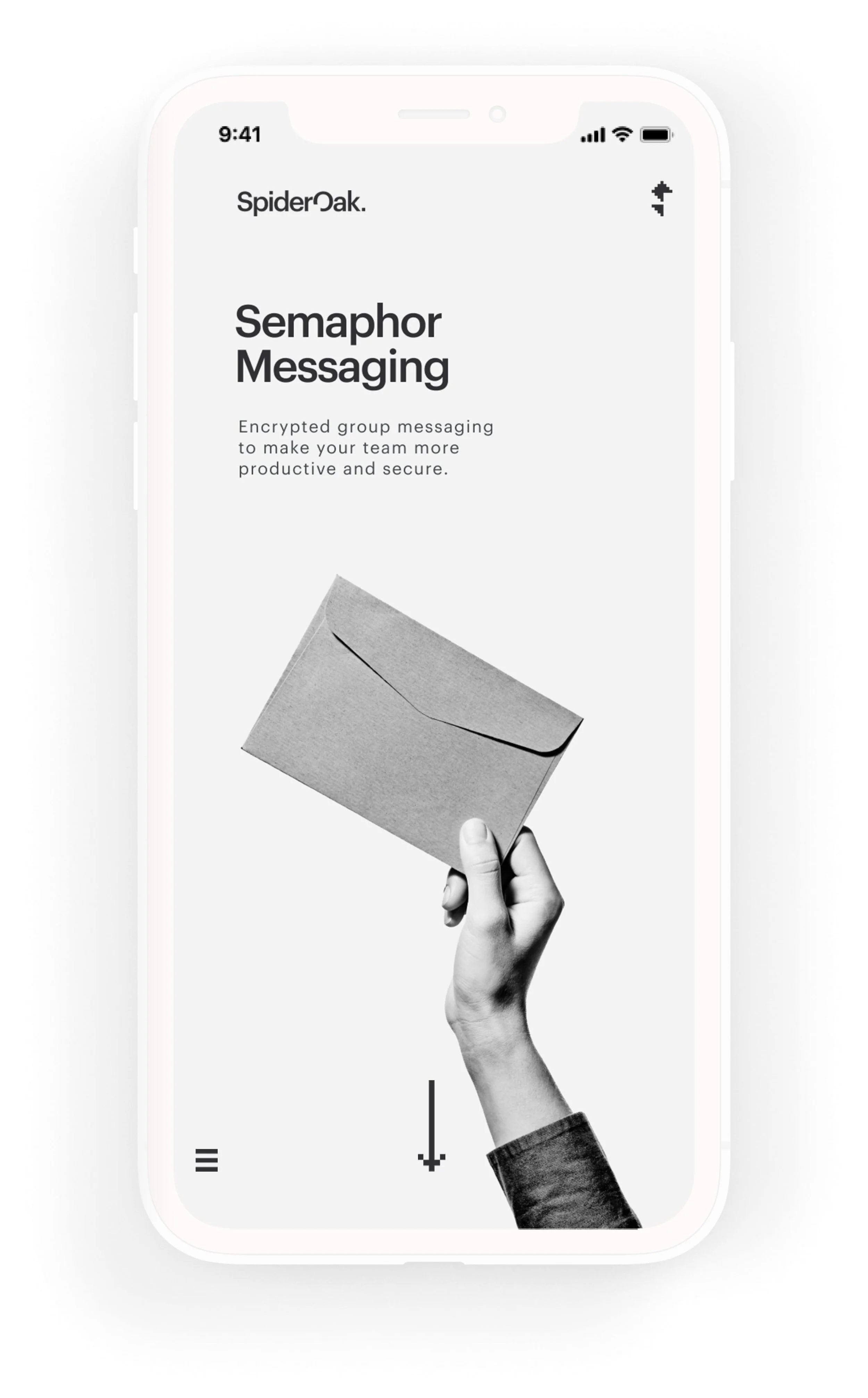
Products
Taking cues from Swiss Design, black and white photography served as effective at-a-glance communication for objectivity and clarity.
Creative Direction, Design
Products
Taking cues from Swiss Design, black and white photography served as effective at-a-glance communication for objectivity and clarity.
Creative Direction, Design
Logo Redesign
The old “keyhole oak tree” mark felt too literal — and increasingly out of step with the company’s pivot toward government security. Its chunky typography carried weight, but not the precision the brand now needed.
The redesign introduced a lighter, crisper cut of Graphik and shifted the focus back to the name itself. By carving a small square “bit” from the “O” and echoing it as a final block at the end of the wordmark, the logo now tied directly into the brand story — data secured, bit by bit.
Before
Keyhole oak logo, lacking focus
After
Precision and clarity, bit by bit
Securing the world’s data, bit by bit.
Bit by bit, or, little by little.
A “bit” being the smallest unit of data in a computer, the line is also a nod to the small startup’s scrappy resilience, managing to do more with less in the face of numerous hurdles throughout the years.
The very nature of 8-bit is simplification, and SpiderOak had been struggling for years not to come across as too technical.
Pivoting sharply from the consumer market it had known for over a decade, SpiderOak sought to position itself as indispensable technology for defense and intelligence communities within the United States government.
This new business-to-government direction required a straight-forward, no-nonsense approach in all of the company’s brand and marketing communications.
What better visual metaphor for blockchain than 8-bit styling with its tiny clusters of squares — a chain of blocks in the form of pixels. Early SpiderOak brand designs were even based on old school 8-bit styles.
Recalling the earliest days of computers, when pixel icons were first created to make the incomprehensible technology more intuitive and user friendly, SpiderOak needed a similarly simplified “less is more” approach to connect current and future audiences with its innovative security-first blockchain technology.
Brand Story
Brand Story
Background
Despite a loyal following among security enthusiasts for SpiderOak’s flagship One Backup product, the response to the proprietary applications in the years that followed was sorely underwhelming.
With the redevelopment of its private blockchain platform, the company was looking to take things in a new direction.
tagline
SpiderOak
Secure Software
After years of building niche backup tools for tech enthusiasts, SpiderOak set its sights on a bigger stage: government security. The new brand stripped things down to the essentials — no frivolous decorations — just clarity and trust.
↓ Brand Story
↓ Logo Redesign
↓ Icon Collection
↓ Products
↓ Downloads
↓ Release Notes
↓ White Papers
↓ Products
↓ Downloads
↓ Release Notes
↓ White Papers
Spideroak
Secure Software
Despite a loyal following among security enthusiasts for SpiderOak’s flagship One Backup product, the response to the proprietary applications in the years that followed was sorely underwhelming.
With the redevelopment of its private blockchain platform, the company was looking to take things in a new direction.
↓ Brand Story
↓ Logo Redesign

Brand Concept
Spideroak
Secure Software
Despite a loyal following among security enthusiasts for SpiderOak’s flagship One Backup product, the response to the proprietary applications in the years that followed was sorely underwhelming.
With the redevelopment of its private blockchain platform, the company was looking to take things in a new direction.
Pivoting sharply from the consumer market it had known for over a decade, SpiderOak sought to position itself as indispensable technology for defense and intelligence communities within the United States government. This new business-to-government direction required a straight-forward, no-nonsense approach in all of the company’s brand and marketing communications.
Brand Concept
Securing the world’s data, bit by bit.
Brand Story
Despite a loyal following among security enthusiasts for SpiderOak’s flagship One Backup product, the response to the proprietary applications in the years that followed was sorely underwhelming.
With the redevelopment of its private blockchain platform, the company was looking to take things in a new direction.
Background
Pivoting sharply from the consumer market it had known for over a decade, SpiderOak sought to position itself as indispensable technology for defense and intelligence communities within the United States government.
This new business-to-government direction required a straight-forward, no-nonsense approach in all of the company’s brand and marketing communications.
Background
This rebrand is a concept only; much of this content never went live.
Securing the world’s data, bit by bit.
Brand Story
Despite a loyal following among security enthusiasts for SpiderOak’s flagship One Backup product, the response to the proprietary applications in the years that followed was sorely underwhelming.
With the redevelopment of its private blockchain platform, the company was looking to take things in a new direction.
Background
Pivoting sharply from the consumer market it had known for over a decade, SpiderOak sought to position itself as indispensable technology for defense and intelligence communities within the United States government. This new business-to-government direction required a straight-forward, no-nonsense approach in all of the company’s brand and marketing communications.
Background
This rebrand is a concept only; much of this content never went live.
Before
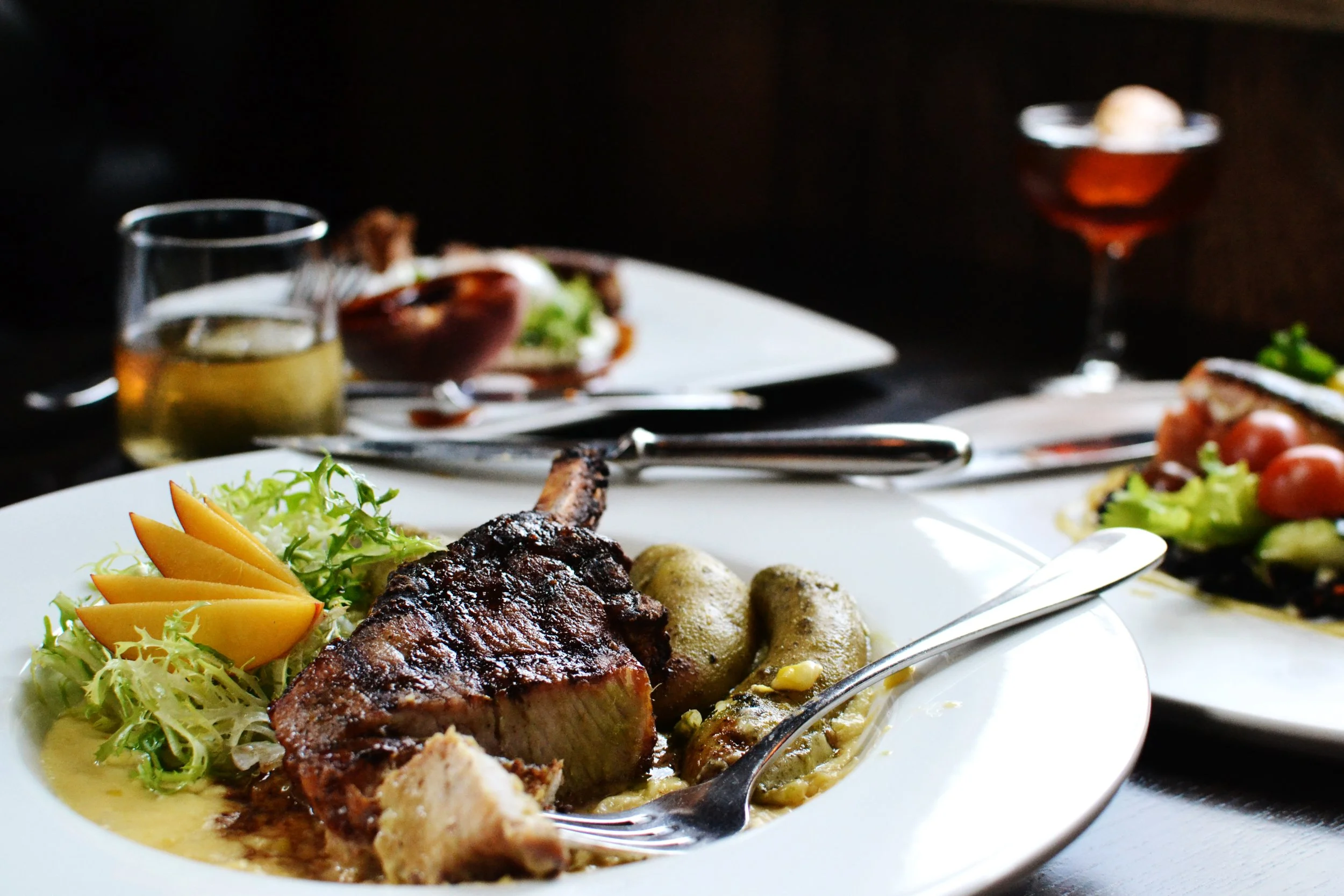
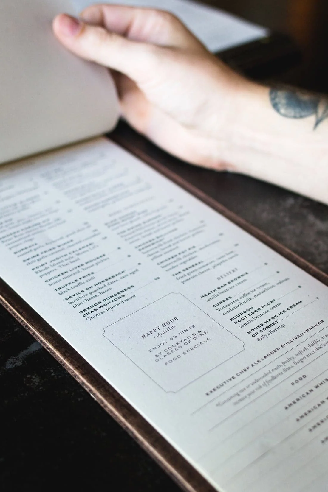
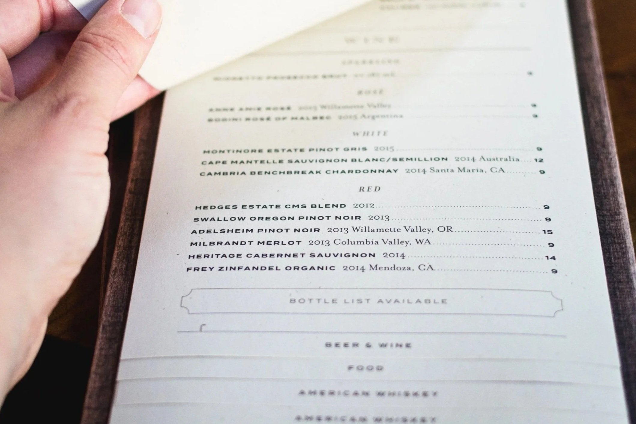
The restaurant menus needed a refresh to match the sophistication of the dishes leaving the kitchen.
Because the chef updated the offerings daily, dinner menus in multiple formats had to be reprinted and trimmed to size each afternoon before service.
images from Yelp
AFTER
We simplified production by resizing the layouts to reduce trimming and better suit the wooden boards. Since the menus were fastened with a magnet, we adjusted the text to sit neatly within the final frame.
With the dinner menus resolved, we carried the refinements through the rest for a cohesive set.
libations menu for cocktails,
beer, and wine by the glass
wine list
dinner menu
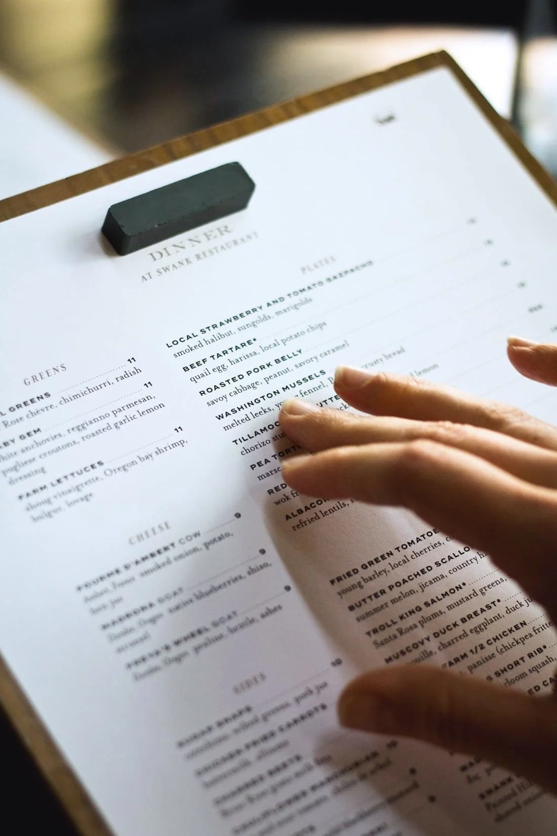
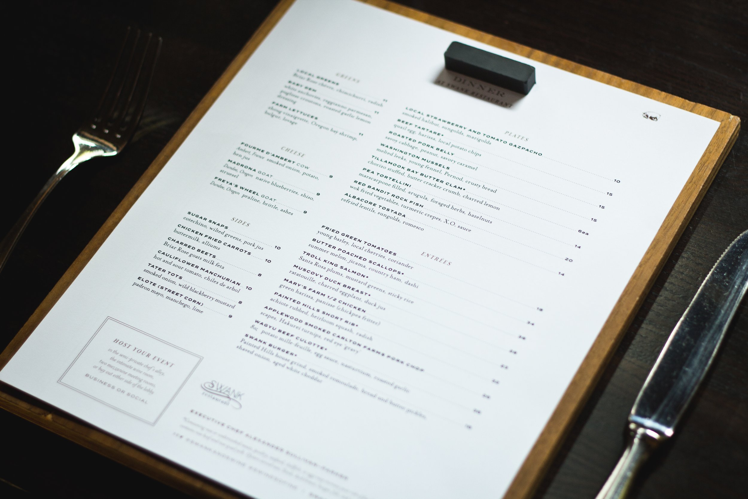
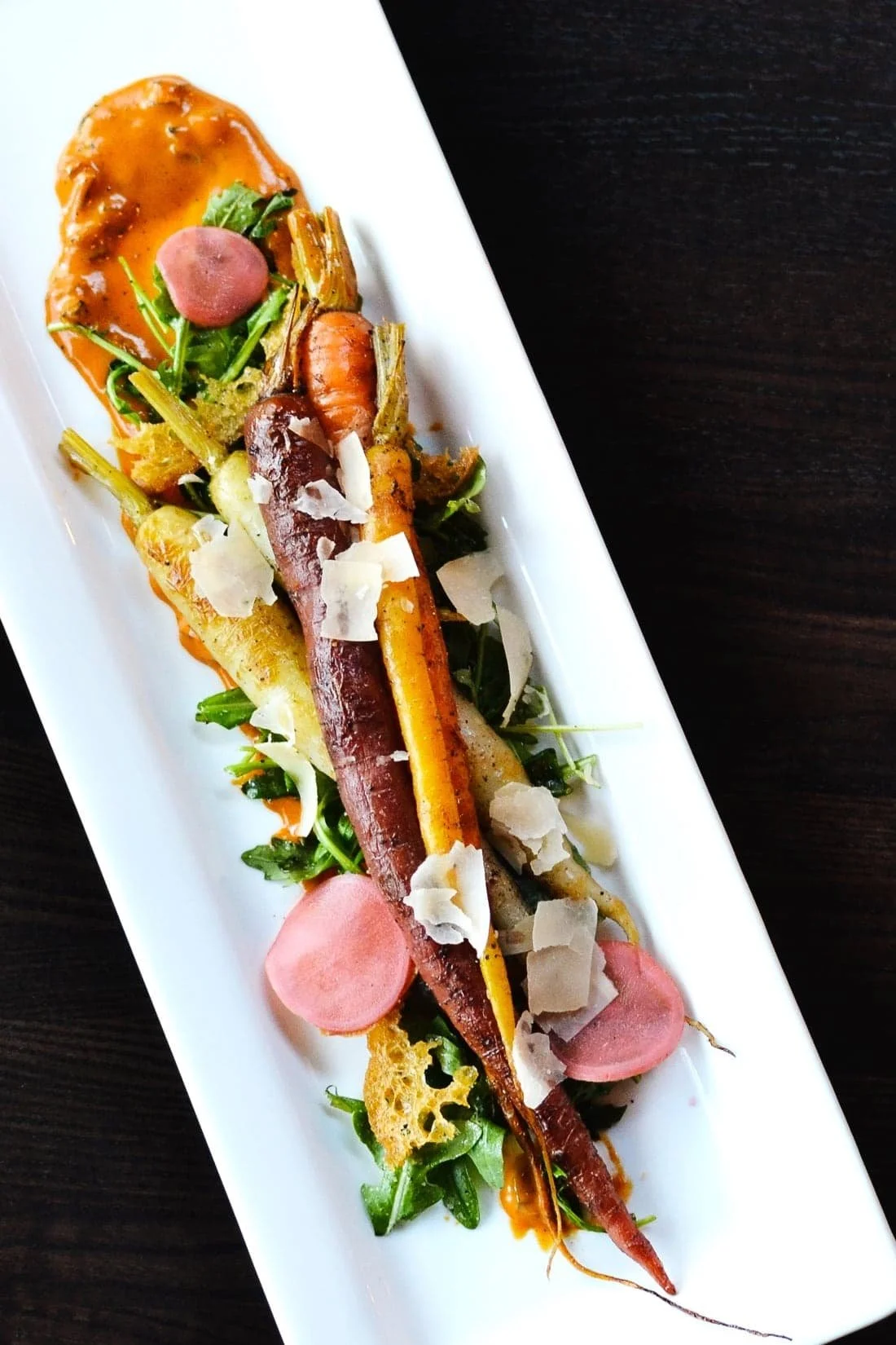
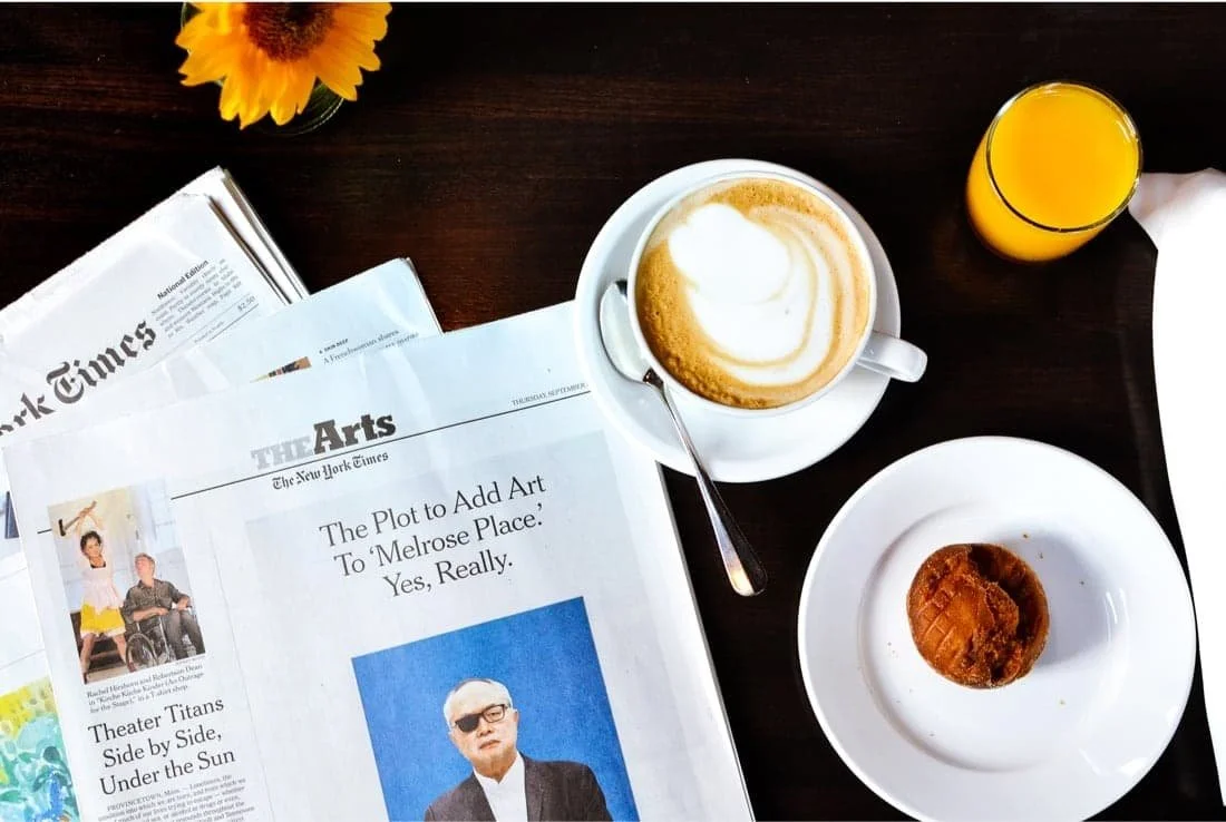
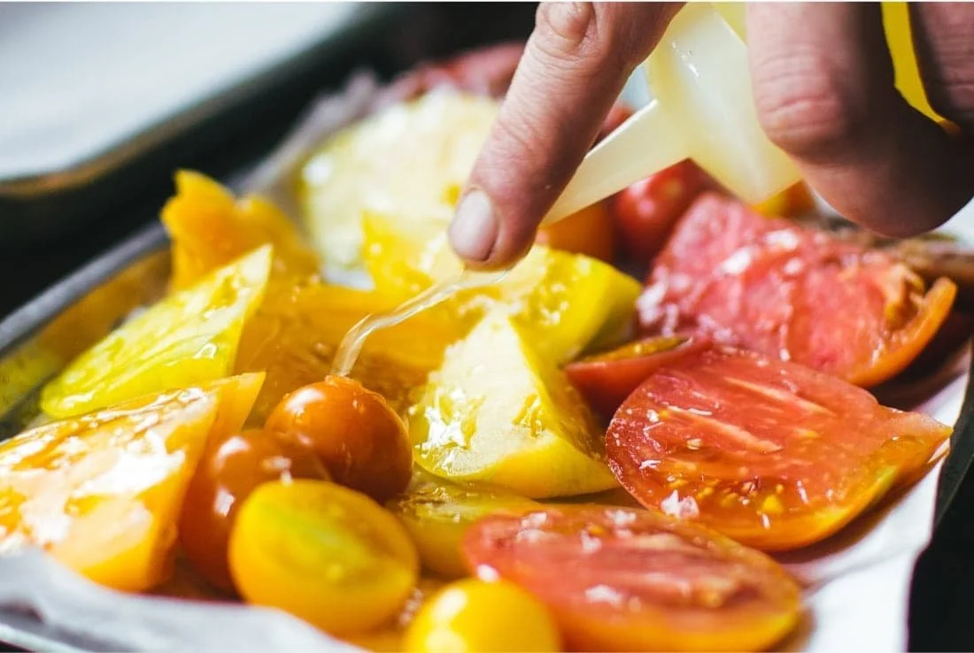
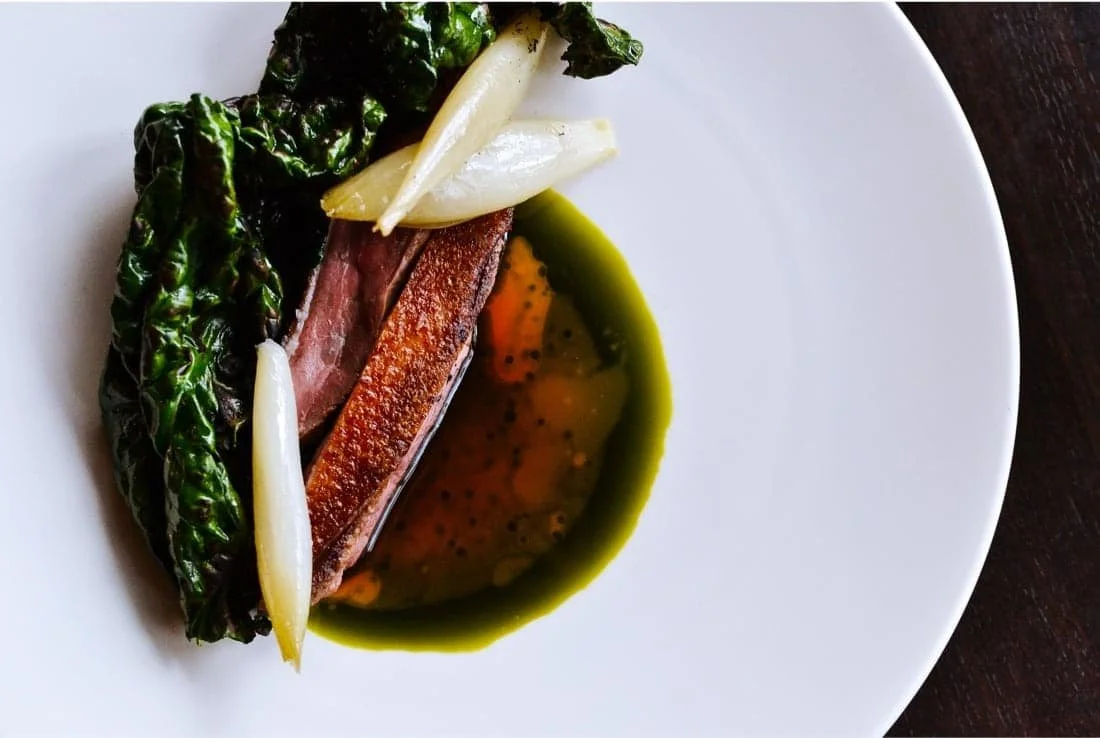
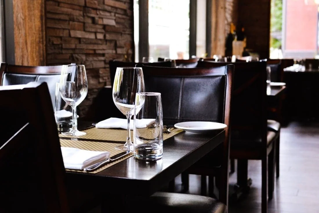
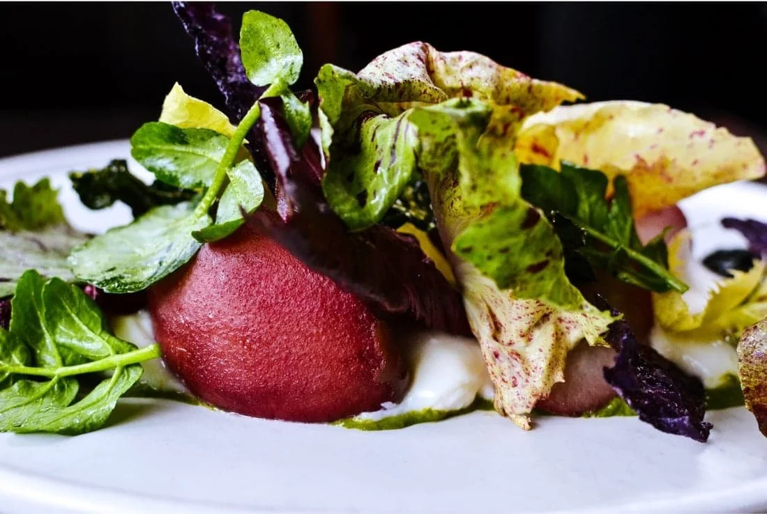
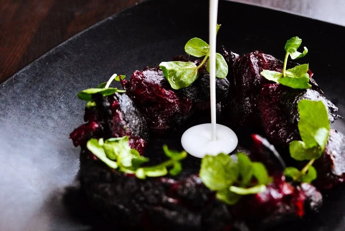
Swank Restaurant
Art Direction, Photography


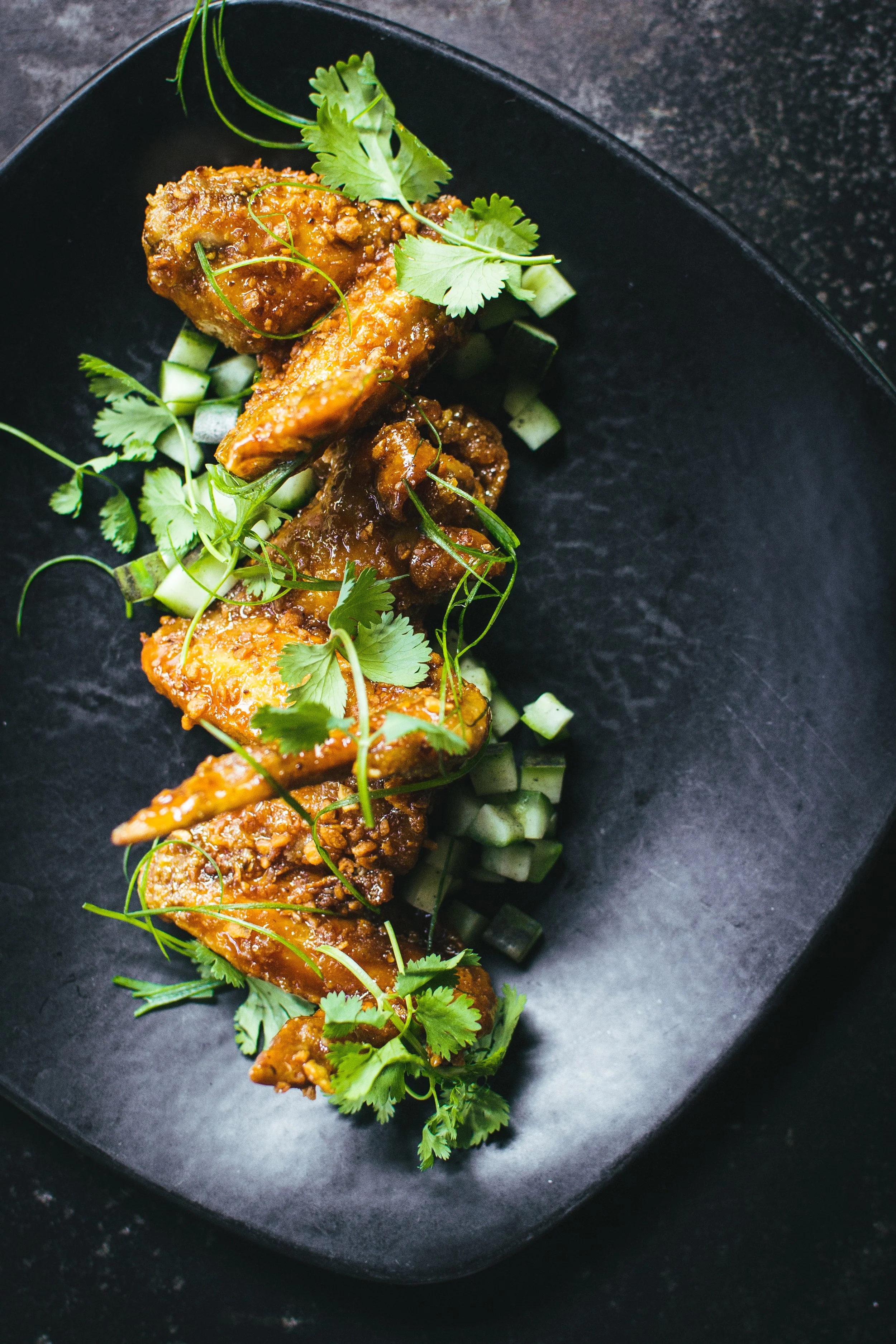
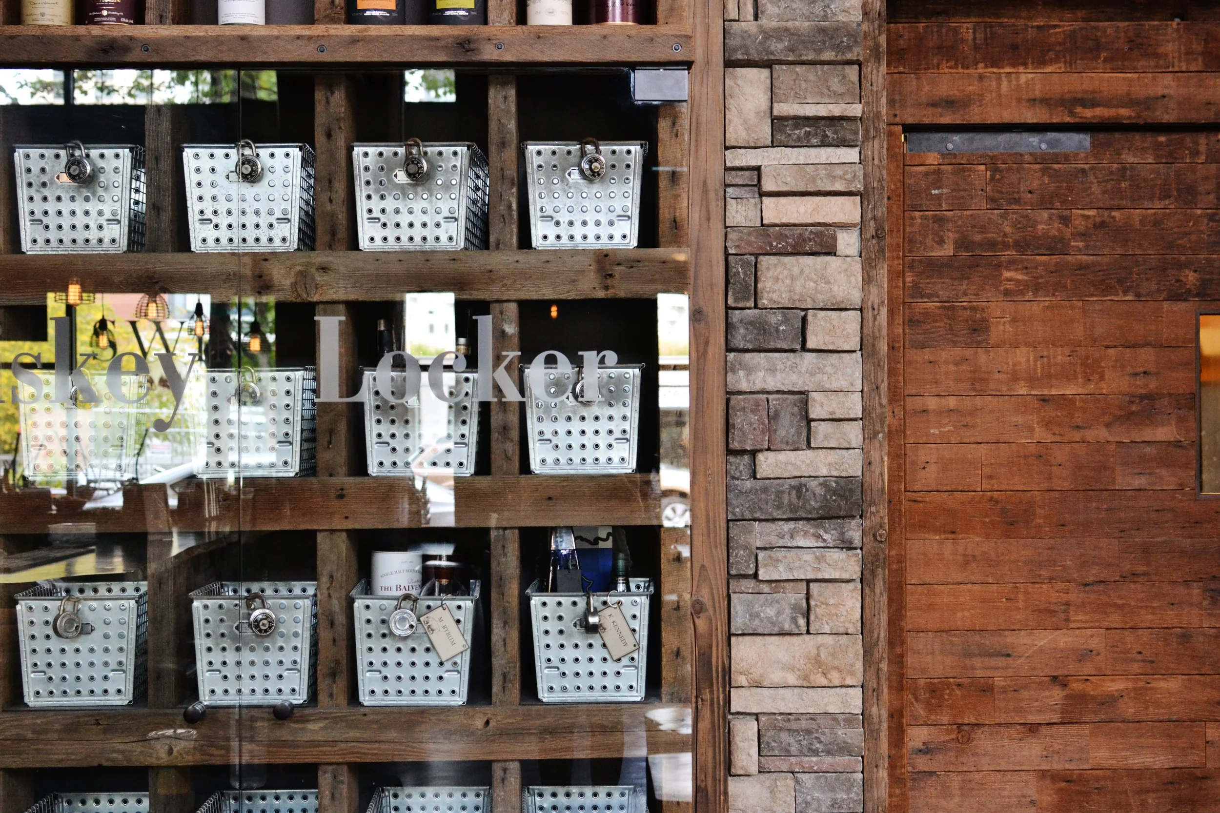
SWINE MOONSHINE
& WHISKEY BAR
Art Direction, Photography

Menus for Swine
Moonshine & Whiskey Bar
Art Direction, Design, Photography
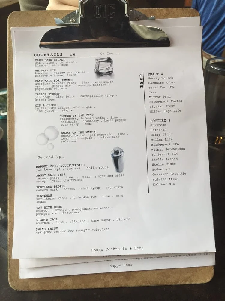
Before
images from Yelp
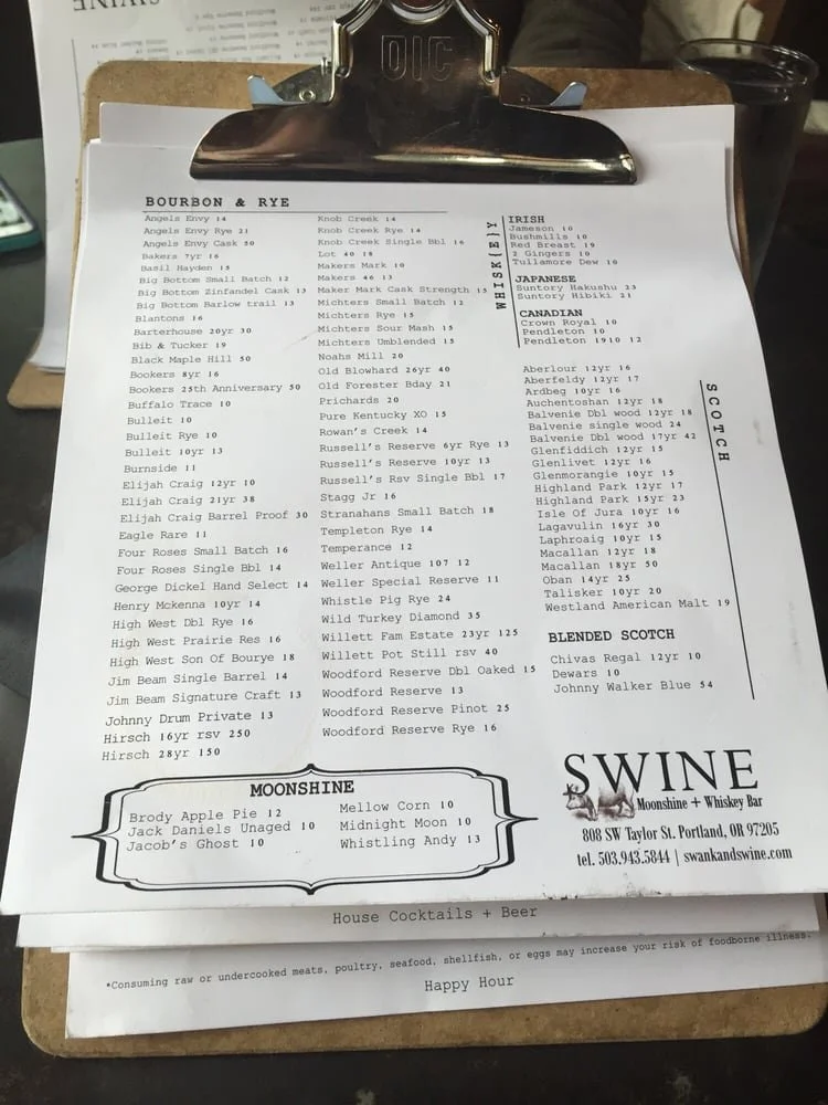
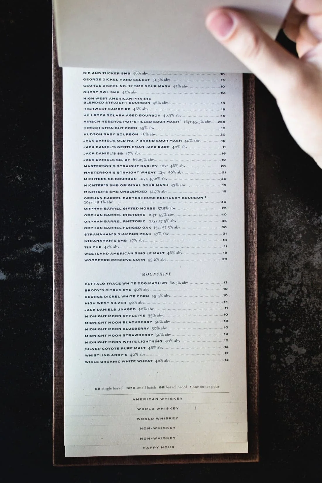
Swine Moonshine and Whiskey Bar needed a proper menu to showcase its extensive backbar.
The original clipboards left pages stained, out of order, and constantly in need of reprinting — hardly the impression of a serious whiskey destination.
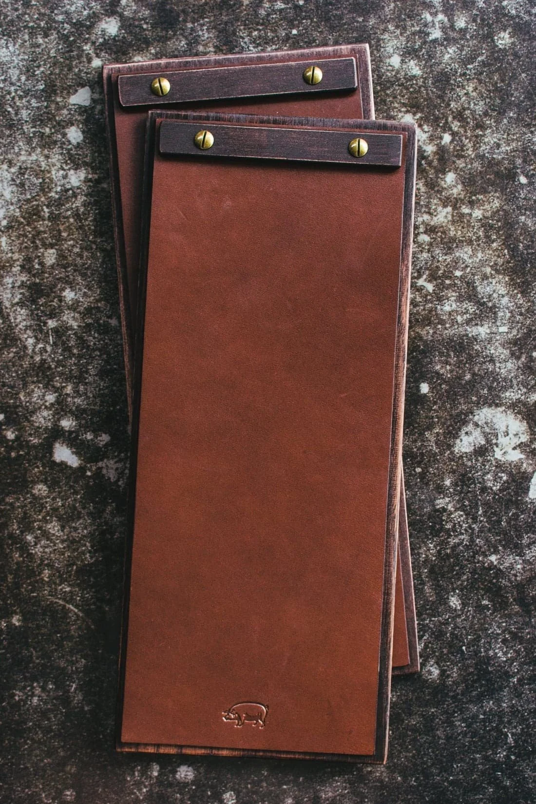
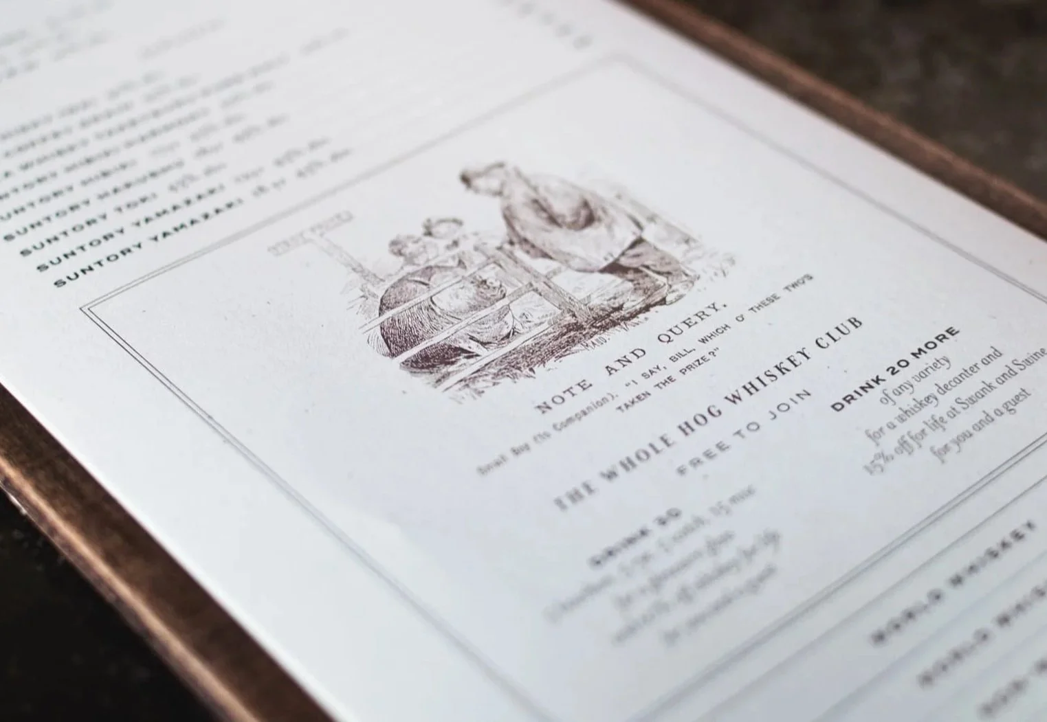
AFTER
We redesigned the menus from the ground up.
Partnering with local craftsman Hankbuilt, we commissioned custom wooden clipboards, then worked with Tanner Goods to add custom leather tops that kept the pages secure and orderly. To weave in character, we included vintage pig-and-whiskey themed cartoons that reinforced the bar’s story.


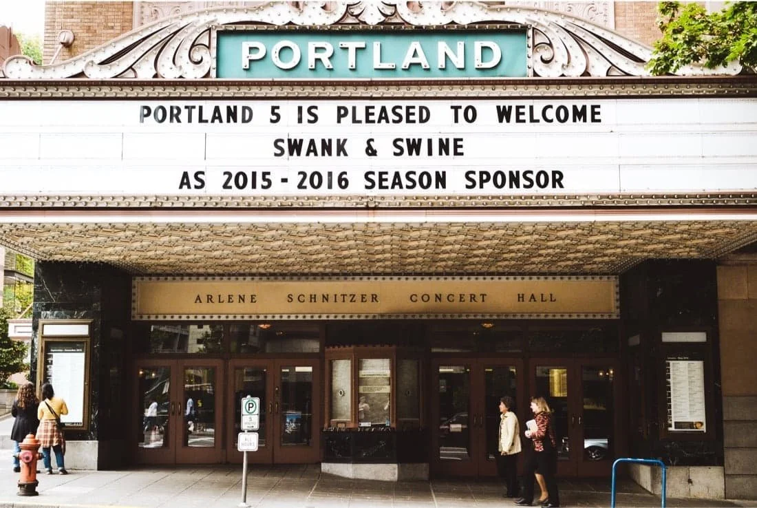
Website for
Swank n’ Swine
Art Direction, Design, Photography, Copywriting, Web Development
Before
The original website was clunky, visually unappealing, and not optimized for web or search. Poor photography and confusing navigation left it struggling to attract visitors, averaging not even 400 sessions per month.
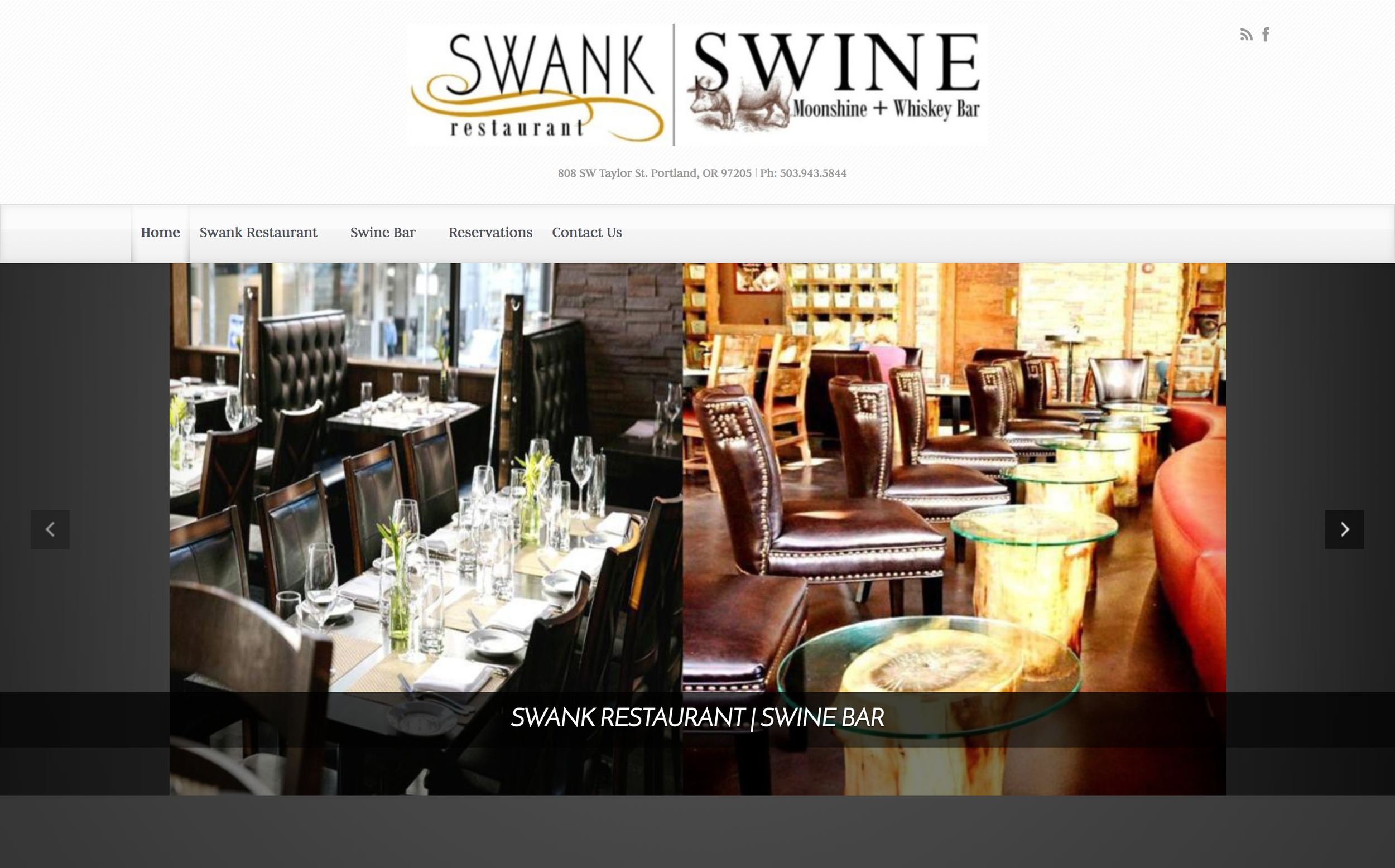

AFTER
Through a complete creative overhaul — fresh photography, clear messaging, a streamlined user experience, and a modern design system — the site was transformed into a compelling digital presence.
Within the first month of launch, traffic increased tenfold to over 4,000 sessions per month. Within six months, it achieved first-page Google search results for “Portland whiskey.”
Gallery for
Swank n’ Swine
Art Direction, Photography